
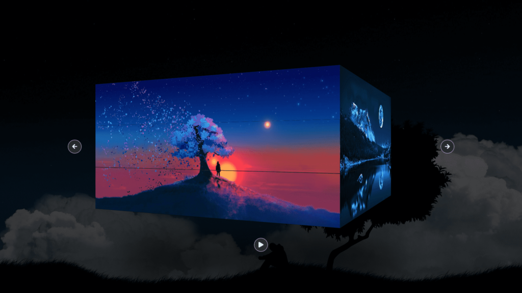
In this blog, we are creating a 3D cube image slideshow. The HTML document includes a “container” div, which is use to take up the full width and height of the viewport. Inside this container, we have a “viewport” div which is position at the center of the page and given a perspective property to create the 3D effect.
Within the “viewport” div, we have three “cube” divs, each with the class “cube-1”, “cube-2”, and “cube-3”. Each of these cubes has six “face” divs, one for the front, back, top, bottom, left, and right faces of the cube. These “face” divs are given background images using the “background” property in CSS.
We also have “control” divs for the left and right arrow buttons, as well as a play/pause button. These buttons are style using Font Awesome icons.
This code creates a 3D cube slideshow that allows the user to rotate the cubes using arrow buttons and play/pause button. It uses functions to handle the rotation and toggle play/pause button icon. Variables are use to track rotation, play status and interval.
The “playPause” function is use to start and stop the rotation of the cubes, and the left and right arrow buttons are use to manually rotate the cubes. Additionally, when the cursor is over the arrow buttons, the cubes will rotate slightly for added interactivity.
Video Tutorial of 3D Cube Image Slide Show
To see a live demonstration of the 3D Cube Image Slide Show, Click Here. For a complete video guide on how the generator works, check out the accompanying YouTube video.
You might like this:
3D Cube Image Slide Show
HTML:
Create a new file with the name “index.html” and add the provide code to it. Ensure the file has a “.html” extension.
<!DOCTYPE html>
<html lang="en">
<head>
    <meta charset="UTF-8">
    <meta http-equiv="X-UA-Compatible" content="IE=edge">
    <meta name="viewport" content="width=device-width, initial-scale=1.0">
    <title>3D Cube Image Slide Show</title>
    <link rel="stylesheet" href="style.css">
    <link rel="stylesheet" href="https://cdnjs.cloudflare.com/ajax/libs/font-awesome/5.15.4/css/all.min.css">
</head>
<body>
    <div class="container">
        <div class="viewport">
            <div class="control left-arrow">
                <i class="fas fa-arrow-left"></i>
            </div>
            <div class="cube cube-1">
                <div class="face front"></div>
                <div class="face back"></div>
                <div class="face top"></div>
                <div class="face bottom"></div>
                <div class="face left"></div>
                <div class="face right"></div>
            </div>
            <div class="cube cube-2">
                <div class="face front"></div>
                <div class="face back"></div>
                <div class="face top"></div>
                <div class="face bottom"></div>
                <div class="face left"></div>
                <div class="face right"></div>
            </div>
            <div class="cube cube-3">
                <div class="face front"></div>
                <div class="face back"></div>
                <div class="face top"></div>
                <div class="face bottom"></div>
                <div class="face left"></div>
                <div class="face right"></div>
            </div>
            <div class="control right-arrow">
                <i class="fas fa-arrow-right"></i>
            </div>
            <div class="control play-pause">
                <i class="fas fa-play"></i>
            </div>
        </div>
    </div>
</body>
</html>
This code creates an HTML web page that displays a 3D cube image slideshow. The page includes a container that takes up the entire viewport and sets the background to a linear gradient. The viewport is center in the container and has a width and height of 42vw and 21vw, respectively, and is use to have a perspective of 1300px. The viewport also has an ::after pseudo-element that creates a blurred background behind the cube.
The page also includes 3 divs with the class of “cube” which are the 3 sides of the cube. Each cube is made up of 6 “face” divs, one for each face of the cube, and each face is use to be the same size as the cube. The front, back, top, bottom, left, and right classes are use to position each face of the cube in the correct position.
The page also includes two control arrows, one for the left and one for the right, and a play/pause button. Each control arrow includes an <i> element that uses FontAwesome to display an arrow icon. The play/pause button includes an <i> element that uses FontAwesome to display a play or pause icon depending on the current state of the slideshow.
The page also links to an external CSS stylesheet, “style.css” which is used to style the page, including positioning and visual styling of the cubes and the control arrows. Additionally, it links to a CDN of FontAwesome to use its icons in the control arrows.
CSS:
Create a new CSS file name “style.css” and copy the provide code into it. Ensure that the file has a “.css” extension.
*{
    margin: 0;
    padding: 0;
    box-sizing: border-box;
}
.container{
    width: 100%;
    height: 100vh;
    background: linear-gradient(rgba(0,0,0,.6),
                rgba(0,0,0,.8)),
                url(bg.jpg) no-repeat;
    background-position: center;
    background-size: cover;
}
.viewport{
    position: absolute;
    top: 50%;
    left: 50%;
    width: 42vw;
    height: 21vw;
    transform: translate(-50%, -50%);
    perspective: 1300px;
}
.viewport::after{
    content: '';
    position: absolute;
    top: 140%;
    left: -10%;
    width: 120%;
    height: 20%;
    background: #000;
    filter: blur(50px);
    z-index: -1;
}
.cube{
    position: relative;
    width: 100%;
    height: 33.33%;
    transform-style: preserve-3d;
}
.cube-1{
    transition: transform 0.4s;
}
.cube-2{
    z-index: 10;
    transition: transform 0.4s .2s;
}
.cube-3{
    transition: transform 0.4s .4s;
}
.face{
    position: absolute;
    width: 100%;
    height: 100%;
}
.face{
    transform: translateZ(21vw);
}
.cube-1 .front{
    background: url(img1.jpg) no-repeat 50% 0;
    background-size: cover;
}
.cube-2 .front{
    background: url(img1.jpg) no-repeat 50% -7vw;
    background-size: cover;
}
.cube-3 .front{
    background: url(img1.jpg) no-repeat 50% -14vw;
    background-size: cover;
}
.back{
    transform: translateZ(-21vw) rotateY(180deg);
}
.cube-1 .back{
    background: url(img2.jpg) no-repeat 50% 0;
    background-size: cover;
}
.cube-2 .back{
    background: url(img2.jpg) no-repeat 50% -7vw;
    background-size: cover;
}
.cube-3 .back{
    background: url(img2.jpg) no-repeat 50% -14vw;
    background-size: cover;
}
.left{
    transform: translateX(-21vw) rotateY(-90deg);
}
.cube-1 .left{
    background: url(img3.jpg) no-repeat 50% 0;
    background-size: cover;
}
.cube-2 .left{
    background: url(img3.jpg) no-repeat 50% -7vw;
    background-size: cover;
}
.cube-3 .left{
    background: url(img3.jpg) no-repeat 50% -14vw;
    background-size: cover;
}
.right{
    transform: translateX(21vw) rotateY(90deg);
}
.cube-1 .right{
    background: url(img4.jpg) no-repeat 50% 0;
    background-size: cover;
}
.cube-2 .right{
    background: url(img4.jpg) no-repeat 50% -7vw;
    background-size: cover;
}
.cube-3 .right{
    background: url(img4.jpg) no-repeat 50% -14vw;
    background-size: cover;
}
.top{
    height: 42vw;
    background: #111;
    transform: translateY(-21vw) rotateX(90deg);
}
.bottom{
    height: 42vw;
    background: #111;
    transform: translateY(-14vw) rotateX(-90deg);
}
.control{
    position: absolute;
    width: 40px;
    height: 40px;
    color: #fff;
    background: rgba(59,52,50,.7);
    border: 1px solid #fff;
    border-radius: 100%;
    display: flex;
    justify-content: center;
    align-items: center;
    transform: translate(-50%, -50%);
    cursor: pointer;
    z-index: 100;
    transition: background .3s;
}
.control:hover{
    background: rgba(42,38,36,.8);
}
.control i{
    pointer-events: none;
}
.left-arrow{
    top: 50%;
    left: -35%;
}
.right-arrow{
    top: 50%;
    left: 135%;
}
.play-pause{
    top: 140%;
    left: 50%;
}
This code creates a 3D image slider using HTML and CSS. The slider is place inside a container with a background image and gradient. The container is use to take up the entire viewport. Inside the container, there is a .viewport class that is position at the center of the container and has a width and height of 42vw and 21vw respectively. The .viewport class also has a perspective of 1300px, which allows for the 3D effect.
The code creates 3 .cube classes, each with a width and height of 33.33% of the .viewport. The .cube class are given a 3D transform-style and are position relative. Each cube has 6 faces, .front, .back, .left, .right, .top, and .bottom, that are position absolutely with a width and height of 100%. Each of these faces are given a background image and are rotate according to their position on the cube.
The code also adds controls for the slider, such as left and right arrows and a play/pause button, that when clicked or hovered over, rotate the cubes accordingly. The cubes rotate using the rotateY() function, which rotates the cubes along the Y-axis. The rotation is done using an interval set by the setInterval() function, the interval is set to 3000ms and is cleared using the clearInterval() function.
Overall, this code creates a visually appealing 3D image slider that is easy to navigate and interact with. The code uses CSS 3D transforms, gradients, and background images to create a dynamic and engaging experience for the user.
JavaScript:
In between the <body></body> tags, you can include JavaScript code by enclosing it within <script> tags.
const rotate = () => {
            const cubes = document.querySelectorAll(".cube");

            Array.from(cubes).forEach(
                (cube) => (cube.style.transform = `rotateY(${x}deg)`)
            );
        };

        const changePlayPause = () => {
            const i = document.querySelector(".play-pause i");
            const cls = i.classList[1];
            if (cls === "fa-play") {
                i.classList.remove("fa-play");
                i.classList.add("fa-pause")
            } else {
                i.classList.remove("fa-pause");
                i.classList.add("fa-play");
            }
        };

        let x = 0;
        let bool = false;
        let interval;

        const playPause = () => {
            if (!bool) {
                interval = setInterval(() => {
                    x -= 90;
                    rotate();
                }, 3000);
                changePlayPause();
                bool = true;
            } else {
                clearInterval(interval);
                changePlayPause();
                bool = false;
            }
        };

        document.querySelector(".left-arrow").addEventListener("click", () => {
            x += 90;
            rotate();
            if (bool) {
                playPause();
            }
        });

        document.querySelector(".left-arrow").addEventListener("mouseover", () => {
            x += 25;
            rotate();
        });

        document.querySelector(".left-arrow").addEventListener("mouseout", () => {
            x -= 25;
            rotate();
        });

        document.querySelector(".right-arrow").addEventListener("click", () => {
            x -= 90;
            rotate();
            if (bool) {
                playPause();
            }
        });

        document.querySelector(".right-arrow").addEventListener("mouseover", () => {
            x -= 25;
            rotate();
        });

        document.querySelector(".right-arrow").addEventListener("mouseout", () => {
            x += 25;
            rotate();
        });

        document.querySelector(".play-pause").addEventListener("click", () => {
            playPause();
        });
This code is a JavaScript script that controls the behavior of a cube displayed on a webpage. It uses the rotateY() CSS transformation property to rotate the cubes on the Y-axis and allows the user to control the rotation with left and right arrow buttons. The play-pause button starts and stops the rotation of the cubes. The play-pause button also changes appearance when clicked.
Summary:
This code creates a 3D cube image slide show. The HTML structure includes a container div and a viewport div which holds the cubes, left arrow control, right arrow control, and play/pause control. The CSS styles the container, viewport, and cubes to create a 3D cube effect. The JavaScript is responsible for the functionality of the slide show, including rotating the cubes when the left or right arrow controls are click or hovered over, and the play/pause functionality which automatically rotates the cubes. The script also switches the icon of the play/pause button between a play and pause icon.

