In this tutorial, we will learn how to detect the user’s browser using JavaScript and visually highlight the detected browser icon on a webpage.
What we’ll do:
- Use the
navigator.userAgentstring to identify popular browsers such as Chrome, Firefox, Edge, Safari, and Opera. - Dynamically determine the current browser.
- Display a row of browser icons, and highlight only the detected browser by changing its opacity.
Purpose of the tutorial:
This is a great starting point if you’re building:
- A browser compatibility warning system
- A download page with browser-specific links
- Or just want to learn more about
userAgentstring parsing in JavaScript
By the end of this tutorial, you’ll understand how to:
- Work with the browser’s
userAgentstring - Use basic DOM manipulation with JavaScript
- Apply conditional logic to control UI behavior
Video Tutorial of Detect Browser using HTML CSS & JavaScript
To see a live demonstration of The Detect Browser Click Here. For a complete video guide on how the generator works, check out the accompanying YouTube video.
Detect Browser using HTML CSS & JavaScript
HTML
This HTML file creates a simple user interface designed to display browser icons, which will later be used with JavaScript to detect and highlight the user’s current browser.
<!DOCTYPE html>
This declaration defines the document type and version of HTML (HTML5 in this case).
<html lang="en">
This is the root element of the HTML page. The lang="en" attribute specifies that the content is in English.
<head> Section
Contains meta information about the webpage.
<meta charset="UTF-8">- Sets the character encoding to UTF-8, which supports most characters used in modern web content.
<meta http-equiv="X-UA-Compatible" content="IE=edge">- Tells Internet Explorer to use the latest rendering engine.
<meta name="viewport" content="width=device-width, initial-scale=1.0">- Ensures the page is responsive on all devices by setting the viewport to the device width.
<title>Detect Browser</title>- Sets the title of the webpage as seen in the browser tab.
<link rel="stylesheet" href="style.css">- Links an external CSS file named
style.cssfor styling the page elements.
- Links an external CSS file named
<body> Section
This is the main visible content of the webpage.
<div class="browsers">
A container div with class browsers. It wraps everything related to browser icons.
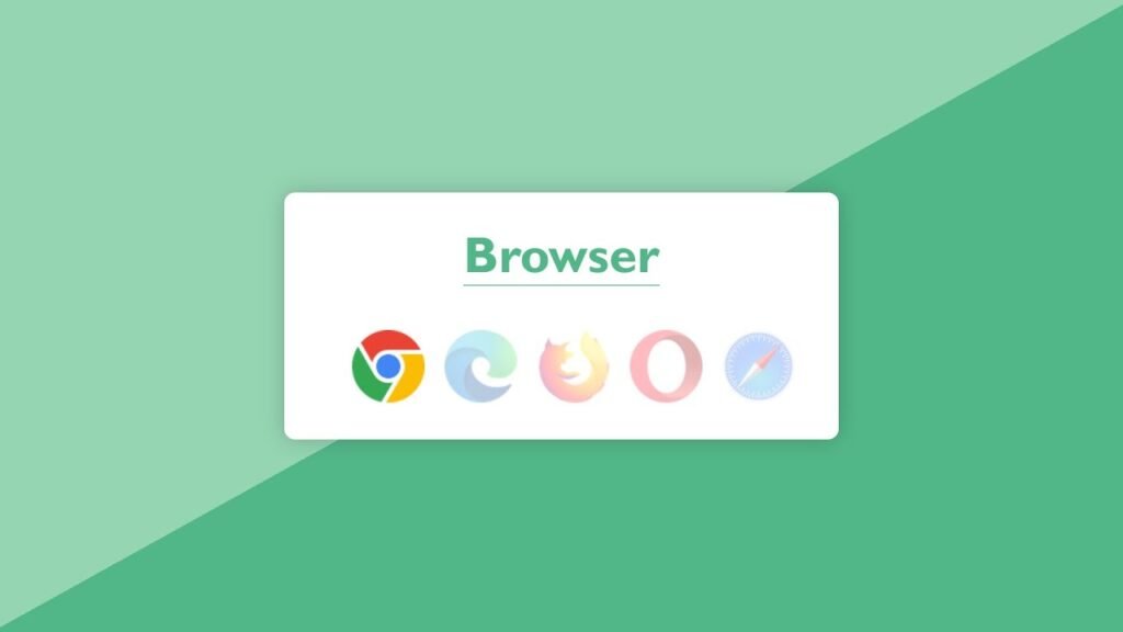
<h2>Browser</h2>
A heading indicating that the section is related to browsers.
<div class="icons">
A nested div with the class icons, used to group all browser icons together.
Inside this div, five browser icon images are listed:
<img class="chrome" src="chrome.png">
<img class="edge" src="edge.png">
<img class="firefox" src="firefox.png">
<img class="opera" src="opera.png">
<img class="safari" src="safari.png">
Each img tag:
- Has a
classmatching the browser name (e.g.,.chrome,.firefox). - Uses
srcto point to the respective image file (e.g.,chrome.png).
These image elements will be visually styled and manipulated later with CSS and JavaScript (e.g., to highlight the detected browser).
CSS
Now that we’ve set up the HTML layout to showcase browser icons, it’s time to bring the interface to life with CSS. This stylesheet adds a modern, responsive, and visually appealing design to our browser detection tool.
Let’s break down the stylesheet step by step to understand how each section contributes to the overall look and feel.
Global Styles
* {
  margin: 0;
  padding: 0;
  box-sizing: border-box;
  font-family: 'Gill Sans', 'Gill Sans MT', Calibri, 'Trebuchet MS', sans-serif;
}
Universal selector *: Resets default margin and padding for all elements.
box-sizing: border-box: Ensures that padding and borders are included in the element’s total width/height—makes layout more predictable.
Font family: Sets a clean, modern sans-serif font for all text on the page.
Body Styling
body {
  height: 100vh;
  width: 100%;
  display: flex;
  align-items: center;
  justify-content: center;
  background: linear-gradient(151deg, #95d5b2 50%, #52b788 50%);
}
height: 100vh and width: 100%: The body takes up the full height and width of the browser viewport.
Flexbox: Centers the content both vertically and horizontally using display: flex, align-items: center, and justify-content: center.
Gradient background: Adds a diagonal two-tone green background using a linear-gradient.
.browsers Container
.browsers {
  padding: 30px 40px;
  display: flex;
  justify-content: center;
  align-items: center;
  flex-wrap: wrap;
  flex-direction: column;
  border-radius: 10px;
  background: #fff;
  box-shadow: 0 0 20px 0 rgba(0, 0, 0, 0.2);
}Padding: Creates inner spacing around content.
Flexbox Layout: Arranges content in a vertical column (flex-direction: column) and allows it to wrap if needed.
Rounded corners and shadow: Enhances UI with a soft white card design using border-radius and box-shadow.
.browsers h2 Heading
.browsers h2 {
  margin-bottom: 40px;
  color: #52b788;
  font-size: 46px;
  border-bottom: 2px solid #95d5b2;
}
Bottom margin: Adds space below the heading.
Text styling: Large green font matches the theme.
Underline: A subtle border-bottom provides visual separation.
.icons Wrapper
.browsers .icons {
  margin-left: 15px;
}- Adds spacing to slightly shift the icon row for visual balance.
Browser Icons Styling
.icons img {
  opacity: 0.3;
  margin: 0 7px;
  transition: opacity 0.4s ease;
}Opacity: Initially dims all icons (will be overridden by JavaScript for the detected browser).
Spacing: Adds horizontal margins between icons.
Smooth transitions: Makes any change in opacity feel fluid and user-friendly.
.icons img:last-child {
  margin-right: 0px;
}- Removes extra space to the right of the last icon for perfect alignment.
Final Result
With this CSS:
- You get a centered card layout with browser icons.
- Icons are dimmed by default but styled to look elegant and modern.
- Responsiveness and user experience are considered, thanks to flexbox and smooth transitions.
JavaScript
Once the HTML layout and CSS styling are in place, the final step is to add logic to automatically detect the user’s browser and visually highlight it among the icons. That’s exactly what this JavaScript snippet does.
Let’s break it down line by line.
let userAgent = navigator.userAgent;
let browser;
if (userAgent.match(/edg/i)) {
  browser = "edge";
} else if (userAgent.match(/chrome|chromium|crios/i)) {
  browser = "chrome";
} else if (userAgent.match(/firefox|fxios/i)) {
  browser = "firefox";
} else if (userAgent.match(/safari/i)) {
  browser = "safari";
} else if (userAgent.match(/opr\//i)) {
  browser = "opera";
} else {
  alert("Other browser");
}
const icon = document.querySelector(`.icons .${browser}`);
if (icon) {
  icon.style.opacity = "1";
}
Get the Browser’s User Agent
let userAgent = navigator.userAgent;
- This retrieves the user agent string — a piece of data the browser sends to websites, which typically includes the browser name, version, OS, etc.
Determine Which Browser It Is
let browser;
- A variable to store the detected browser name.
Then a series of if...else checks run:
if (userAgent.match(/edg/i)) {
  browser = "edge";
}- Checks if the user agent contains
"edg"(used by Microsoft Edge).
else if (userAgent.match(/chrome|chromium|crios/i)) {
  browser = "chrome";
}- Matches Chrome or Chromium-based browsers (including Chrome on iOS which uses
"crios").
else if (userAgent.match(/firefox|fxios/i)) {
  browser = "firefox";
}- Detects Firefox, including the iOS version.
else if (userAgent.match(/safari/i)) {
  browser = "safari";
}- Matches Safari—but note this will also match Chrome unless checked after the Chrome condition (which you handled correctly).
else if (userAgent.match(/opr\//i)) {
  browser = "opera";
}- Detects Opera, which identifies itself using
"OPR/"in the user agent string.
else {
  alert("Other browser");
}- If none of the conditions match, a message is shown saying it’s an “Other browser.”
Highlight the Detected Icon
const icon = document.querySelector(`.icons .${browser}`);
if (icon) {
  icon.style.opacity = "1";
}- Selects the browser icon that matches the detected browser class name.
- Changes its opacity to
1(which overrides the default0.3set in CSS), visually highlighting the icon.
Conclusion
In this tutorial, we built a simple yet effective Browser Detection Web App using HTML, CSS, and JavaScript. Here’s what we achieved:
- HTML provided a clean structure to display major browser icons.
- CSS styled the layout with a modern, centered card design and smooth transitions to enhance user experience.
- JavaScript dynamically detected the user’s browser using the
navigator.userAgentand visually highlighted the correct browser icon by adjusting its opacity.
This kind of project is great for beginners to understand how front-end technologies work together and how user agent strings can be leveraged to personalize content.
You can further enhance this by adding animations, tooltips, or even using this logic in analytics or browser-specific UI tweaks in larger projects. It’s a simple foundation, but the possibilities are endless!