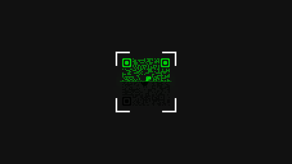
In this blog, we will be creating a QR Code Scanner Animation using HTML and CSS. This animation simulates a real QR code scanner and can be used in various web projects, such as e-commerce websites, mobile apps, and more.
To begin, we set up the basic HTML structure and added a div container that will hold the animation. Inside the container, we added a div with a class of “border” that will act as the border of the QR code scanner. Inside the border div, we added another div with a class of “qrcode” that will hold the animation.
Next, we used CSS to style the container, border, and qrcode divs. We added a background image to the border div, which serves as the border of the QR code scanner. Then, we added a background image to the qrcode div, which serves as the QR code that will be scanned.
To create the animation, we used the ::before and ::after pseudo-elements and added a background image to them. We then used keyframe animations to create the scanning effect. The ::before element simulates the scanning line, while the ::after element simulates the scanning light.
Finally, we added a few CSS filters to enhance the animation and give it a more realistic look.
Overall, this QR Code Scanner Animation is a simple yet effective way to add an interactive touch to your web projects. With a little bit of creativity and customization, you can use this animation in various ways and make it fit your specific project needs. You can download the source code files for this QR Code Scanner Animation by clicking on the given download button. It’s free, and a zip file will be downloaded that contains the project folder with source code files.
Video Tutorial of QR Code Scanning Animation
To see a live demonstration of the QR Code Scanning Animation, Click Here. For a complete video guide on how the generator works, check out the accompanying YouTube video.
QR Code Scanning Animation
HTML:
Create a new file with the name “index.html” and add the provide code to it. Ensure the file has a “.html” extension.
<!DOCTYPE html>
<html lang="en">

<head>
    <meta charset="UTF-8">
    <meta http-equiv="X-UA-Compatible" content="IE=edge">
    <meta name="viewport" content="width=device-width, initial-scale=1.0">
    <title>QR Code Scanner Animation</title>
    <link rel="stylesheet" href="./style.css">
</head>

<body>
    <div class="conatiner">
        <div class="border">
            <div class="qrcode"></div>
        </div>
    </div>
</body>

</html>
The body of this HTML code contains a single container element with a class of “conatiner”. Inside this container, there is a nested element with a class of “border”, and within that, there is another nested element with a class of “qrcode”. These elements are use to create the structure for an animation that simulates a QR code scanner.
The container element is use to set the overall dimensions and position of the animation on the page. The border element is use to create a visual border around the animation, and the qrcode element is use to hold the animation itself.
The animation is create using CSS, specifically using the ::before and ::after pseudo-elements to add two separate images to the qrcode element. The ::before element adds the first QR code image, while the ::after element adds a second QR code image and a line animation that moves across the image.
The animation is achiev through the use of CSS keyframe animations, specifically the “animImg” and “animLine” animations. These animations control the movement of the QR code images and the line animation, giving the illusion of a scanner moving over the QR code. The keyframe animations are use to repeat indefinitely, creating a seamless loop.
Overall, this code creates a visually engaging animation that simulates a QR code scanner using HTML, CSS, and CSS animation. The animation is fully customizable, and the elements can be style and repositioned to fit any design.
CSS:
Create a new CSS file name “style.css” and copy the provide code into it. Ensure that the file has a “.css” extension.
*{
    margin: 0;
    padding: 0;
    box-sizing: border-box;
}
body{
    display: flex;
    justify-content: center;
    align-items: center;
    min-height: 100vh;
    background: #111;
}
.conatiner{
    position: relative;
    width: 400px;
    height: 400px;
}
.conatiner .border{
    position: relative;
    width: 100%;
    height: 100%;
    background: url(./border.png);
    object-fit: cover;
    background-position: center;
    background-size: cover;
    display: flex;
    justify-content: center;
    align-items: center;
}
.conatiner .border .qrcode{
    position: relative;
    width: 380px;
    height: 380px;
    background: url(./qrcode1.png);
    object-fit: cover;
    background-position: center;
    background-size: cover;
}
.conatiner .border .qrcode::before{
    content: '';
    position: absolute;
    top: 0;
    left: 0;
    width: 100%;
    height: 100%;
    background: url(./qrcode2.png);
    background-size: 380px;
    overflow: hidden;
    animation: animImg 4s linear infinite;
}
@keyframes animImg{
    0%,
    100%{
        height: 18px;
    }
    50%{
        height: calc(100% - 18px);
    }
}
.conatiner .border .qrcode::after{
    content: '';
    position: absolute;
    inset: 18px;
    width: calc(100% - 40px);
    height: 2px;
    background: #00d00a;
    filter: drop-shadow(0 0 30px #00d00a) drop-shadow(0 0 60px #00d00a) drop-shadow(0 0 100px #00d00a);
    animation: animLine 4s linear infinite;
}
@keyframes animLine{
    0%,
    100%{
        top: 18px;
    }
    50%{
        top: calc(100% - 18px);
    }
}
This CSS code styles a container element with a border and QR code inside. The container is center on the page with a background color of #111. The border element has a background image and the QR code element also has a background image both set to cover and center.
The QR code element has a pseudo-element ::before, which is use to create an animation of the QR code switching between two different images. The animation is use to run for 4 seconds, looping infinitely with a linear timing function. The QR code element also has a pseudo-element ::after, which is use to create an animation of a line scanning across the QR code. The animation is use to run for 4 seconds, looping infinitely with a linear timing function. The line also has a drop-shadow effect applied to it.
Summary:
This code creates an animation of a QR code scanner using HTML and CSS. It uses a container div with a border div inside, which holds the QR code div. The QR code div uses a before and after pseudo-element to create the scanning line animation, which loops infinitely. The border and QR code background images are import using CSS “background” property and the animation is create with CSS keyframes. Overall, this creates a visually pleasing animation of a QR code scanner that can be use in various contexts like QR code reader apps or online checkout.