Hello Reader!, This code is a simple HTML file with a linked CSS stylesheet. The HTML file contains a single div with the class “container” which contains another div with the class “shadow”.
The CSS stylesheet sets the background color of the body to a dark gray, and positions the “container” div at the center of the screen with fixed positioning and a 100x100px size. The “shadow” div is also positioned at the center of the “container” div using absolute positioning, and given a 0x0px size with a 10px border and 50% border radius.
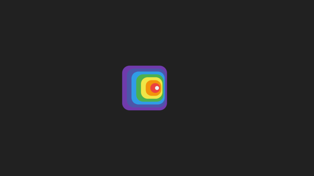
The “shadow” div also has a number of box-shadow properties set, with each shadow offset by a different amount and given a different color. These shadows create the appearance of a circular gradient. The div also has an animation applied to it, named “anim”, which alternates between the initial box-shadow settings and a reversed version of them. This animation is set to run for 5 seconds, with an ease-in-out timing function, and will repeat indefinitely.
This code creates an animation of a circular gradient that alternates colors continuously. It uses CSS animation to change the colors of the shadows and border colors with the animation property. The animation effect makes the gradient smooth and visually appealing.
Video Tutorial of Box Shadow Animation
To see a live demonstration of the Box Shadow Animation, Click Here. For a complete video guide on how the generator works, check out the accompanying YouTube video.
You might like this:
Box Shadow Animation
HTML:
Create a new file with the name “index.html” and add the provide code to it. Ensure the file has a “.html” extension.
<!DOCTYPE html>
<html lang="en">

<head>
    <meta charset="UTF-8">
    <meta http-equiv="X-UA-Compatible" content="IE=edge">
    <meta name="viewport" content="width=device-width, initial-scale=1.0">
    <title>Box Shadow Animation</title>
    <link rel="stylesheet" href="style.css">
</head>

<body>
    <div class="container">
        <div class="shadow"></div>
    </div>
</body>

</html>
The body of this code is where the main content of the webpage is placed. In this particular example, there is a single element within the body, a div with a class of “container”. This container div holds another div with a class of “shadow”.
The “shadow” div is where the majority of the styling and animation takes place. This div has a series of box-shadow properties applied to it, creating the appearance of a layered, multi-colored ring around the div. Additionally, the “shadow” div has an animation applied to it, causing the box-shadows and border color to change over time.
The “container” div serves to center the “shadow” div on the page, by setting its position to fixed and using various properties such as width, height, and margins to ensure it stays in the center of the page.
Overall, the body of this code sets up the structure and visual elements of the webpage, with the “shadow” div serving as the main focal point of the animation.
CSS:
Create a new CSS file name “style.css” and copy the provide code into it. Ensure that the file has a “.css” extension.
body {
    background: #212121;
}

.container {
    position: fixed;
    width: 100px;
    height: 100px;
    top: 0;
    left: 0;
    right: 0;
    bottom: 0;
    margin: auto;
}

.shadow {
    position: absolute;
    top: 0;
    left: 0;
    right: 0;
    bottom: 0;
    width: 0;
    height: 0;
    margin: auto;
    border: 10px solid;
    box-shadow: 10px 0 1px 14.3px #673ab4,
        20px 0 1px 28.6px #3f51b5,
        30px 0 1px 42.9px #2196f3,
        40px 0 1px 57.2px #4caf50,
        50px 0 1px 71.5px #ffeb3b,
        60px 0 1px 85.8px #ff9800,
        70px 0 1px 100px #f44336;
    border-radius: 50%;
    animation: anim 5s ease-in-out infinite;
}

@keyframes anim {

    0%,
    100% {
        border-color: #212121;
        box-shadow: 10px 0 1px 14.3px #673ab4,
            20px 0 1px 28.6px #3f51b5,
            30px 0 1px 42.9px #2196f3,
            40px 0 1px 57.2px #4caf50,
            50px 0 1px 71.5px #ffeb3b,
            60px 0 1px 85.8px #ff9800,
            70px 0 1px 100px #f44336;
        ;
    }

    50% {
        border-color: #fff;
        box-shadow: -10px 0 1px 14.3px #f44336,
            -20px 0 1px 28.6px #ff9800,
            -30px 0 1px 42.9px #ffeb3b,
            -40px 0 1px 57.2px #4caf50,
            -50px 0 1px 71.5px #2196f3,
            -60px 0 1px 85.8px #3f51b5,
            -70px 0 1px 100px #673ab4;
        ;
    }
}
This code creates a spinning, color-changing circle with a shadow effect. The background of the page is set to a dark gray color (#212121).
The container class has a fixed position and is set to take up the full screen. The shadow class is also set to take up the full screen and has a width and height of 0, creating a circle shape. The border and box-shadow properties create the shadow effect, with different colors and opacities at different distances from the center of the circle. The border-radius property rounds the edges of the circle.
The animation property makes the circle spin and change colors, using the keyframes set in the anim class. At 0% and 100%, the border color is use to the background color and the box-shadow colors match the initial colors. At 50%, the border color changes to white and the box-shadow colors change to the opposite colors. The animation has a duration of 5 seconds, an ease-in-out timing function, and repeats infinitely.
Summary:
This code is a webpage that displays a box shadow animation. The webpage has a black background and a container that is fixed and center on the screen. Within the container, there is a “shadow” div that has an animation applied to it. The animation changes the border color and the box shadow of the div between black and white, and also changes the direction of the shadows. The animation is use to repeat infinitely and has a duration of 5 seconds. The CSS code also includes specific values for the box shadow, such as the offset and blur radius, as well as a border radius of 50% to create a circular shape.