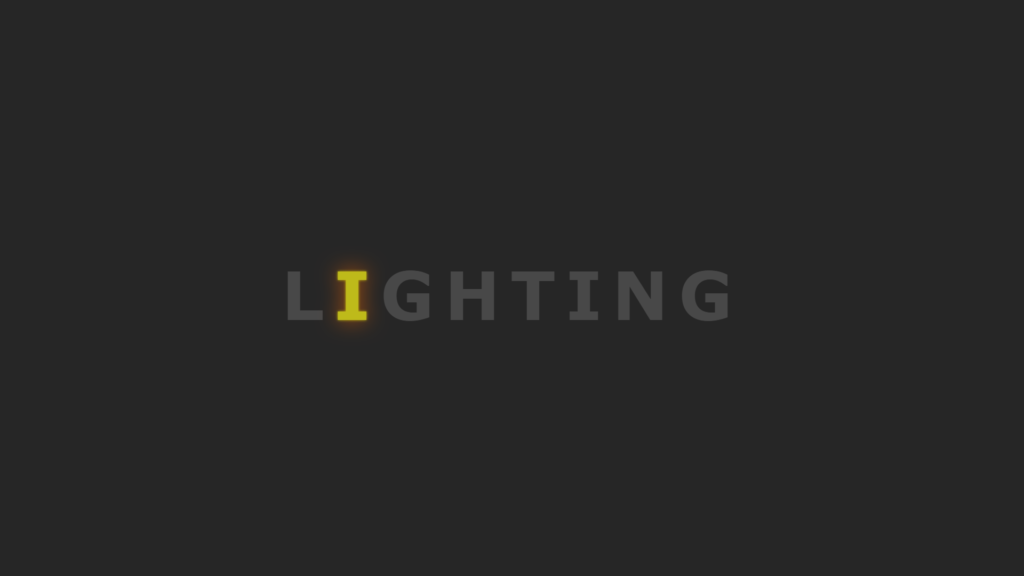
Hello Readers!, This code creates a lighting text effect using HTML, CSS and a bit of animation. The HTML sets up the basic structure of the page, including a link to a stylesheet (style.css) and a title for the page. The body of the HTML creates an unordered list with the letters “L”, “I”, “G”, “H”, “T”, “I”, “N”, “G” each as a separate list item.
The CSS styles the page and the text to create the lighting effect. The body is given a background color of #262626 and the text is set to be centered on the page with a font of Verdana. The unordered list is set to be a flex container, and each list item is given a specific animation delay to create the lighting effect.
The animation in this code uses the @keyframes rule and the animation property to change the color and text-shadow of the text over time, creating a lighting effect. The animation lasts 1.4 seconds and repeats indefinitely.
Overall, this code creates a visually striking and dynamic lighting text effect on a web page.
Video Tutorial of Lighting text effect
To see a live demonstration of the Lighting text effect, Click Here. For a complete video guide on how the generator works, check out the accompanying YouTube video.
You might like this:
Lighting text effect
HTML Part:
Create a new file with the name “index.html” and add the provide code to it. Ensure the file has a “.html” extension.
<!DOCTYPE html>
<html lang="en">

<head>
    <meta charset="UTF-8">
    <meta http-equiv="X-UA-Compatible" content="IE=edge">
    <meta name="viewport" content="width=device-width, initial-scale=1.0">
    <link rel="stylesheet" href="style.css">
    <title>Lighting Text Effect</title>
</head>

<body>
    <ul>
        <li>L</li>
        <li>I</li>
        <li>G</li>
        <li>H</li>
        <li>T</li>
        <li>I</li>
        <li>N</li>
        <li>G</li>
    </ul>
</body>

</html>
The body of this code is the section between the <body> tags. It contains an unordered list (ul) that has 8 list items (li), each displaying a letter of the word “LIGHTING”. This code is likely used to create a lighting text effect, as suggested by the title of the document. The CSS file “style.css” is linked to in the head section, and it is likely used to style the text and create the lighting effect. The meta tags in the head section provide information about the document, such as the character encoding and viewport size. The title tag sets the title of the document, which is displayed in the browser tab.
CSS Part:
Create a new CSS file name “style.css” and copy the provide code into it. Ensure that the file has a “.css” extension.
body {
    display: flex;
    justify-content: center;
    align-items: center;
    min-height: 100vh;
    font-family: Verdana, Geneva, Tahoma, sans-serif;
    background: #262626;
    overflow: hidden;
}

ul {
    margin: 0;
    padding: 0;
    display: flex;
}

ul li {
    list-style: none;
    color: #484848;
    font-size: 100px;
    letter-spacing: 15px;
    font-weight: 700;
    animation: lighting 1.4s linear infinite;
}

@keyframes lighting {
    0% {
        color: #484848;
        text-shadow: none;
    }

    90% {
        color: #484848;
        text-shadow: none;
    }

    100% {
        color: #fff900;
        text-shadow: 0 0 7px #fff900, 0 0 50px #ff6c00;
    }
}

ul li:nth-child(1) {
    animation-delay: 0;
}

ul li:nth-child(2) {
    animation-delay: 0.1s;
}

ul li:nth-child(3) {
    animation-delay: 0.2s;
}

ul li:nth-child(4) {
    animation-delay: 0.3s;
}

ul li:nth-child(5) {
    animation-delay: 0.4s;
}

ul li:nth-child(6) {
    animation-delay: 0.5s;
}

ul li:nth-child(7) {
    animation-delay: 0.6s;
}

ul li:nth-child(8) {
    animation-delay: 0.7s;
}
The main css properties in this code are the “animation” and “animation-delay” properties. The animation property is applie to the “ul li” elements and controls the animation of the text effect. The animation is use to “lighting” which is define in the keyframes, and it has a duration of 1.4 seconds with a linear timing function and is use to repeat indefinitely (infinite).
This creates the illusion of the text lighting up. The animation-delay property is applie to each “ul li:nth-child” element, which controls the delay before the animation starts for each individual letter. This creates a staggered animation effect, making the letters appear to light up one at a time. The combination of animation and animation-delay properties creates the overall lighting text effect.
The background color is use to “#262626” and font-family is useto Verdana, Geneva, Tahoma, sans-serif. The display properties are also set to “flex” and “display: flex” for body and ul respectively, which centers the text and aligns it in the middle of the screen.
The overflow is use to hidden, it will hide any content that is too large to fit within an element’s box.
Summary:
The above code is a combination of HTML and CSS that creates a lighting text effect on a webpage. It uses an unordered list of letters “L”, “I”, “G”, “H”, “T”, “I”, “N”, “G” in the HTML and applies styles and animation using CSS. The animation changes the color and text-shadow of the text to create the lighting effect, which is centere on the page with a dark background. The animation lasts 1.4 seconds and repeats indefinitely. It creates a visually striking and dynamic effect on the webpage.