Hello Reader!, This code creates a simple image zoom effect using HTML, CSS and JavaScript. When an image is hover over, it will scale up by 20% and rotate 9 degrees to create a dynamic and eye-catching effect.
The HTML code creates a simple structure with a single “img” element inside a “div” element. The “img” element is use to display the image and the “div” element is use to apply styling to the image.
The CSS sets the default style of the page. The body is center vertically and horizontally with “display: flex”, “justify-content: center”, and “align-items: center”. The minimum height of the body is 100% of the viewport with “min-height: 100vh”. The background color is “#4b4b4b” and overflow is hidden.
The “div” element has its width and height set to “800px” and “500px”, respectively, with a border of 5px solid white. The “overflow” property is use to “hidden”, which will hide any overflow outside of the defined bounds.
The “img” element is use to take up 100% of its parent’s width and height. The “transition” property is use to “transform 1s”, which means that any changes to the “transform” property will take 1 second to complete.
Finally, the “img:hover” selector is use to apply styling to the “img” element when it is hover over. The “transform” property is use to “scale(1.2) rotate(9deg)”, which means that when the image is hover over, it will scale up by 20% and rotate 9 degrees.
With this code, you can create a simple image zoom effect that is sure to catch the eye and add some dynamic movement to your website.
Video Tutorial of Image Zoom Effect
To see a live demonstration of the Image Zoom Effect, Click Here. For a complete video guide on how the generator works, check out the accompanying YouTube video.
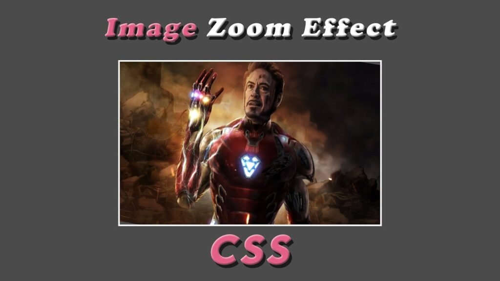
Image Zoom Effect
HTML:
Create a new file with the name “index.html” and add the provided code to it. Ensure the file has a “.html” extension.
<!DOCTYPE html>
<html lang="en">

<head>
    <meta charset="UTF-8">
    <meta http-equiv="X-UA-Compatible" content="IE=edge">
    <meta name="viewport" content="width=device-width, initial-scale=1.0">
    <link rel="stylesheet" href="style.css">
    <title>Image Zoom Effect</title>
</head>

<body>
    <div>
        <img src="img.jpg">
    </div>
</body>

</html>
This code is an HTML document with a title “Image Zoom Effect”. The document has a head section with meta information about the character set, compatibility, and viewport, as well as a link to the stylesheet file “style.css”. The body contains a single div container with an image source “img.jpg”.
CSS:
Create a new CSS file name “style.css” and copy the provide code into it. Ensure that the file has a “.css” extension.
body{
    display: flex;
    justify-content: center;
    align-items: center;
    min-height: 100vh;
    background: #4b4b4b;
    overflow: hidden;
}
div{
    width: 800px;
    height: 500px;
    border: 5px solid #fff;
    overflow: hidden;
}
img{
    width: 100%;
    height: 100%;
    transition: transform 1s;
}
img:hover{
    transform: scale(1.2) rotate(9deg);
}
This code is a CSS style sheet that styles the HTML document. The body is use to display as a flex container, with its contents centered both vertically and horizontally. The background color is use to a dark gray and the minimum height of the page is use to 100% of the view height. The overflow is use to hidden. The div container has a width and height of 800px and 500px respectively, and a white border with a width of 5px. The overflow of the div container is also use to hidden. The image within the div container is use to have a width and height of 100%, and a transition effect of transforming the image over 1 second. When the image is hover over, it will scale up by 20% and rotate 9 degrees.
Summary:
The code is a simple HTML document with a CSS style sheet that creates an image zoom effect. When the image is hover over, it will scale up by 20% and rotate 9 degrees. The body is use to display as a flex container, with its contents centered both vertically and horizontally. the background color to dark gray and the minimum height of the page to 100% of the view height. The image is display in a white-bordered div container with width and height of 100%.