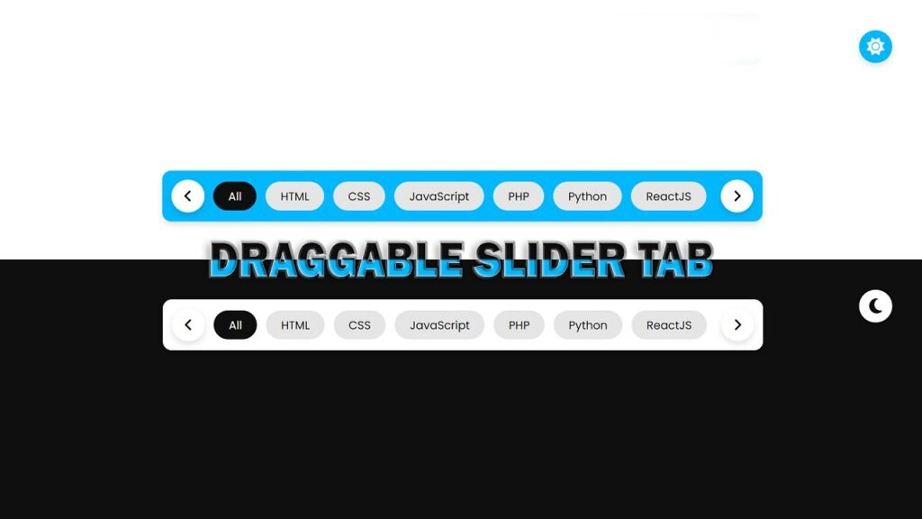
In this article, we will be discussing a code snippet for creating a draggable slider tab in HTML, CSS, and JavaScript. The code features a toggle switch for changing between light and dark mode, an array of tabs that can be scroll through using the arrow icons on either side of the tabs or by using the mouse wheel, and the ability to drag the tabs with the mouse. Additionally, the code uses Font Awesome icons for the sun, moon, and arrow icons.
The HTML structure of the code is straightforward, with a head section that includes the title of the page and links to the CSS and Font Awesome stylesheet. In the body section, we have the dark mode toggle, the wrapper class, and the slider tab. The slider tab consists of two arrow icons on either side of the tabs, and a list of tabs.
In the CSS section, we have used styles to create a visually appealing slider tab. The styles include styling for the dark mode toggle, the wrapper class, the arrow icons, and the tabs. The CSS styles are use to position the tabs and the arrow icons, and to give them a clean, modern look.
The JavaScript code in this code snippet provides the functionality for the draggable slider tab. The code uses event listeners to respond to user interactions, such as clicking the arrow icons, clicking the tabs, dragging the tabs, and scrolling the mouse wheel. The JavaScript code also includes the logic for the dark mode toggle, which switches between light and dark themes based on user interactions.
Video Tutorial of Draggable Slider Tab
To see a live demonstration of the Draggable Slider Tab, Click Here. For a complete video guide on how the generator works, check out the accompanying YouTube video.
You may like this:
- Colorful Rain Animation Effects
- Random Color Palette Generator
- Word Counter
- Working Google Search Engine
Draggable Slider Tab
HTML:
Create a new file with the name “index.html” and add the provided code to it. Ensure the file has a “.html” extension.
<!DOCTYPE html>
<html lang="en">
<head>
    <meta charset="UTF-8">
    <meta http-equiv="X-UA-Compatible" content="IE=edge">
    <meta name="viewport" content="width=device-width, initial-scale=1.0">
    <title>Draggable Slider Tab</title>
    <link rel="stylesheet" href="./style.css">
    <link rel="stylesheet" href="https://cdnjs.cloudflare.com/ajax/libs/font-awesome/6.3.0/css/all.min.css" integrity="sha512-SzlrxWUlpfuzQ+pcUCosxcglQRNAq/DZjVsC0lE40xsADsfeQoEypE+enwcOiGjk/bSuGGKHEyjSoQ1zVisanQ==" crossorigin="anonymous" referrerpolicy="no-referrer" />
</head>
<body>
    <div class="toggle">
        <i class="fa-solid fa-sun"></i>
        <i class="fa-solid fa-moon"></i>
    </div>
    <div class="dark"></div>
    <div class="wrapper">
        <div class="icon">
            <i id="left" class="fa-solid fa-angle-left"></i>
        </div>
        <ul class="tabsBox">
            <li class="tab active">All</li>
            <li class="tab">HTML</li>
            <li class="tab">CSS</li>
            <li class="tab">JavaScript</li>
            <li class="tab">PHP</li>
            <li class="tab">Python</li>
            <li class="tab">ReactJS</li>
            <li class="tab">NodeJS</li>
            <li class="tab">AngularJS</li>
            <li class="tab">VueJS</li>
            <li class="tab">Subscribe</li>
            <li class="tab">Like</li>
            <li class="tab">Share</li>
            <li class="tab">Comment</li>
        </ul>
        <div class="icon">
            <i id="right" class="fa-solid fa-angle-right"></i>
        </div>
    </div>
</body>
</html>
This HTML code contains the structure for a Draggable Slider Tab. The code includes a few key elements:
<head>: The head of the HTML document, which includes meta information and links to stylesheets.<body>: The body of the HTML document, which contains the main content of the page.<div class="toggle">: This is a toggle button to switch between a light and dark theme. It contains two Font Awesome icons for the sun and moon.<div class="dark"></div>: This div is use to darken the background when the dark theme is select.<div class="wrapper">: This div is the main container for the slider tab.<div class="icon">: This div contains two Font Awesome icons, one for the left and one for the right, to allow the user to navigate through the slider tab.<ul class="tabsBox">: This unordered list contains all of the tabs in the slider tab. Each tab is represent by a list item with the class “tab”. The first tab has the class “active”, which is use to style the active tab.
The CSS stylesheet linked in the head of the HTML document is responsible for styling the slider tab and toggling the dark theme. The Font Awesome icons are use to provide visual cues for navigation and for the toggle button.
Overall, this code provides the structure for a simple and functional slider tab that can be use to navigate between different content categories.
CSS:
Create a new CSS file name “style.css” and copy the provide code into it. Ensure that the file has a “.css” extension.
*{
    margin: 0;
    padding: 0;
    box-sizing: border-box;
    font-family: Poppins;
}
body{
    display: flex;
    justify-content: center;
    align-items: center;
    min-height: 100vh;
    background: #fff;
    padding: 0 10px;
}
.wrapper{
    position: relative;
    max-width: 1000px;
    padding: 15px;
    background: #00b8ff;
    border-radius: 15px;
    overflow-x: hidden;
    transition: .3s ease;
    display: flex;
    align-items: center;
    gap: 15px;
    box-shadow: 0 5px 10px rgba(0, 0, 0, .12);
}
.wrapper .icon{
    position: relative;
    width: 55px;
    height: 55px;
    display: flex;
    align-items: center;
    border-radius: 100%;
    background: #fff;
    box-shadow: 0 5px 10px rgba(0, 0, 0, .12);
    display: flex;
    justify-content: center;
    align-items: center;
}
.icon i{
    position: relative;
    width: 55px;
    height: 55px;
    text-align: center;
    line-height: 55px;
    border-radius: 100%;
    font-size: 1.5em;
    cursor: pointer;
}
.icon i:hover{
    background: #efedfb;
}
.wrapper .tabsBox{
    display: flex;
    gap: 15px;
    scroll-behavior: smooth;
    overflow-x: hidden;
    list-style: none;
}
.tabsBox.dragging{
    cursor: grab;
    scroll-behavior: auto;
}
.tabsBox .tab{
    background: #e5e5e5;
    font-size: 1.18rem;
    padding: 10px 25px;
    border-radius: 30px;
    cursor: pointer;
    white-space: nowrap;
    transition: .3s ease;
}
.tabsBox .tab:hover{
    background: #efedfb;
}
.tabsBox.dragging .tab{
    user-select: none;
    pointer-events: none;
    transition: .3s ease;
}
.tabsBox .tab.active{
    color: #fff;
    background: #0f0f0f;
    transition: .3s ease;
}
.toggle{
    position: fixed;
    top: 50px;
    right: 50px;
    width: 55px;
    height: 55px;
    background: #00b8ff;
    border-radius: 50%;
    display: flex;
    justify-content: center;
    align-items: center;
    box-shadow: 0 5px 10px rgba(0, 0, 0, .12);
    transition: .3s ease;
    cursor: pointer;
}
.toggle i{
    font-size: 1.8em;
    color: #fff;
}
.toggle.active{
    background: #fff;
}
.toggle i:last-child{
    position: absolute;
    visibility: hidden;
}
.toggle.active i:last-child{
    visibility: visible;
    color: #0f0f0f;
}
.toggle.active i:first-child{
    visibility: hidden;
}
.dark{
    position: absolute;
    top: 52.5px;
    right: 52.5px;
    width: 50px;
    height: 50px;
    background: #0f0f0f;
    border-radius: 50%;
    transition: .5s ease;
    z-index: -5;
}
.dark.active{
    top: 0;
    right: 0;
    width: 100%;
    height: 100vh;
    border-radius: 0;
    transition: .5s ease;
}
.dark.active ~ .wrapper{
    background: #fff;
    transition: .3s ease;
}
This is a CSS code for styling a UI element. The code styles a “tabs” interface that allows a user to toggle between different tabs. The UI has the following features:
Body Part:
The root element, body, has display: flex and justify-content: center properties, which cause its children to be centered both horizontally and vertically on the page.
Wrapper Part (container):
The .wrapper class defines a container for the tabs interface. It has display: flex property, which causes its children to be displayed horizontally. The container has a maximum width of 1000px, with 15px padding and a blue background color. The border-radius property is use to 15px to give the container rounded corners.
The .icon class defines a small circular element that serves as a button. It has a width and height of 55px and a white background color. It uses a box-shadow property to create a small drop shadow. The icon element is positioned in the center of the .wrapper container.
The .icon i class defines the actual icon within the .icon container. It has a width, height, and font-size of 55px and a font-size of 1.5em. The i element is positioned in the center of the .icon container.
UL Part (Unordered List):
The .tabsBox class defines a container for the tabs. It uses the display: flex property to cause its children to be displayed horizontally. The container has a gap of 15px between each tab. The scroll-behavior property is set to smooth by default, but changes to auto when the tabs are being dragged.
LI Part (List Item):
The .tab class defines the individual tabs. It has a gray background color and white text color. The font-size is use to 1.18rem. The .tab elements are rounded and have a transition of 0.3s when hovered over.
Toggle:
The .toggle class defines a button in the top-right corner of the page that the user can click to toggle the dark mode. The button has a blue background color, with an icon in the center. The button changes color to white when in dark mode and the icon changes from a sun to a moon.
Dark Mode:
The .dark class defines the dark mode overlay that covers the entire screen when the dark mode toggle is activated. It starts off as a small circular element in the top-right corner, but expands to cover the entire screen when the dark mode toggle is active. The background color is use to a dark gray.
The code uses several transition properties to create smooth animations between different states of the UI elements.
This CSS code provides a clean and well-organized way to style a tabs interface. The use of classes and properties such as display, justify-content, align-items, box-shadow, transition, and scroll-behavior makes the code easy to understand and modify if needed.
JavaScript:
In between the <body></body> tags, you can include JavaScript code by enclosing it within <script> tags.
        const dark = document.querySelector('.dark');
        const toggle = document.querySelector('.toggle');
        toggle.onclick = (() =>{
            dark.classList.toggle('active');
            toggle.classList.toggle('active');
        });

        const tabsBox = document.querySelector('.tabsBox');
        const allTabs = document.querySelectorAll('.tab');
        const arrowIcons = document.querySelectorAll('.icon i');

        let isDragging = false;

        const handleIcons = (scrollVal) =>{
            let maxScrollWidth = tabsBox.scrollWidth - tabsBox.clientWidth;
            arrowIcons[0].parentElement.style.display = scrollVal <= 0 ? "none" : "flex";
            arrowIcons[1].parentElement.style.display = maxScrollWidth - scrollVal <= 1 ? "none" : "flex";
        };

        arrowIcons.forEach(icon =>{
            icon.addEventListener('click', () =>{
                let scrollWidth = tabsBox.scrollLeft += icon.id === "left" ? -340 : 340;
                handleIcons(scrollWidth);
            });
        });

        allTabs.forEach(tab =>{
            tab.addEventListener('click', () =>{
                tabsBox.querySelector('.active').classList.remove('active');
                tab.classList.add('active');
            });
        });

        const dragging = (e) =>{
            if(!isDragging) return;
            tabsBox.classList.add('dragging');
            tabsBox.scrollLeft -= e.movementX;
            handleIcons(tabsBox.scrollLeft);
        };

        const dragStop = () =>{
            isDragging = false;
            tabsBox.classList.remove('dragging');
        };

        tabsBox.addEventListener('wheel', (e) =>{
            tabsBox.scrollLeft += e.deltaY * 250;
            tabsBox.scrollLeft += e.deltaX * 250;
            handleIcons(tabsBox.scrollLeft);
        });

        tabsBox.addEventListener('mousedown', () => isDragging = true);
        tabsBox.addEventListener('mousemove', dragging);
        document.addEventListener("mouseup", dragStop);
This code is written in JavaScript and manipulates the DOM elements of a webpage. The code performs several functions:
- Dark mode toggle: The code first selects the DOM elements with class “dark” and “toggle” using the
document.querySelectormethod. Then it adds a click event to the toggle element, which toggles the “active” class on both the dark and toggle elements using the.classList.togglemethod. - Tab functionality: The code then selects the DOM elements with class “tabsBox”, “tab”, and “icon i” using
document.querySelectoranddocument.querySelectorAllmethods. The code sets the active tab on click by removing the “active” class from the previously active tab and adding it to the currently clicked tab. - Scrolling functionality: The code implements scrolling functionality for the tabs by adding a wheel event to the tabsBox element. The scrollLeft property of the tabsBox is update based on the delta value of the wheel event. The handleIcons function is call with the new scrollLeft value to show or hide the arrow icons based on the scroll position.
- Dragging functionality: The code implements dragging functionality for the tabs by adding mousedown, mousemove, and mouseup events to the tabsBox element. The isDragging variable is use to track the drag status and the dragging function updates the scrollLeft property of the tabsBox based on the movementX value. The dragStop function is call on mouseup to stop the dragging.
In summary, the code implements a dark mode toggle, tab functionality, and scrolling and dragging functionality for a set of tabs on a webpage.
Conclusion:
This code is a simple webpage that features a draggable slider tab, which includes a toggle button to switch between a light and dark theme, and a list of tabs that can be scroll through using either the mouse wheel or by clicking on the left and right arrow icons. The tabs themselves are clickable and will highlight the selected tab. The page is style using CSS and the design elements are brought to life through the use of JavaScript events and functions. The styling file linked in the code uses CSS to set default styles for the entire page.