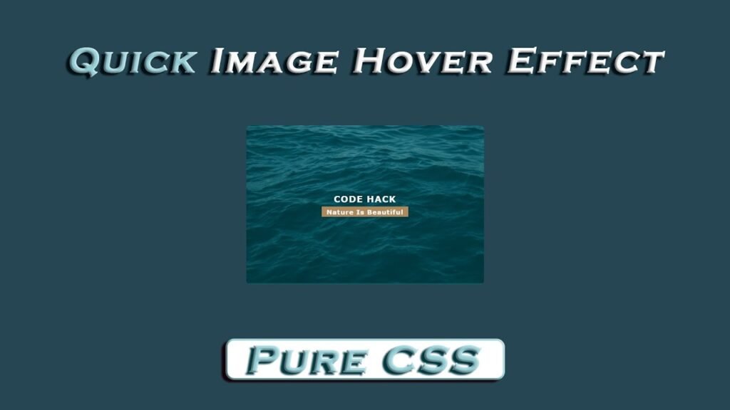
Hello Readers, This HTML and CSS code block implements a quick image hover effect that displays a caption with a title and a subtitle when a user hovers over an image. The code consists of an HTML file and a CSS file.
The HTML file has a div container with a class “fig” that contains an img tag with an image source and an alt attribute. Within the fig container, there is also a div with a class “caption” that holds the title and subtitle.
The CSS file styles the HTML elements. The body is use to have a margin and padding of 0, flex display, and minimum height of 100% of the viewport. The background color is use to #264653, and the font-family is use to Verdana, Geneva, Tahoma, sans-serif.
The fig class is given a width of 500px, a white text color, a border radius of 10px, and relative positioning. The overflow property is use to hidden to hide the caption when it’s not being hover over.
The ::before selector is use to create a translucent overlay with a green color that initially covers the entire image. The overlay is hidden and slides up when the mouse hovers over the image. The .fig:hover::before selector allows for the smooth transition of the overlay.
The .caption class is position absolutely and has a z-index of 1 to ensure it appears above the overlay. The flexbox properties are use to vertically and horizontally center the title and subtitle. When the mouse hovers over the image, the caption slides down, and its opacity changes to 1.
Video Tutorial of Quick Image Hover Effect
To see a live demonstration of The Quick Image Hover Effect Click Here. For a complete video guide on how the generator works, check out the accompanying YouTube video.
Quick Image Hover Effect
HTML:
Create a new file with the name “index.html” and add the provided code to it. Ensure the file has a “.html” extension.
<!DOCTYPE html>
<html lang="en">
<head>
    <meta charset="UTF-8">
    <meta http-equiv="X-UA-Compatible" content="IE=edge">
    <meta name="viewport" content="width=device-width, initial-scale=1.0">
    <link rel="stylesheet" href="style.css">
    <title>Image Hover Effect</title>
</head>
<body>
    <div class="fig">
        <img src="img.png" alt="nature">
        <div class="caption">
            <h3>Code Hack</h3>
            <h5>Nature is beautiful</h5>
        </div>
    </div>
</body>
</html>
The HTML code consists of a div with a class “fig” which contains an image and a caption. The image is represented using an <img> tag with a source (src) of “img.png” and an alt attribute of “nature” for accessibility. The caption is represente using a div with a class “caption” which contains two headings: an h3 with the text “Code Hack” and an h5 with the text “Nature is beautiful”.
CSS:
Create a new CSS file name “style.css” and copy the provide code into it. Ensure that the file has a “.css” extension.
body{
    margin: 0;
    padding: 0;
    display: flex;
    justify-content: center;
    align-items: center;
    min-height: 100vh;
    background: #264653;
    font-family: Verdana, Geneva, Tahoma, sans-serif;
}
.fig{
    width: 500px;
    color: #fff;
    border-radius: 10px;
    position: relative;
    overflow: hidden;
}
.fig img{
    width: 100%;
}
.fig::before{
    content: '';
    position: absolute;
    top: 0;
    left: 0;
    width: 100%;
    height: 100%;
    background: #006266;
    opacity: 0.5;
    transform: translateY(100%);
    transition: all 0.25s;
    transition-delay: 0.25s;
}
.fig:hover::before{
    transform: translateY(0);
    transition-delay: 0s;
}
.fig .caption{
    position: absolute;
    top: 0;
    left: 0;
    width: 100%;
    height: 100%;
    z-index: 1;
    display: flex;
    justify-content: center;
    align-items: center;
    flex-direction: column;
    transform: translateY(-20px);
    opacity: 0;
    transition: all 0.25s ease;
}
.fig h3, .fig h5{
    margin: 0;
    letter-spacing: 1px;
}

.fig h3{
    text-transform: uppercase;
    font-weight: 700;
    margin-bottom: 5px;
}
.fig h5{
    background: #ae895d;
    padding: 3px 10px;
    text-transform: capitalize;
}
.fig:hover .caption{
    transform: translateY(0);
    opacity: 1;
    transition-delay: 0.3s;
}
The body element has several CSS properties, including a flex display, that centers the image horizontally and vertically on the page. The min-height property ensures that the image takes up at least the full height of the viewport. The background color is use to a dark blue (#264653) and the font-family is use to a sans-serif font.
The image is containe within a div element with a class of “fig.” The div has a fixed width of 500 pixels, a white text color, and a border radius of 10 pixels. The div is use to position:relative and has an overflow:hidden property to hide the caption.
The image itself is use to width:100% to ensure that it fills the width of the div container.
The ::before pseudo-element creates an overlay over the image using absolute positioning. It has a background color of #006266 with an opacity of 0.5. The transform property moves the overlay below the image using translateY(100%). A transition property is use to animate the overlay sliding up when the user hovers over the image.
The caption, position absolutely with a z-index of 1, is containe in a div element with a class of “caption.” It’s center both horizontally and vertically using display:flex and justify-content/align-items properties. Initially hidden with transform:translateY(-20px) and opacity:0, the caption becomes visible on hover with a transition-delay property of 0.3 seconds.
The caption has two headings: h3 and h5. h3 displays “Code Hack” in uppercase, has a font-weight of 700, and a margin-bottom of 5 pixels. h5 shows “Nature is beautiful,” capitalized, with a brown background (#ae895d) and 3-pixel padding on top and bottom and 10-pixel padding on the left and right.
Summary:
The code is for a simple image hover effect create using HTML and CSS. The HTML markup includes an image and a caption div that displays on hover. The CSS sets the background, font, and layout properties for the body, and defines the styles for the image and caption. The hover effect is create using the ::before pseudo-element to add a semi-transparent overlay over the image, which slides up on hover to reveal the caption. The caption is position absolutely on top of the image and uses flexbox to center and align its contents. The code is responsive and uses a minimum height of 100vh to ensure that the content is always center vertically.