Hello Readers, This code is an HTML and CSS code snippet that creates a navigation bar with hover effects. The HTML markup consists of an unordered list (<ul>) with five list items (<li>) that contain anchor links (<a>) to different sections of the website. The anchor links have empty span tags (<span>) nested within them.
The CSS styling applies to all HTML elements and sets margin, padding, and box-sizing. The body element is use to display flex and centered both horizontally and vertically with a minimum height of 100vh. The font family used is Verdana, Geneva, Tahoma, and sans-serif.
The unordered list is use to display flex, and the list-style-type is remove with no margin or padding. The anchor links are display as block elements with a width of 120px, a height of 40px, and a line-height of 40px. The text is center, capitalize, and the color is use to #262626. The position is use to relative, and a transition of 0.5s is add to animate the hover effect.
When the anchor link is hover over, the color is change to white (#fff). The span tags are use to position absolute, with a width of 100% and a height of 25%. The background color is use to #262626, and the z-index is use to -1 to position them behind the anchor links. The left and top positions are use to 0, and the transform property is use to scaleX(0) to hide the spans.
When the anchor link is hover over, the transform property of the span tags is change to scaleX(1), which makes them visible. The nth-child property is use to target the second, third, and fourth span tags and adjust their top position and delay their transitions.
Video Tutorial of Navigation Bar Hover Effect
To see a live demonstration of The Navigation Bar Hover Effects Click Here. For a complete video guide on how the generator works, check out the accompanying YouTube video.
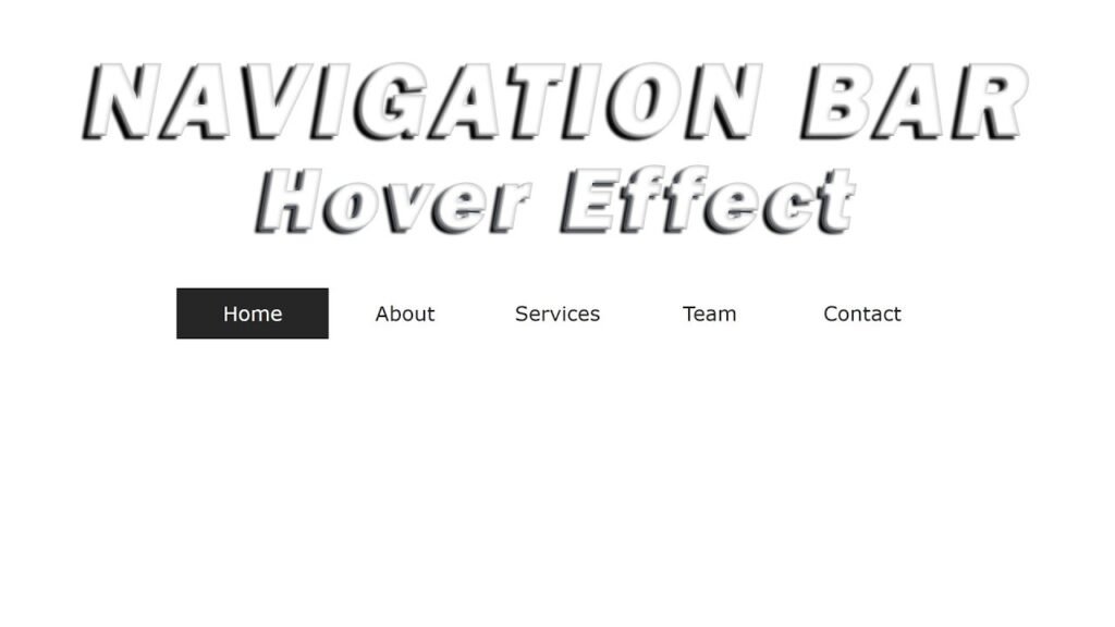
Navigation Bar Hover Effects
HTML:
Create a new file with the name “index.html” and add the provided code to it. Ensure the file has a “.html” extension.
<!DOCTYPE html>
<html lang="en">
<head>
    <meta charset="UTF-8">
    <meta http-equiv="X-UA-Compatible" content="IE=edge">
    <meta name="viewport" content="width=device-width, initial-scale=1.0">
    <link rel="stylesheet" href="style.css">
    <title>Navigation Bar Hover Effects</title>
</head>
<body>
    <ul>
        <li>
            <a href="#">Home
                <span></span>
                <span></span>
                <span></span>
                <span></span>
            </a>
        </li>
        <li>
            <a href="#">About
                <span></span>
                <span></span>
                <span></span>
                <span></span>
            </a>
        </li>
        <li>
            <a href="#">Services
                <span></span>
                <span></span>
                <span></span>
                <span></span>
            </a>
        </li>
        <li>
            <a href="#">team
                <span></span>
                <span></span>
                <span></span>
                <span></span>
            </a>
        </li>
        <li>
            <a href="#">Contact
                <span></span>
                <span></span>
                <span></span>
                <span></span>
            </a>
        </li>
    </ul>
</body>
</html>
This HTML code represents a navigation bar that contains an unordered list (ul) with five list items (li). Each list item has an anchor tag (a) which contains the name of the page that the navigation link leads to.
Each anchor tag contains four span elements that are positioned absolutely within it. These span elements will be used to create the hover effect on the navigation links.
The HTML code also links to an external stylesheet named style.css that contains the styling for the navigation bar.
The use of the meta tags in the head section of the HTML code is to provide information about the character set, viewport, and browser compatibility.
The title tag in the head section specifies the title of the page.
This code is written in HTML5 and has a basic structure that includes a head and body section. The head section contains information about the document such as title, author, and metadata, while the body section contains the visible content that is display in the browser.
CSS:
Create a new CSS file name “style.css” and copy the provide code into it. Ensure that the file has a “.css” extension.
*{
    margin: 0;
    padding: 0;
    box-sizing: border-box;
}
body{
    display: flex;
    justify-content: center;
    align-items: center;
    min-height: 100vh;
    font-family: Verdana, Geneva, Tahoma, sans-serif;
}
ul{
    margin: 0;
    padding: 0;
    display: flex;
    list-style-type: none;
}
ul li a{
    display: block;
    width: 120px;
    height: 40px;
    line-height: 40px;
    text-align: center;
    color: red;
    text-transform: capitalize;
    text-decoration: none;
    position: relative;
    transition: all 0.5s;
    color: #262626;
}
a:hover{
    color: #fff;
}
ul li a span{
    position: absolute;
    width: 100%;
    height: 25%;
    background: #262626;
    z-index: -1;
    left: 0;
    top: 0;
    transform: scaleX(0);
    transition: all 0.5s;
    transform-origin: left;
}
a:hover span{
    transform: scaleX(1);
}
span:nth-child(2){
    top: 25%;
    transition-delay:0.15s;
}
span:nth-child(3){
    top: 50%;
    transition-delay:0.3s;
}
span:nth-child(4){
    top: 75%;
    transition-delay:0.45s;
}
This is a CSS stylesheet for a navigation bar with hover effects. Here is a breakdown of what each section does:
- The first section sets universal styling for all elements on the page, including setting the margin and padding to 0 and using the border-box model for box-sizing.
- The second section sets styling for the body element, including centering its contents and setting a minimum height and font family.
- The third section sets styling for the unordered list, including removing its margin and padding, making it a flex container, and removing the bullet points for list items.
- The fourth section sets styling for the links within the list items, including giving them a fixed width and height, centering their text, and positioning them relative to their containing list item.
- The fifth section sets styling for the hover state of the links, including changing their color to white.
- The sixth section styles the span elements used for the hover effect. The spans are position absolutely with a width of 100% and height of 25% of their containing link. They are initially hidden with scaleX(0) transform and reveal when the link is hover over with a scaleX(1) transform. The transform-origin is use to the left of the span to create a left-to-right growth animation.
- The final section sets the positioning of each span element within the link. Each span is position at a different vertical position (25%, 50%, 75%) and has a different transition-delay to create a staggered animation effect.
Summary:
This code is for creating a navigation bar with hover effects using HTML and CSS. The code sets the default margin, padding, and box-sizing for all elements on the page. It also sets the font family and the minimum height for the body. The navigation bar is create using an unordered list and each item is a link with a block display. The links have a set width, height, and text styling, as well as a relative position and a transition effect. Additionally, each link has four span elements which serve as the background for the hover effect.
The spans are absolutely position and have a width of 100% and a height of 25%. Initially, the spans have a zero width and are hidden. When a link is hover over, the spans transform to full width and reveal the hover effect. The span elements have a delay in their transition timing so that they appear sequentially from top to bottom.