
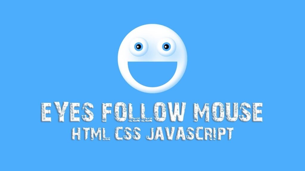
In This Blog, This HTML, CSS, and JavaScript code creates an animated face with two eyes and a mouth that follows the mouse cursor. The face is made using a div element with a class of “face”, and the eyes and mouth are made using div elements with the classes of “eye” and “mouth”, respectively. The CSS code sets the styles for the face, eyes, and mouth, including positioning, size, background color, and border-radius. The face is given a box-shadow effect to create depth.
The JavaScript code listens for the “mousemove” event on the body element and calls the “eyes” function when the mouse is move. The “eyes” function uses the “querySelectorAll” method to select all elements with the class of “eye”, and then loops through each one. It calculates the x and y coordinates of the center of each eye relative to the window using the “getBoundingClientRect” method and some basic math. Then, it calculates the angle of rotation needed to point the eyes towards the mouse cursor using the “atan2” method and more math. Finally, it sets the “transform” property of each eye element to rotate it to the calculated angle.
The CSS code also includes a hover effect for the mouth element, which makes it smaller and changes its position to give the impression of a smiling face.
Overall, this code demonstrates how HTML, CSS, and JavaScript can be used together to create dynamic and interactive web content. It showcases how even simple animations can enhance the user experience and make a website more engaging.
Video Tutorial of Animated Eyes Follow Mouse Cursor
To see a live demonstration of The Animated Eyes Follow Mouse Cursor Click Here. For a complete video guide on how the generator works, check out the accompanying YouTube video.
You may like this:
- Colorful Rain Animation Effects
- Random Color Palette Generator
- Word Counter
- Working Google Search Engine
Animated Eyes Follow Mouse Cursor
HTML:
Create a new file with the name “index.html” and add the provided code to it. Ensure the file has a “.html” extension.
<!DOCTYPE html>
<html lang="en">
<head>
    <meta charset="UTF-8">
    <meta http-equiv="X-UA-Compatible" content="IE=edge">
    <meta name="viewport" content="width=device-width, initial-scale=1.0">
    <title>Animated Eyes Follow Mouse Cursor</title>
    <link rel="stylesheet" href="./style.css">
</head>
<body>
    <div class="face">
        <div class="eye"></div>
        <div class="eye"></div>
        <div class="mouth"></div>
    </div>
</body>
</html>
This is an HTML document that displays a simple face with two animated eyes that follow the mouse cursor. The document includes basic HTML structure with head and body tags, and links to a separate style sheet file. The face is made up of three divs: two eyes and one mouth. The eyes are animated using JavaScript that rotates them based on the position of the mouse cursor.
CSS:
Create a new CSS file name “style.css” and copy the provide code into it. Ensure that the file has a “.css” extension.
*{
    margin: 0;
    padding: 0;
    box-sizing: border-box;
}
body{
    display: flex;
    justify-content: center;
    align-items: center;
    min-height: 100vh;
    background: #4cadfc;
}
.face{
    position: relative;
    width: 350px;
    height: 350px;
    display: flex;
    justify-content: center;
    align-items: center;
    gap: 40px;
    background: #fff;
    border-radius: 50%;
    box-shadow: 35px 35px 68px 0px rgba(76, 173, 252, 0.5),
    inset -8px -8px 16px 0px rgba(76, 173, 252, 0.6),
    inset 0px 11px 28px 0px rgb(255, 255, 255);
}
.eye{
    position: relative;
    width: 100px;
    height: 100px;
    top: -60px;
    display: block;
    background: #fff;
    border-radius: 50%;
    box-shadow: 35px 35px 68px 0px rgba(76, 173, 252, 0.5),
    inset -8px -8px 16px 0px rgba(76, 173, 252, 0.6),
    inset 0px 11px 28px 0px rgb(255, 255, 255);
}
.eye::before{
    content: '';
    position: absolute;
    top: 50%;
    left: 35px;
    width: 25px;
    height: 25px;
    transform: translate(-50%, -50%);
    background: #000;
    border-radius: 50%;
    border: 10px solid #4cadfc;
}
.eye::after{
    content: '';
    position: absolute;
    top: 50%;
    left: 40px;
    width: 10px;
    height: 10px;
    transform: translate(-50%, -50%);
    background: #fff;
    border-radius: 50%;
    box-shadow: inset 2px 0 3px #181818;
}
.mouth{
    position: absolute;
    width: 250px;
    height: 130px;
    top: 190px;
    background: #4cadfc;
    border-bottom-left-radius: 250px;
    border-bottom-right-radius: 250px;
    transition: .5s ease;
}
.face:hover .mouth{
    top: 185px;
    height: 50px;
    border-bottom-left-radius: 0px;
    border-bottom-right-radius: 0px;
}
Here are the main parts of the CSS code:
- The body element is use to be a flex container with its items center both horizontally and vertically. The min-height property is use to 100vh (100% of the viewport height), and the background color is use to #4cadfc.
- The .face element is position relatively and given a width and height of 350px, with the display set to flex and the items centered both horizontally and vertically. The gap property sets the space between the child elements, and the border-radius property creates a circular shape. The box-shadow property adds a drop shadow effect.
- The .eye element is position relatively and given a width and height of 100px. It is position above the .face element using the top property. The background color is use to white, and the border-radius creates a circular shape. The box-shadow property adds a drop shadow effect.
- The ::before and ::after pseudo-elements are use to create the iris and pupil of the eye, respectively. They are position absolutely and given specific sizes and positions. The background color and border create the desired appearance.
- The .mouth element is position absolutely and given a width and height of 250px and 130px, respectively. It is position below the .face element using the top property. The background color and border-radius create a curved shape. The transition property sets the animation effect.
- On hover of the .face element, the .mouth element moves up and becomes smaller, creating the appearance of a smiling face. The border-radius properties are use to 0 to create a flat bottom edge.
JavaScript:
In between the <body></body> tags, you can include JavaScript code by enclosing it within <script> tags.
         document.querySelector('body').addEventListener('mousemove', eyes);

         function eyes() {
             const eye = document.querySelectorAll('.eye');
             eye.forEach(function (eye) {
                 let x = (eye.getBoundingClientRect().left) + (eye.clientWidth / 2);
                 let y = (eye.getBoundingClientRect().top) + (eye.clientHeight / 2);

                 let radian = Math.atan2(event.pageX - x, event.pageY - y);
                 let rotation = (radian * (180 / Math.PI) * -1) + 270;
                 eye.style.transform = "rotate(" + rotation + "deg)";
             });
         };
This JavaScript code adds an event listener to the mousemove event on the body element. When the mouse moves, the eyes function is called. The function gets all elements with the class name eye using document.querySelectorAll('.eye'), then loops through them using the forEach method. For each eye element, the function calculates the coordinates of the eye’s center using getBoundingClientRect(), and then calculates the angle between the eye’s center and the mouse pointer using Math.atan2(). It then sets the rotation of the eye element using eye.style.transform = "rotate(" + rotation + "deg)". As a result, the eyes follow the movement of the mouse cursor.
Summary:
This is a code for an animated face with two eyes and a mouth that follows the mouse cursor. The face and eyes are style using CSS, with a white circular eye and a black circular iris that follows the movement of the mouse. The mouth also changes shape and position when the mouse hovers over the face, using CSS transitions. The JavaScript function uses the addEventListener method to detect when the mouse is moved, and calculates the position of the mouse in relation to the eyes using trigonometry. The calculate angle is then use to rotate the eyes towards the direction of the mouse movement.
