
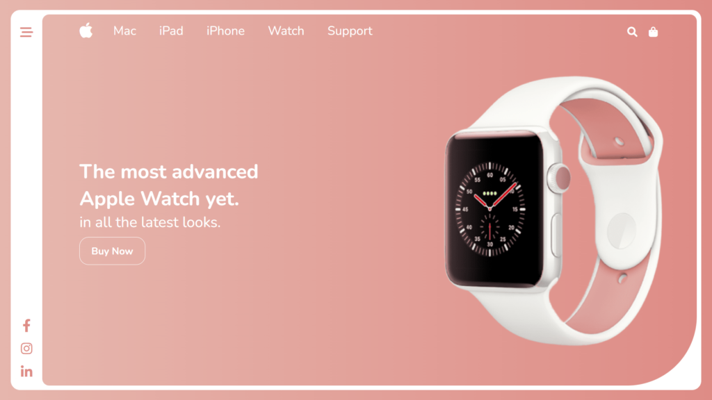
In this blog, This code is an HTML document that creates a webpage for an Apple Watch. The webpage is design to be responsive and looks great on different screen sizes.
The <body> element contains the main content of the webpage, which is divided into a left sidebar, a header, and a main section. The left sidebar includes a bar icon and social media icons, while the header includes the Apple logo, a menu, and a search bar. The main section includes a detailed description of the Apple Watch and an image of it.
The CSS stylesheet include at the end of the code is use to style the webpage, including setting font properties, setting the background, and positioning elements on the page. It also uses CSS grid and Flexbox to arrange the layout and make the webpage responsive, that means the webpage will adjust and display correctly on different screen sizes, including those of smartphones and tablets.
There is also a script include which uses JavaScript to toggle the class “active” on the left sidebar and navigation bar when clicked. This causes the sidebar and navigation bar to open and close when the corresponding icons are click.
This webpage uses responsive design and JavaScript to enhance user experience across devices. The JavaScript toggles the “active” class on the sidebar and navigation bar, making them easily accessible while saving space.
Video Tutorial of Responsive Apple Watch Landing Page
To see a live demonstration of the Apple Watch Landing Page, Click Here. For a complete video guide on how the generator works, check out the accompanying YouTube video.
You might like this:
Apple Watch Landing Page
HTML:
Create a new file with the name “index.html” and add the provide code to it. Ensure the file has a “.html” extension.
<!DOCTYPE html>
<html lang="en">

<head>
    <meta charset="UTF-8">
    <meta http-equiv="X-UA-Compatible" content="IE=edge">
    <meta name="viewport" content="width=device-width, initial-scale=1.0">
    <title>Apple Watch</title>
    <link rel="stylesheet" href="style.css">
    <link rel="stylesheet" href="https://cdnjs.cloudflare.com/ajax/libs/font-awesome/6.1.1/css/all.min.css" />
</head>

<body>
    <div class="container">
        <div class="left">
            <div class="bar">
                <a href="#"><i class="fa-solid fa-bars-staggered"></i></a>
            </div>
            <div class="icon">
                <a href="#"><i class="fa-brands fa-facebook-f"></i></a>
                <a href="#"><i class="fa-brands fa-instagram"></i></a>
                <a href="#"><i class="fa-brands fa-linkedin-in"></i></a>
            </div>
        </div>
        <div class="right">
            <header>
                <div class="menu">
                    <a href="#"><i class="fa-brands fa-apple"></i></a>
                    <nav>
                        <ul>
                            <li>
                                <a href="#" class="text">Mac</a>
                            </li>
                            <li>
                                <a href="#">iPad</a>
                            </li>
                            <li>
                                <a href="#">iPhone</a>
                            </li>
                            <li>
                                <a href="#">Watch</a>
                            </li>
                            <li>
                                <a href="#">Support</a>
                            </li>
                        </ul>
                    </nav>
                </div>
                <div class="search">
                    <a href="#">
                        <i class="fa-solid fa-magnifying-glass"></i>
                    </a>
                    <a href="#">
                        <i class="fa-solid fa-bag-shopping"></i>
                    </a>
                    <a href="#">
                        <i class="fa-solid fa-bars-staggered" onclick="myToggle()"></i>
                    </a>
                </div>
            </header>
            <main>
                <div class="detail">
                    <h2>The most advanced<br>Apple Watch yet.</h2>
                    <p>in all the latest looks.</p>
                    <button>Buy Now</button>
                </div>
                <div class="imgBx">
                    <img src="appleWatch.png" alt="apple watch">
                </div>
            </main>
        </div>
    </div>
</body>

</html>
This code is an HTML document that represents a webpage. The webpage features an image of an Apple Watch and some text describing the product. The webpage also includes links to social media sites and other parts of the website.
The <body> element contains the visible content of the webpage, which is divided into several sections. The main section of the webpage is a <div> element with the class “container”, which contains two child <div> elements with the classes “left” and “right”. This webpage displays information about an Apple Watch and includes a slide-out menu and social media links. The “left” element contains the slide-out menu and social media links, while the “right” element contains the main content, including a header with a menu, a search bar, and a “Buy Now” button.
The webpage also makes use of Font Awesome icons, which are included using the <i> element with classes such as “fa-brands” and “fa-solid”. These classes are use to style the icons using CSS. The webpage also use a JavaScript function “myToggle()” which is called when the icon with the class “fa-bars-staggered” is click. This function is use to toggle the class “active” on certain elements and cause the slide-out menu to appear or disappear.
Overall, This code is an example of a webpage that displays information about an Apple Watch using HTML, CSS, and JavaScript. It includes links, a menu bar, and a search bar, with a clean and modern design. The code is structure well and easy to understand. It uses CSS flexbox and Font Awesome icons for visual appeal and responsiveness.
CSS:
Create a new CSS file name “style.css” and copy the provide code into it. Ensure that the file has a “.css” extension.
* {
    margin: 0;
    padding: 0;
    box-sizing: border-box;
    font-family: Nunito;
    font-size: 66.6%;
}

body {
    display: flex;
    justify-content: center;
    align-items: center;
    min-height: 100vh;
    background: linear-gradient(to right, #E6B6AD, #DE8C86);
}

.container {
    position: relative;
    width: 97vw;
    height: 95vh;
    background: #fff;
    border-radius: 20px;
    border: 10px solid #fff;
    display: flex;
    justify-content: space-between;
    align-items: center;
    overflow: hidden;
}

.container .left {
    position: relative;
    width: 50px;
    height: 100%;
    background: #fff;
    display: flex;
    justify-content: space-between;
    align-items: center;
    flex-direction: column;
    padding: 10px 0;
    transition: all .5s ease;
}

.container .left .bar {
    position: relative;
    padding-top: 8px;
    z-index: 10;
}

.container .left .bar a {
    text-decoration: none;
    color: #fff;
    font-size: 4rem;
    width: 40px;
    height: 40px;
    transition: .3s ease;
    display: flex;
    justify-content: center;
    align-items: center;
    border-radius: 10px;
}

.container .left.active .bar a {
    color: #DE8C86;
}

.container .left .bar a:hover {
    transform: scale(1.1);
    background: #DE8C86;
    color: #fff;
}

.container .left .icon {
    position: relative;
    display: flex;
    justify-content: center;
    align-items: center;
    flex-direction: column;
}

.container .left .icon a {
    text-decoration: none;
    font-size: 4rem;
    color: #DE8C86;
    margin-top: 10px;
    width: 40px;
    height: 40px;
    transition: .3s ease;
    display: flex;
    justify-content: center;
    align-items: center;
    border-radius: 10px;
}

.container .left .icon a:hover {
    transform: scale(1.1);
    background: #DE8C86;
    color: #fff;
}

.container .right {
    position: absolute;
    right: 0;
    width: 100%;
    height: 100%;
    background: linear-gradient(to right, #E6B6AD, #DE8C86);
    border-radius: 15px 15px 150px 15px;
    transition: width .5s ease;
    padding: 10px 10px;
    padding-left: 80px;

}

.container .left.active~.right {
    right: 0;
    width: 96%;
}


.container .right header{
    position: relative;
    width: calc(100% - 50px);
    height: 50px;
    display: flex;
    justify-content: space-between;
    align-items: center;
}
.container .right header .menu {
    position: relative;
    display: flex;
    justify-content: center;
    align-items: center;
}

.container .right header .menu a {
    text-decoration: none;
    display: flex;
    justify-content: space-around;
    align-items: center;
}

.container .right header .menu .fa-apple {
    color: #fff;
    font-size: 3.5rem;
    transition: .3s ease;
    margin-right: 20px;
}

.container .right header .menu .fa-apple:hover {
    transform: scale(1.1);
}

.container .right header .menu nav {
    position: relative;
    display: flex;
    justify-content: center;
    align-items: center;
    transition: .5s ease-out;
}

.container .right header .menu nav ul {
    position: relative;
    display: flex;
    justify-content: center;
    align-items: center;
}

.container .right header .menu nav ul li {
    list-style: none;
    padding: 25px;
    display: flex;
}

.container .right header .menu nav ul li a {
    text-decoration: none;
    color: #fff;
    display: inline-block;
    font-size: 2.5rem;
    transition: .3s ease;
}

.container .right header .menu nav ul li a:hover {
    transform: scale(1.1);
}

.container .right header .search {
    position: relative;
    display: flex;
    justify-content: space-evenly;
    align-items: center;
    z-index: 100;
}

.container .right header .search a {
    text-decoration: none;
    color: #fff;
    font-size: 3rem;
    transition: .3s ease;
    display: inline-block;
    padding-left: 25px;
}

.container .right header .search a:hover {
    transform: scale(1.1);
}

.container .right header .search a .fa-bars-staggered {
    display: none;
}

.container .right header .menu nav.active {
    left: -80px;
    transition: .5s ease-out;

}

.container main {
    position: relative;
    width: 100%;
    height: calc(100% - 50px);
    display: flex;
    justify-content: space-between;
    align-items: center;
}

.container main .detail {
    position: relative;

}

.container main .detail h2 {
    font-size: 4rem;
    color: #fff;
}

.container main .detail p {
    font-size: 3rem;
    color: #fff;
}

.container main .detail button {
    padding: 15px 25px;
    font-size: 2rem;
    font-weight: 700;
    color: #fff;
    outline: none;
    border: 1px solid #fff;
    border-radius: 20px;
    background: transparent;
    margin-top: 10px;
    cursor: pointer;
    transition: .3s ease;

}

.container main .detail button:Hover {
    transform: scale(0.9);
}

.container main .imgBx {
    position: relative;
}

.container main .imgBx img {
    width: 600px;
}

@media (max-width: 1290px) {
    .container .left.active~.right {
        width: 95.5%;
    }
}

@media (max-width: 1186px) {
    .container main {
        justify-content: space-between;
    }

    .container main .detail h2 {
        font-size: 3.5rem;
        color: #fff;
    }

    .container main .detail p {
        font-size: 2.5rem;
        color: #fff;
    }

    .container main .imgBx img {
        width: 500px;
    }
}

@media (max-width: 1065px) {
    .container .left {
        width: 40px;
    }

    .container .left .bar a {
        font-size: 3.5rem;
        width: 35px;
        height: 35px;
    }

    .container .left .icon a {
        font-size: 3.5rem;
        width: 35px;
        height: 35px;
    }
}

@media (max-width: 990px) {
    .container .right header .search a .fa-bars-staggered {
        display: block;
    }

    .container .right header .menu nav {
        position: absolute;
        width: 95vw;
        height: 85vh;
        background: linear-gradient(to right, #E6B6AD, #DE8C86);
        top: 50px;
        left: -1090px;
        z-index: 100;
        border-radius: 20px;
    }

    .container .right header .menu nav ul {
        display: flex;
        flex-direction: column;
    }

    .container main .detail h2 {
        font-size: 3rem;
        color: #fff;
    }

    .container main .detail p {
        font-size: 2rem;
        color: #fff;
    }

    .container main .imgBx img {
        width: 450px;
    }

    .container .left.active~.right {
        width: 94.5%;
    }
}

@media (max-width: 876px) {
    .container main .detail h2 {
        font-size: 2.5rem;
        color: #fff;
    }

    .container main .detail p {
        font-size: 1.5rem;
        color: #fff;
    }

    .container main .imgBx img {
        width: 400px;
    }

}

@media (max-width: 776px) {
    .container main {
        justify-content: center;
        flex-direction: column-reverse;
        margin-left: -30px;
    }

    .container main .imgBx img {
        width: 350px;
    }

    .container main .detail button {
        padding: 10px 20px;
    }

    .container .right header .menu nav {
        height: 85vh;
    }

    .container .left.active~.right {
        width: 93%;
    }
}
This is CSS code that is defining the styles for elements on a web page. The code is setting default styles for all elements (by using the universal selector “*”), as well as specific styles for different classes and elements. The styles include things such as setting font-family, aligning items, setting background colors and gradients, defining widths and heights, and controlling the behavior of elements on hover and when a class is toggle. The code is also making use of CSS flexbox to align and layout the elements on the page. It is also defining the styles for elements in the DOM with the class of .left, .bar, .right, .icon and .menu, .fa-apple, nav etc.
JavaScript:
In between the <body></body> tags, you can include JavaScript code by enclosing it within <script> tags.
        const bar = document.querySelector('.bar');
        const left = document.querySelector('.left');
        bar.onclick = () => {
            left.classList.toggle('active');
        };

        const navBar = document.querySelector('.fa-bars-staggered')
        const nav = document.querySelector('nav');
        function myToggle(){
            nav.classList.toggle('active');
        };
This JavaScript code is interacting with the DOM (Document Object Model) to toggle the class “active” on certain elements. The first block of code is selecting the elements with the class “bar” and “left”, and when the “bar” element is click, it toggles the class “active” on the “left” element. The second block of code is selecting the elements with the class “fa-bars-staggered” and “nav”, and the function “myToggle” is define to toggle the class “active” on the “nav” element when it is called.
Summary:
The webpage for the Apple Watch is a well-designed, visually pleasing, and responsive webpage that is easy to navigate. It uses CSS stylesheets, Font Awesome icons, and JavaScript to make the webpage interactive and user-friendly. Linear gradients in the background add depth, and the “Buy Now” button makes it easy for users to purchase the product. Responsive design techniques ensure users have a positive experience on any device. This webpage is an effective example of adaptable web design.


