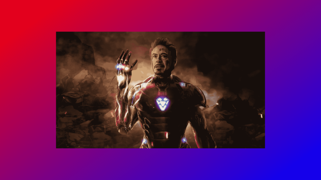
In this blog, This code is an HTML and CSS code that creates a background change animation. The HTML document contains a head section that links to a CSS file and a body section that contains a div element with a class of “slide”. The CSS code sets default margin, padding, and box-sizing properties, and styles the body and slide classes. The body class sets the background to a linear gradient of red and blue, and positions the slide element in the center of the screen.
The slide class sets the width and height of the element, and sets the background to a specific image. The animation property is also add to the slide class, with a name of “bgchange” and a duration of 10 seconds that repeats infinitely.
The keyframes “bgchange” is define that changes the background image of the slide element at specific intervals. 0%, 20%, 45% and 70% it will have one image, 25%, 50% and 75% it will have another image, and 100% it will have the final image.
The overall effect is a continuously changing background, with different images appearing in succession. This animation can be use to create a dynamic background for a webpage, adding visual interest and movement to the page.
Video Tutorial of Background Change Animation
To see a live demonstration of the Background Change Animation, Click Here. For a complete video guide on how the generator works, check out the accompanying YouTube video.
Background Change Animation
HTML:
Create a new file with the name “index.html” and add the provide code to it. Ensure the file has a “.html” extension.
<!DOCTYPE html>
<html lang="en">

<head>
    <meta charset="UTF-8">
    <meta http-equiv="X-UA-Compatible" content="IE=edge">
    <meta name="viewport" content="width=device-width, initial-scale=1.0">
    <link rel="stylesheet" href="style.css">
    <title>Background Change Animation</title>
</head>

<body>
    <div class="slide"></div>
</body>

</html>
The body section of this code is relatively simple and only contains one element, a div with a class of “slide”. This div will be the container for the background change animation that is create by the CSS code.
The body section of an HTML document is the main area for the content of a webpage. It contains elements like headings, images, paragraphs and links. It is the most important section of an HTML document as it is what users see and interact with on a webpage.
In this example, the body section is quite minimalistic and only contains a single div element. This is done to keep the focus on the background change animation that is created by the CSS code. In a real-world scenario, the body section would likely contain a variety of elements such as images, text, and links to other pages, depending on the purpose of the webpage.
Overall, the body section of this code serves as a foundation for the animation that is created by the CSS code. It provides a container for the animation and sets the stage for the dynamic background that is create by the CSS code.
CSS:
Create a new CSS file name “style.css” and copy the provide code into it. Ensure that the file has a “.css” extension.
* {
    margin: 0;
    padding: 0;
    box-sizing: border-box;
}

body {
    position: relative;
    display: flex;
    justify-content: center;
    align-items: center;
    min-height: 100vh;
    background: linear-gradient(145deg, red, blue);
}

.slide {
    width: 1000px;
    height: 560px;
    background: url(Bg-1.jpg);
    animation: bgchange 10s infinite;
}

@keyframes bgchange {
    0% {
        background: url(Bg-1.jpg);
    }

    20% {
        background: url(Bg-1.jpg);
    }

    25% {
        background: url(Bg-2.jpg);
    }

    45% {
        background: url(Bg-2.jpg);
    }

    50% {
        background: url(Bg-3.jpg);
    }

    70% {
        background: url(Bg-3.jpg);
    }

    75% {
        background: url(Bg-4.jpg);
    }

    100% {
        background: url(Bg-4.jpg);
    }
}
The main CSS properties for this code are:
- The
box-sizingproperty, which is set toborder-boxfor all elements, ensuring that the width and height properties include padding and borders. - The
bodyelement is styled withposition: relative,display: flex,justify-content: center,align-items: center,min-height: 100vhandbackground: linear-gradient(145deg, red, blue)which sets the position, alignment, height and background color of the body element. - The
.slideclass is styled withwidth,height,background, andanimationproperties. The width and height is use to 1000px and 560px respectively, and the background is use to an image. The animation property is use to “bgchange” and runs for 10 seconds in an infinite loop. - The
@keyframes bgchangeis defined to change the background of the slide class at different keyframes using different background images. - The overall effect is a slide element that changes its background image every 10 seconds in an infinite loop.
Summary:
The code creates an HTML/CSS background change animation. The body section has a div with class “slide.” CSS sets default properties, styles body with linear gradient background, and styles slide class with width/height/background/animation properties. The animation changes background every 10 seconds in an infinite loop.