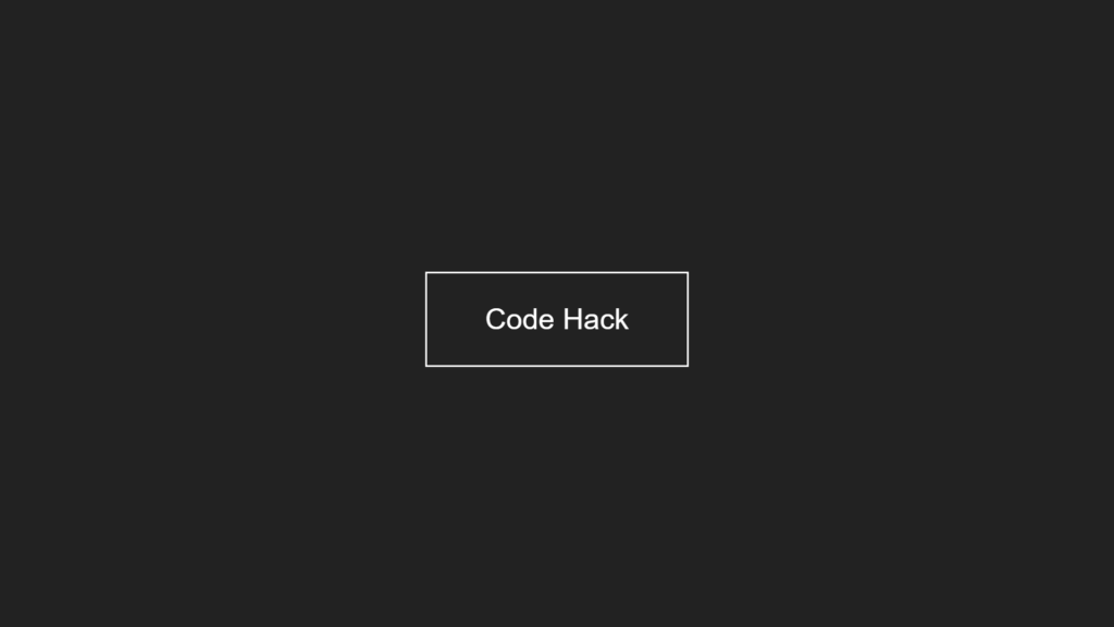
Hello Reader!, This code creates a simple webpage with a button that has a mirror reflection effect when hovered over. The webpage is written in HTML and CSS.
The HTML sets up the basic structure of the webpage and includes a link to a CSS stylesheet. The link within the body of the HTML serves as the button for the mirror reflection effect.
The CSS styles the webpage and the button to create the mirror reflection effect. It sets the display, text-decoration, color, font, border, padding, and transition properties of the button. The hover effect is create by setting the background color of the button to a different color and using the ::before pseudo-element to create the reflection. The transform property is used to rotate and translate the reflection to create the mirror effect.
Video Tutorial of Button Mirror Reflection
To see a live demonstration of the Button Mirror Reflection, Click Here. For a complete video guide on how the generator works, check out the accompanying YouTube video.
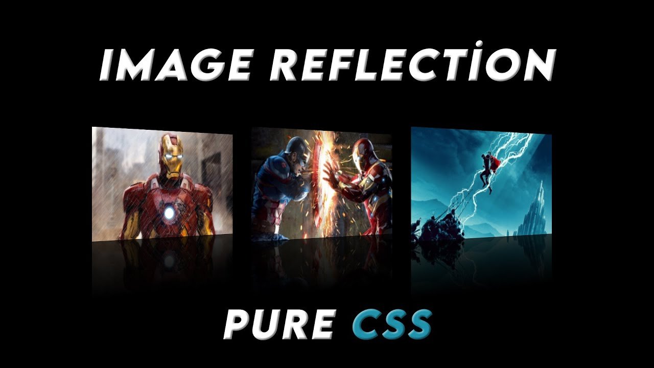
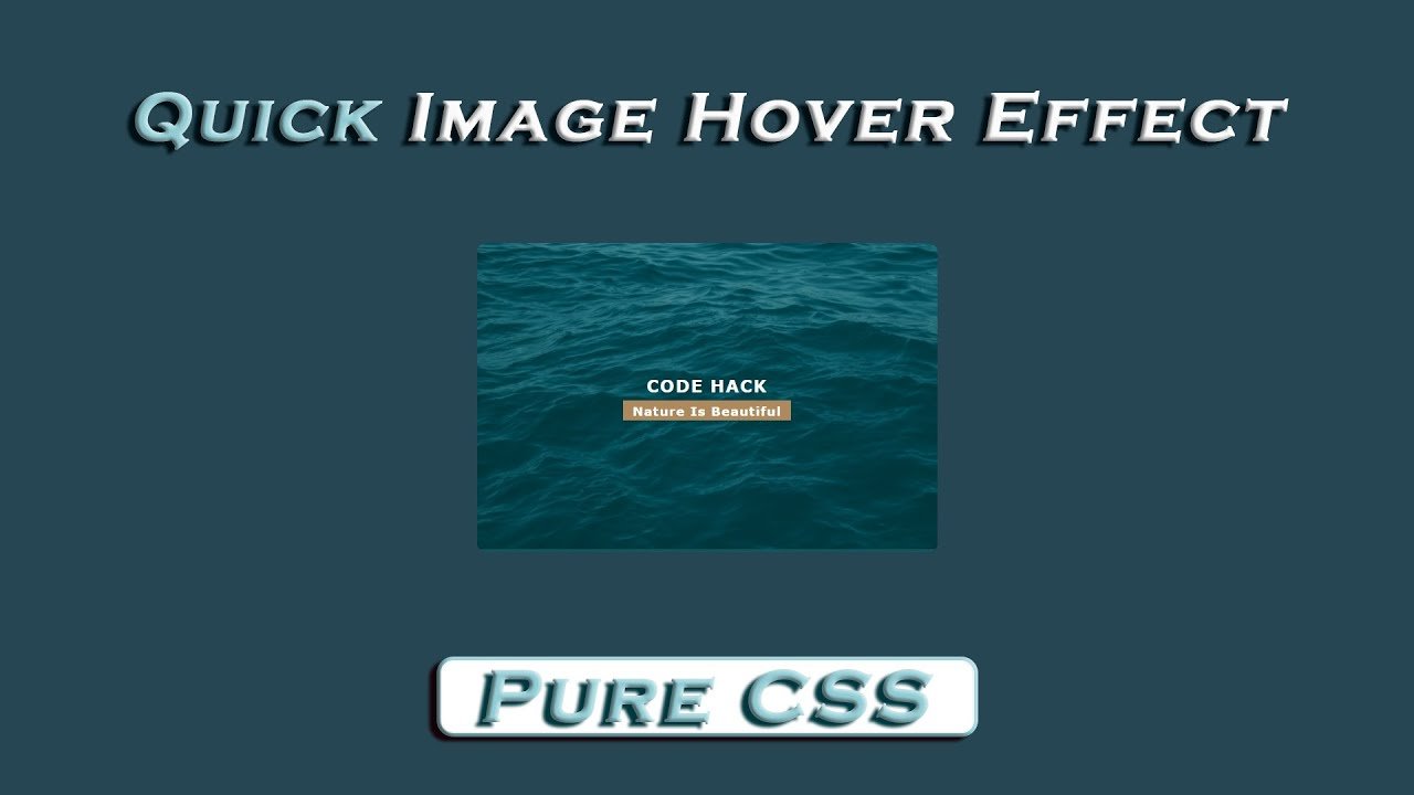
You might like this:
Button Mirror Reflection
HTML Part:
Create a new file with the name “index.html” and add the provide code to it. Ensure the file has a “.html” extension.
<!DOCTYPE html>
<html lang="en">

<head>
    <meta charset="UTF-8">
    <meta http-equiv="X-UA-Compatible" content="IE=edge">
    <meta name="viewport" content="width=device-width, initial-scale=1.0">
    <link rel="stylesheet" href="style.css">
    <title>Botton Mirror Reflection</title>
</head>

<body>
    <a href="#">Code Hack</a>
</body>

</html>
This code is a basic HTML document that sets up the structure for a website.
The first line, <!DOCTYPE html>, is a declaration that this is an HTML document.
The <html> tag that follows indicates the start of the HTML document and the “lang” attribute specifies that the language of the document is English.
The <head> tag contains information about the document that is not visible on the website, such as the title of the page, which is “Botton Mirror Reflection” and is set using the <title> tag. It also contains a link to a stylesheet named “style.css” which defines the look and layout of the website.
The <body> tag contains the actual content of the website. In this case, it contains an anchor tag <a> which creates a hyperlink to a website named “Code Hack”.
The </html> tag at the end of the code indicates the end of the HTML document.
CSS Part:
Create a new CSS file name “style.css” and copy the provide code into it. Ensure that the file has a “.css” extension.
body {
    display: flex;
    justify-content: center;
    align-items: center;
    min-height: 100vh;
    background: #222;
    overflow: hidden;
}

a {
    position: relative;
    text-decoration: none;
    color: #fff;
    font-family: sans-serif;
    font-size: 40px;
    border: 3px solid #fff;
    padding: 40px 80px;
    transition: all 0.3s;
    overflow: hidden;
    text-transform: capitalize;
}

a:hover {
    background: #F44336;
}

a::before {
    content: '';
    position: absolute;
    top: 0;
    left: 0;
    width: 100%;
    height: 50px;
    transform: translateX(-100%) rotate(45deg);
    background: #fff;
    transition: all 0.3s;
}

a:hover::before {
    transform: translateX(100%) rotate(45deg);
}
This code is a simple webpage that displays a button with a mirror reflection effect when hovered over. The webpage is written in HTML and CSS. The HTML sets up the basic structure of the webpage and includes a link to the CSS stylesheet. The CSS styles the webpage and the button, using properties such as display, text-decoration, color, font, border, padding, and transition, as well as the ::before pseudo-element to create the reflection effect. The hover effect is create by changing the background color of the button and using the transform property to rotate and translate the reflection.
This CSS code is styling a webpage.
The first block of CSS styles the <body> tag.
- The
display: flexproperty sets the display property of the <body> element to flex, which is a layout mode that aligns elements in a row or a column. - The
justify-content: centerproperty aligns the content of the <body> element along the horizontal axis. - The
align-items: centerproperty aligns the content of the <body> element along the vertical axis. - The
min-height: 100vhproperty sets the minimum height of the <body> element to be the full height of the viewport. - The
background: #222property sets the background color of the <body> element to be a dark gray color. - The
overflow: hiddenproperty sets the overflow property of the <body> element to hidden, which hides any content that overflows the <body> element.
The second block of CSS styles the <a> tag.
- The
position: relativeproperty sets the position property of the <a> element to relative, which positions the <a> element relative to its default position. - The
text-decoration: noneproperty removes the underline from the <a> element. - The
color: #fffproperty sets the text color of the <a> element to be white. - The
font-family: sans-serifproperty sets the font family of the <a> element to be sans-serif. - The
font-size: 40pxproperty sets the font size of the <a> element to be 40 pixels. - The
border: 3px solid #fffproperty sets the border of the <a> element to be 3 pixels thick and white in color. - The
padding: 40px 80pxproperty sets the padding of the <a> element to be 40 pixels on the top and bottom and 80 pixels on the left and right. - The
transition: all 0.3sproperty adds a transition effect to all properties of the <a> element when they change, with a duration of 0.3 seconds. - The
overflow: hiddenproperty sets the overflow property of the <a> element to hidden, which hides any content that overflows the <a> element. - The
text-transform: capitalizeproperty changes the text inside the <a> element to be capitalized.
The third block of CSS styles the <a> tag when it is hovered over.
- The
background: #F44336property sets the background color of the <a> element to be red when it is hovered over.
The fourth block of CSS styles the ::before pseudo-element of the <a> tag.
- The
content: ''property sets the content of the ::before pseudo-element to be empty. - The
position: absoluteproperty sets the position property of the ::before pseudo-element to be absolute, which positions the pseudo-element relative to the nearest positioned ancestor element. - The
top: 0property sets the top position of the ::before pseudo-element to be 0 pixels. - The
left: 0property sets the left position of the ::before pseudo-element to be 0 pixels. - The
width: 100%property sets the width of the ::before pseudo-element to be 100% of the width of the <a> element. - The
height: 50pxproperty sets the height of the ::before pseudo-element to be 50 pixels. - The
transform: translateX(-100%) rotate(45deg)property moves the ::before pseudo-element 100% of the width of the <a> element to the left and rotates it 45 degrees. - The
background: #fffproperty sets the background color of the ::before pseudo-element to be white. - The
transition: all 0.3sproperty adds a transition effect to all properties of the ::before pseudo-element when they change, with a duration of 0.3 seconds.
The last block of CSS styles the ::before pseudo-element of the <a> tag when the <a> tag is hovered over.
- The
transform: translateX(100%) rotate(45deg)property moves the ::before pseudo-element 100% of the width of the <a> element to the right and rotates it 45 degrees.
Summary:
Overall, this CSS code creates a webpage with a dark gray background, a white, capitalized link with a white border, which when hovered over, changes its background color to red, and creates a white, diagonal stripe that slides in from the left and when hovered over, slides out from the right. This creates a visually appealing and interactive experience for users visiting the website.