
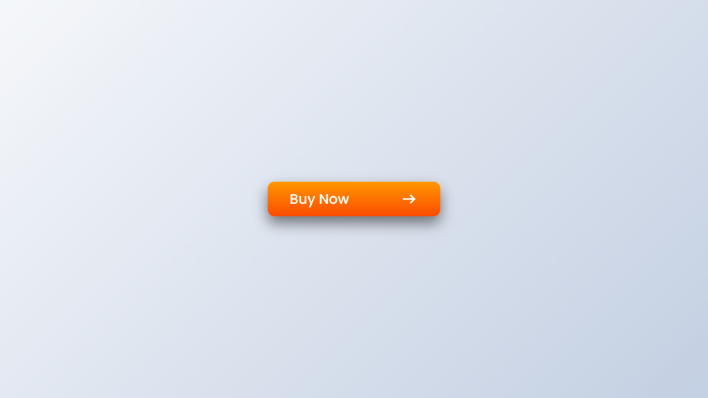
Hello Readers!, This code creates a button with a hover transition effect. The button has a “buy now” text and an arrow icon next to it. When the user hovers over the button, the width of the button increases and the text and the arrow icon move to the right.
In the HTML, the button is create with a “buy now” heading and an arrow icon, which is achieve by using the “material-symbols-outlined” class from the importe font library.
In the CSS, the body of the webpage is use to display a linear gradient background and the button is style with a gradient background, a box shadow, and a border radius. The button is also use to have a relative position, which is necessary for the hover transition effect.
The hover effect is achieve by using the :hover pseudo-class and setting the width of the button to increase and the text and the arrow icon to move to the right by using the translateX property. The transitions are use to occur over a period of time, which gives the effect a smooth animation.
Video Tutorial of BUTTON in HTML & CSS
To see a live demonstration of the Button Transition Hover Effect, Click Here. For a complete video guide on how the generator works, check out the accompanying YouTube video.
You might like this:
Button Transition Hover Effect
HTML Part:
Create a new file with the name “index.html” and add the provide code to it. Ensure the file has a “.html” extension.
<!DOCTYPE html>
<html lang="en">
<head>
    <meta charset="UTF-8">
    <meta http-equiv="X-UA-Compatible" content="IE=edge">
    <meta name="viewport" content="width=device-width, initial-scale=1.0">
    <title>Button Hover Transition Effect</title>
    <link rel="stylesheet" href="./style.css">
    <link rel="stylesheet" href="https://fonts.googleapis.com/css2?family=Material+Symbols+Outlined:opsz,wght,FILL,GRAD@20..48,100..700,0..1,-50..200" />
</head>
<body>
    <button type="submit">
        <h4>buy now</h4>
        <span class="material-symbols-outlined">
            arrow_right_alt
        </span>
    </button>
</body>
</html>
This code creates a button that includes a text and an icon. The button is use to submit a form or to perform an action on the website. The button is created using a <button> element and includes a <h4> element for the text and a <span> element for the icon. The title of the document is “Button Hover Transition Effect” which indicate that the effect will be applie to the button when the user hovers over it.
The link to the CSS stylesheet “style.css” is includ in the head section, where the styles are applie to the elements to achieve the desired design. The <link> element in the head section is used to link the Material Symbols Outlined font from Google Fonts, which is used to display the icon on the button using the <span> element. The meta tags in the head section provide information about the document, such as the character encoding and viewport size.
CSS Part:
Create a new CSS file name “style.css” and copy the provide code into it. Ensure that the file has a “.css” extension.
*{
    margin: 0;
    padding: 0;
    box-sizing: border-box;
    font-family: Poppins;
}
body{
    display: flex;
    justify-content: center;
    align-items: center;
    min-height: 100vh;
    background: linear-gradient(135deg, #f5f7fa 0%, #c3cfe2 100%);
}
button{
    position: relative;
    width: 150px;
    height: 50px;
    display: flex;
    justify-content: center;
    align-items: center;
    outline: none;
    border: none;
    background: linear-gradient(180deg, rgba(255, 151, 0, 1) 0%, rgba(251, 75, 2, 1) 100%);
    border-radius: 10px;
    box-shadow: 0 10px 20px rgba(0, 0, 0, .5);
    cursor: pointer;
    overflow: hidden;
    transition: .8s ease .8s;
}
button h4{
    color: #fff;
    font-size: 1.5em;
    font-weight: 500;
    text-transform: capitalize;
    transition: .4s ease .4s;
}
button .material-symbols-outlined{
    position: absolute;
    font-size: 2em;
    color: #fff;
    opacity: 0;
    visibility: hidden;
    transition: .2s ease;
}
button:hover{
    width: 250px;
    transition: .4s ease;
}
button:hover h4{
    transform: translateX(-50px);
    transition: .4s ease .4s;
}
button:hover .material-symbols-outlined{
    opacity: 1;
    visibility: visible;
    transform: translateX(80px);
    transition: .4s ease .8s;
}
This code creates a button that includes a text and an icon. The button is style using CSS to create a hover transition effect. The button is created using a <button> element and includes a <h4> element for the text and a <span> element for the icon. The code uses CSS reset to set the default margin and padding of all elements to 0 and set the box-sizing property to “border-box”, this makes it easier to size elements and apply styles.
The body is use to be display as flex and its children are aligne at the center of the viewport. The min-height is use to 100vh, ensuring that the body always takes up at least the full height of the viewport. A linear gradient background is applie to the body. The button element is position relatively, and its width and height are use. It is display as flex container and its children are aligne at the center. The button has a linear gradient background, a box-shadow effect, and rounded border. It is use to be hide when not hover and to be visible with a transition effect, when hover.
The h4 element is style with white color, font-size, font-weight and text-transform properties. The span element is position absolute and font-size, color properties are use. It is use to be hide when not hover and to be visible with a transition effect
Summary:
This code creates a button with a hover transition effect. When the button is hover over, the text “buy now” and an arrow icon move and change opacity to create a dynamic effect. The button also has a gradient background, box shadow, and rounded edges. The font is import from the Google font library “Material Symbols Outlined” and the overall layout of the page is center on the screen.

