
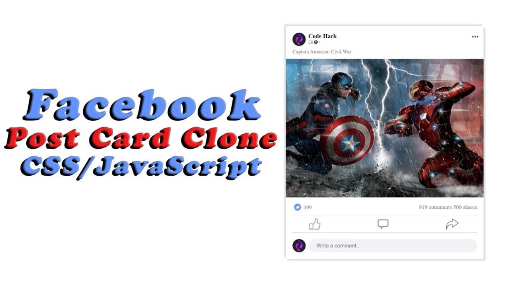
Hello Reader!, Creating a Facebook post card clone is a great chance to practice web development skills, particularly HTML and CSS. The code demonstrates a replica of a Facebook post card on a webpage. It includes images, text, and buttons with a design similar to Facebook’s post card.
There is a “card” div inside the body tag, which holds the post card. The first child element of this div is the “top” div, which shows the user details and options for changing post visibility. The user details include an image, name, time since posting, and a globe icon for visibility.
The h4 tag displays the post message, followed by the “imgBg” div for the image or video. Below that is the “btns” div with two sub-divs: one for the “like” button and another for the “comments” and “share” buttons. The like button has an image and a number for the likes.
Two divs with classes of “border” and “border_bott” add horizontal lines to the post card. The last element, a div with a class of “addComments,” includes an image of the user and an input field for adding comments.
The script tag at the end of the body contains a JavaScript function called likeButton(). This function toggles the “like” button image between two states, the gray like image and the blue like image. It also updates the number of likes to display the new number after the button is clicked.
The CSS file styles all HTML elements used in the post card. It includes body, card, top, user_details, profile_img, cover, h3, hour, globDot, ul, li, dot, message, imgBg, btns, left, right, likes, border, icon, like, graylike, comments, share, border_bott, addComments, userimg, and text. Each element has its own positioning, color, font, and properties to match Facebook’s design.
Video Tutorial of Facebook Post Card Clone
To see a live demonstration of the Facebook Post Card Clone, Click Here. For a complete video guide on how the generator works, check out the accompanying YouTube video.
You may like this:
- Colorful Rain Animation Effects
- Draggable Slider Tab
- Random Color Palette Generator
- Sticky Navbar With Parallax Effect
- Text To Speech Converter
- Word Counter
- Working Google Search Engine
Facebook Post Card Clone
HTML:
Create a new file with the name “index.html” and add the provided code to it. Ensure the file has a “.html” extension.
<!DOCTYPE html>
<html lang="en">

<head>
    <meta charset="UTF-8">
    <meta http-equiv="X-UA-Compatible" content="IE=edge">
    <meta name="viewport" content="width=device-width, initial-scale=1.0">
    <title>Facebook Post Card Clone</title>
    <link rel="stylesheet" href="style.css">
</head>

<body>
    <div class="card">
        <div class="top">
            <div class="user_details">
                <div class="profile_img">
                    <img src="User.jpg" alt="user" class="cover">
                </div>
                <h3>Code Hack<br><span class="hour">20 h</span>
                <span class="globDot">.</span></h3>
                <ul>
                    <li>
                        <img src="globe.png" alt="globe" class="cover">
                    </li>
                </ul>
            </div>
            <div class="dot">
                <img src="dot.png" alt="dot">
            </div>
        </div>
        <h4 class="message">Captain America: Civil War</h4>
        <div class="imgBg">
            <img src="Bg.jpg" alt="bg" class="coverFull">
        </div>
        <div class="btns">
            <div class="left">
                <img src="like.png" alt="like">
                <h4 class="likes">499</h4>
            </div>
            <div class="right">
                <h4>919 comments 500 shares</h4>
            </div>
        </div>
        <div class="border"></div>
        <div class="icon">
            <div class="like">
                <img src="gray_like.png" alt="like" class="graylike" onclick="likeButton()">
                <img src="comments.png" alt="comments">
                <img src="share.png" alt="share">
            </div>
        </div>
        <div class="border_bott"></div>
        <div class="addComments">
            <div class="userimg">
                <img src="User.jpg" alt="user" class="cover">
            </div>
            <input type="text" class="text" placeholder="Write a comment...">
        </div>
    </div>
</body>

</html>
This is the HTML code for a Facebook post card clone. It includes a header with a title and a link to a CSS file, a main body with a div containing several elements such as images, text, and buttons arranged in a similar design as Facebook’s post card. The elements include a user profile image, user details, message, background image, buttons to like, comment, and share, and a section to add comments. The code also uses classes and IDs to style the elements in a separate CSS file.
CSS:
Create a new CSS file name “style.css” and copy the provide code into it. Ensure that the file has a “.css” extension.
* {
    margin: 0;
    padding: 0;
    box-sizing: border-box;
    font-family: Roboto;
}

body {
    display: flex;
    justify-content: center;
    align-items: center;
    min-height: 100vh;
    background: #fff;
}

.card {
    position: relative;
    width: 600px;
    min-height: 450px;
    box-shadow: 5px 5px 5px rgba(0, 0, 0, 0.15),
        -5px -5px 5px rgba(0, 0, 0, 0.15);
    padding: 20px;
}

.card .top {
    display: flex;
    justify-content: space-between;
    align-items: center;
}

.card .top .user_details {
    display: flex;
    align-items: center;
}

.card .top .user_details .profile_img {
    position: relative;
    width: 40px;
    height: 40px;
    border-radius: 50%;
    overflow: hidden;
    margin-right: 8px;
}

.cover {
    position: absolute;
    top: 0;
    right: 0;
    width: 100%;
    height: 100%;
    object-fit: cover;
    object-position: center;
    cursor: pointer;
}

.card .top .user_details h3 {
    font-size: 18px;
    color: black;
    font-weight: 900;
    line-height: 1em;
    cursor: pointer;
}

.hour {
    color: gray;
    font-size: 15px;
    font-weight: 500;
}


.globDot {
    position: absolute;
    margin-left: 5px;
    margin-top: -4px;
    font-size: 20px;
    align-items: center;
    color: #0000004b;
}

ul {
    position: relative;
    width: 25px;
    height: 25px;
    border-radius: 50%;
    display: flex;
    justify-content: center;
    align-items: center;
}

ul li {
    position: absolute;
    top: 0;
    right: 0;
    width: 100%;
    height: 100%;
    border-radius: 50%;
    margin-top: 10px;
    margin-right: 48px;
    list-style: none;
    text-align: center;
}

ul li img {
    position: absolute;
    top: 0;
    right: 0;
    width: 100%;
    height: 100%;
    border-radius: 50%;
    margin-top: -1.5px;
}

.dot {
    transform: rotate(90deg) scale(0.6);
    cursor: pointer;
    margin-top: -16px;
}

.message{
    font-weight: 400;
    margin-top: 5px;
    color: #777;
    line-height: 1.5em;
}
.imgBg{
    position: relative;
    width: 600px;
    height: 420px;
    margin: 10px 0 15px;
    margin-left: -20px;
    overflow: hidden;
}
.coverFull{
    position: absolute;
    top: 0;
    right: 0;
    width: 100%;
    height: 100%;
    object-fit: cover;
    object-position: center;
    cursor: pointer;
}
.btns{
    display: flex;
    align-items: center;
    justify-content: space-between;
}
.btns img{
    max-width: 30px;
    cursor: pointer;
}
.btns .left img{
    margin-right: 8px;
}
.likes{
    margin-top: -28px;
    margin-left: 33px;
    font-size: 17px;
    color: #777;
    text-align: center;
    font-weight: 500;
}
.right h4{
    margin-top: 5px;
    margin-left: 33px;
    font-size: 17px;
    color: #777;
    text-align: center;
    font-weight: 500;
}
.border{
    position: relative;
    width: 100%;
    height: 0.5px;
    background: #0000004b;
    margin-top: 15px;
}
.icon{
    display: flex;
    justify-content: space-between;
    align-items: center;
    margin: 5px 0 5px 0;
}
.icon img{
    max-width: 30px;
    cursor: pointer;
}
.like{
    display: flex;
    justify-content: space-around;
    align-items: center;
    width: 100%;
}
.like img{
    position: relative;
    max-width: 70px;
    cursor: pointer;
    margin: 0 40px;
    margin-top: -15px;
}
.like img:nth-child(1){
    width: 55px;
    margin-right: 20px;
}
.like img:nth-child(2){
    width: 33px;
    margin-right: 15px;
}
.border_bott{
    position: relative;
    width: 100%;
    height: 0.5px;
    background: #0000004b;
    margin-top: -15px;
}
.addComments{
    display: flex;
    align-items: center;
    margin-top: 20px;
}
.addComments .userimg{
    position: relative;
    min-width: 40px;
    height: 40px;
    border-radius: 50%;
    overflow: hidden;
    margin-right: 8px;
}
.text{
    background: #F0F2F5;
    width: 100%;
    height: 40px;
    border: none;
    outline: none;
    font-weight: 400;
    font-size: 16px;
    color: #262626;
    border-radius: 20px;
}

input[type="text"]{
    position: relative;
    padding: 0 25px;
}

@media (max-width: 640px){
    .card{
        width: 350px;
    }
    .imgBg{
        width: 350px;
    }
}
The CSS code provided is for a card component of a social media platform. It has styles for the layout, user details, image, buttons, and comments.
The overall layout of the card is a centered box with a fixed width of 600px and minimum height of 450px. It has a white background and a box-shadow effect.
The top section of the card has user details, such as the profile picture, name, and timestamp. It also has a dropdown menu with additional options.
Below the user details, there is an image section with a cover photo and a like button. It also displays the number of likes.
The bottom section of the card has a comment section, where users can input their comments. It has a user image, a text input, and a button to submit the comment.
The CSS code is written in a mobile-first approach, as it has styles for smaller screen sizes first and then adds styles for larger screen sizes using media queries. The code uses flexbox to position and align elements, and it uses CSS variables for colors and other values.
JavaScript:
In between the <body></body> tags, you can include JavaScript code by enclosing it within <script> tags.
        function likeButton(){
            let graylike = document.querySelector('.graylike');
            let likes = document.querySelector('.likes');
            if (graylike.src.match("gray_like.png")) {
                graylike.src = "blue_like.png";
                likes.innerHTML = "500"
            }else{
                graylike.src = "gray_like.png";
                likes.innerHTML = "499";
            }

        }
This is a function for the like button. It selects the graylike and likes elements from the HTML document. If the graylike element’s source matches “gray_like.png”, it changes the source to “blue_like.png” and sets the likes text to “500”. If the source doesn’t match, it changes the source back to “gray_like.png” and sets the likes text to “499”.
Summary:
This code is an HTML document that creates a Facebook post card clone. It includes a title, a link to an external stylesheet, and a body with a container element that holds all the post content. The post includes an image, user details, a message, buttons to like, comment, and share the post, as well as a section to add comments. The stylesheet includes CSS code that styles the layout and the content of the post, including a function that allows the user to like the post by clicking on a grayed-out like button.


