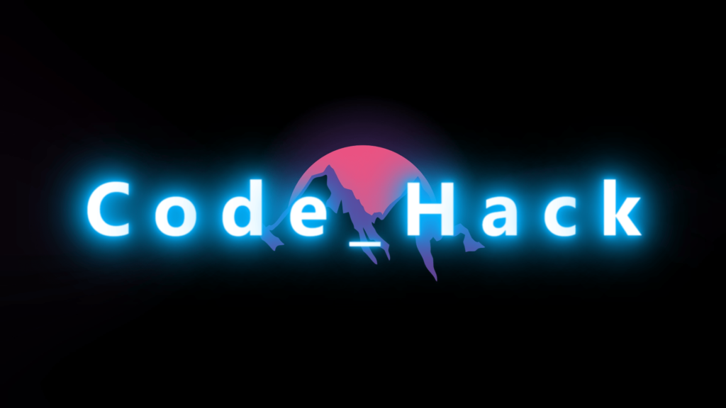
In this blog, This code is an HTML and CSS example of creating a glowing text effect. The text “CODE_HACK” is written using individual span tags for each letter, and the CSS is used to animate the text.
The text is first set to be transparent and given a large font size. The span tags within the h1 heading are then given an animation property with a linear infinite loop, causing each letter to glow.
To create the effect of the letters glowing at different times, the animation-delay property is added to specific letters. For example, the first letter has an animation delay of 0.5 seconds, while the second letter has an animation delay of 1.25 seconds. This creates a staggered effect, making the text appear to be glowing in a wave pattern.
The code actively uses the keyframe animation “animate” to change the color of the text to white, add a blur effect and create different shades of blue text-shadow to create the glowing effect.
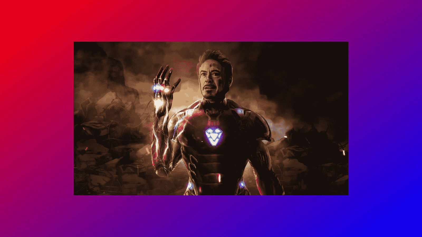
The background of the webpage to a specific image and uses the background-size property to cover the entire screen. Overall, this code creates an eye-catching and dynamic text effect that would be great for a landing page or title on a website.
Video Tutorial of Glowing Text
To see a live demonstration of the Glowing Text, Click Here. For a complete video guide on how the generator works, check out the accompanying YouTube video.
You might like this:
Glowing Text
HTML Part:
Create a new file with the name “index.html” and add the provide code to it. Ensure the file has a “.html” extension.
<!DOCTYPE html>
<html lang="en">
<head>
    <meta charset="UTF-8">
    <meta http-equiv="X-UA-Compatible" content="IE=edge">
    <meta name="viewport" content="width=device-width, initial-scale=1.0">
    <link rel="stylesheet" href="style.css">
    <title>Glowing Text Effects</title>
</head>
<body>
    <h1>
        <span>C</span>
        <span>o</span>
        <span>d</span>
        <span>e</span>
        <span>_</span>
        <span>H</span>
        <span>a</span>
        <span>c</span>
        <span>k</span>
    </h1>
</body>
</html>
This code creates a webpage with a heading that displays “Code_Hack” in individual letters, and uses CSS to style it with a glowing effect. The webpage title is “Glowing Text Effects”.
CSS Part:
Create a new CSS file name “style.css” and copy the provide code into it. Ensure that the file has a “.css” extension.
* {
    margin: 0;
    padding: 0;
    box-sizing: border-box;
}

body {
    display: flex;
    justify-content: center;
    align-items: center;
    min-height: 100vh;
    background: url(bg.jpg);
    background-size: cover;
    background-position: center;
    font-family: 'Segoe UI', Tahoma, Geneva, Verdana, sans-serif;
    font-weight: 700;
}

h1 {
    margin: 0;
    padding: 0;
    color: transparent;
    font-size: 10em;
}

h1 span {
    animation: animate 1s linear infinite;
}

h1 span:nth-child(9n+1) {
    animation-delay: 0.5s;
}

h1 span:nth-child(9n+2) {
    animation-delay: 1.25s;
}

h1 span:nth-child(9n+5) {
    animation-delay: 1s;
}

h1 span:nth-child(9n+6) {
    animation-delay: 1.35s;
}

h1 span:nth-child(9n+7) {
    animation-delay: 1.8s;
}

@keyframes animate{
    0%, 100%{
        color: #fff;
        filter: blur(1px);
        text-shadow: 0 0 10px #00b3ff,
        0 0 20px #00b3ff,
        0 0 40px #00b3ff,
        0 0 60px #00b3ff,
        0 0 80px #00b3ff,
        0 0 100px #00b3ff,
        0 0 120px #00b3ff;
    }
}
The CSS code animates the text by applying a glowing effect on it using the “animation” and “keyframes” properties. It also uses the “filter” property to blur the text and creates a 3D effect by applying multiple shadows to the text using the “text-shadow” property.
This code actively creates a glowing text effect for the text “CODE_HACK” by wrapping each letter in a separate span element and using CSS animations and keyframe animations with staggered delays to create the wave pattern effect. The background of the page is also set to a specific image to enhance the visual appeal. It can be actively used for a landing page or as a title on a website.