
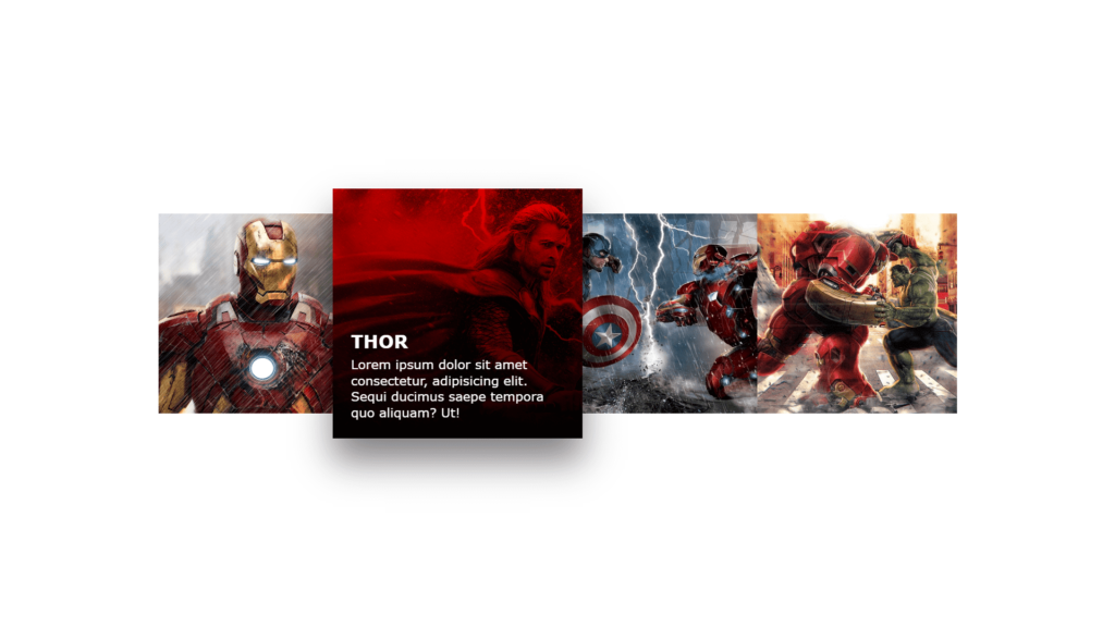
Hello Reader!, The code above is an HTML and CSS code that creates a grid of image hover effects. The images, along with their corresponding titles and descriptions, are contained within a “container” class and then organized using the “box” class. Each “box” contains an “imgBx” class for the image, and a “content” class for the title and description.
Firstly, the “imgBx” class includes a “::before” element that adds a linear gradient background color with a blend mode, creating a unique effect when hovered over. Furthermore, the “*” CSS selector sets default margins, padding, and box-sizing for all elements. Also, the “body” class centers the elements on the page and sets the minimum height to 100% of the viewport. In addition, the “container” and “box” classes organize the grid layout. Finally, this code creates a visually appealing and interactive image grid that would be great for showcasing a portfolio or a collection of products.
Video Tutorial of Image Hover Effect
To see a live demonstration of the Random Color Palette Generator, Click Here. For a complete video guide on how the generator works, check out the accompanying YouTube video.
You might like this:
Image Hover Effect
HTML Part:
Create a new file with the name “index.html” and add the provide code to it. Ensure the file has a “.html” extension.
<!DOCTYPE html>
<html lang="en">

<head>
    <meta charset="UTF-8">
    <meta http-equiv="X-UA-Compatible" content="IE=edge">
    <meta name="viewport" content="width=device-width, initial-scale=1.0">
    <link rel="stylesheet" href="style.css">
    <title>Image Hover Effects</title>
</head>

<body>
    <div class="container">
        <div class="box">
            <div class="imgBx">
                <img src="img1.jpg">
            </div>
            <div class="content">
                <div>
                    <h2>Iron Man</h2>
                    <p>Lorem ipsum dolor sit amet consectetur, adipisicing elit. Sequi ducimus saepe tempora quo
                        aliquam? Ut!</p>
                </div>
            </div>
        </div>
        <div class="box">
            <div class="imgBx">
                <img src="img2.jpg">
            </div>
            <div class="content">
                <div>
                    <h2>Thor</h2>
                    <p>Lorem ipsum dolor sit amet consectetur, adipisicing elit. Sequi ducimus saepe tempora quo
                        aliquam? Ut!</p>
                </div>
            </div>
        </div>
        <div class="box">
            <div class="imgBx">
                <img src="img3.jpg">
            </div>
            <div class="content">
                <div>
                    <h2>Captain America</h2>
                    <p>Lorem ipsum dolor sit amet consectetur, adipisicing elit. Sequi ducimus saepe tempora quo
                        aliquam? Ut!</p>
                </div>
            </div>
        </div>
        <div class="box">
            <div class="imgBx">
                <img src="img4.jpg">
            </div>
            <div class="content">
                <div>
                    <h2>Hulk</h2>
                    <p>Lorem ipsum dolor sit amet consectetur, adipisicing elit. Sequi ducimus saepe tempora quo
                        aliquam? Ut!</p>
                </div>
            </div>
        </div>
    </div>
</body>

</html>
This code is for an HTML webpage that features “image hover effects.” The webpage is made up of a head section with meta information and a link to a CSS stylesheet, and a body section containing a container div with multiple child divs. Each child div has a class of “box” and contains an image with the class “imgBx” and a content div with an heading and a paragraph. The CSS styles the HTML and sets the layout of the page and styles the images and their respective content to have a hover effect, which changes the opacity of the images and their content when hovered over.
CSS Part:
Create a new CSS file name “style.css” and copy the provide code into it. Ensure that the file has a “.css” extension.
* {
    margin: 0;
    padding: 0;
    box-sizing: border-box;
    font-family: Verdana, Geneva, Tahoma, sans-serif;
}

body {
    display: flex;
    justify-content: center;
    align-items: center;
    min-height: 100vh;
}

.container {
    position: relative;
    width: 1100px;
    display: flex;
    flex-wrap: wrap;
}

.container .box {
    position: relative;
    width: 275px;
    height: 275px;
    background: #ccc;
    overflow: hidden;
    transition: 0.5s;
}

.container .box:hover {
    transform: scale(1.25);
    z-index: 1;
    box-shadow: 0 25px 40px rgba(0, 0, 0, 0.5);
}

.container .box .imgBx {
    position: absolute;
    top: 0;
    left: 0;
    width: 100%;
    height: 100%;
}

.container .box .imgBx::before {
    content: '';
    position: absolute;
    top: 0;
    left: 0;
    width: 100%;
    height: 100%;
    background: linear-gradient(180deg, #f00, #000);
    z-index: 1;
    mix-blend-mode: multiply;
    opacity: 0;
    transition: 0.5s;
}

.container .box:hover .imgBx::before {
    opacity: 1;
}

.container .box .imgBx img {
    position: absolute;
    top: 0;
    left: 0;
    width: 100%;
    height: 100%;
    object-fit: cover;
}

.container .box .content {
    position: absolute;
    top: 0;
    left: 0;
    width: 100%;
    height: 100%;
    z-index: 1;
    display: flex;
    padding: 20px;
    align-items: flex-end;
}

.container .box .content h2 {
    color: #fff;
    transform: translateY(200px);
    transition: 0.5s;
    text-transform: uppercase;
    margin-bottom: 5px;
    font-size: 20px;
}

.container .box .content p {
    color: #fff;
    transform: translateY(200px);
    transition: 0.5s;
    font-size: 14px;
}

.container .box:hover .content h2 {
    transform: translateY(0);
    transition-delay: 0.5s;
}

.container .box:hover .content p {
    transform: translateY(0);
    transition-delay: 0.5s;
}
This code is for an HTML webpage that features “image hover effects”. This webpage uses CSS to create an interactive hover effect for images and their respective content in a grid layout. The images scale and have a box-shadow and linear-gradient background when hovered over, and text content is also made visible.
The main-main CSS properties in this code are:
- The code applies the “transition” property to smoothly transition the changes in the CSS property values in classes such as “.container .box” and “.container .box .content h2”, resulting in smooth scaling, movement, and appearance of elements when hovered over.
- The CSS property “position” is use to position the elements in specific locations on the webpage in classes such as “.container”, “.container .box”, “.container .box .imgBx” and “.container .box .content” to create a grid layout.
- “transform” property is use to apply transformation to the elements. This property is use in classes such as “.container .box” and “.container .box .content h2” to scale the elements and translate them vertically.
- The “mix-blend-mode” property is use to create a unique effect by blending the background color of an element with the element behind it when hovered over. This property is applie to the class “.container .box .imgBx::before” to blend the background color with the image behind it, creating a unique effect when hovered over.
Summary:
The above code is an HTML and CSS code that creates a grid of image hover effects. When a user hovers over an image, it scales up and a box shadow appears. The code also includes a linear gradient background color that creates a unique effect when hovered over. The code uses the “container” and “box” classes to organize and create an interactive image grid that is visually appealing and can be use to display a portfolio or a collection of products.


