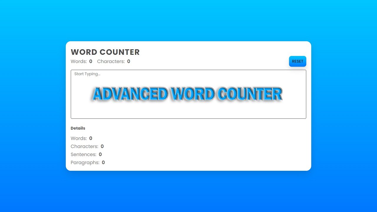
Hello Reader!, This code is a simple HTML and CSS code that creates an image overlay with a slide from the top effect.
In the body of the HTML, a div with class “container” is created which contains an image and a div with class “caption”. The “container” div has a width and height set, as well as a border radius and overflow hidden, while the image within it takes up the full width and height of the “container”.
The CSS stylesheet defines the overall look and behavior of the code. The body of the document is given display properties of “flex”, “justify-content” and “align-items” to center the content vertically and horizontally, with a minimum height set to “100vh” (the full height of the viewport).
The “container” div has a relative position and the image within it has a 0.5s transition effect. The “caption” div has absolute positioning and is 100% height/width with content center vertically and horizontally. The text is white with 0.5s transition and a background color of #22223b.
The “caption” div is initially hidden by translating it upwards by -100% using the “transform” property. On hover of the “container” div, the “caption” div will slide down from the top by translating it to 0, while the image within the “container” div will be translate upwards by 100%.
This code creates a visually appealing image overlay with a slide from the top effect that can be use on websites or in web projects.
Video Tutorial of Image Overlay Slide From Top
To see a live demonstration of theImage Overlay Slide From Top, Click Here. For a complete video guide on how the generator works, check out the accompanying YouTube video.
You might like this:
- Animated Image Pattern
- Background Change Animation
- Image Hover Effect
- QR Code Scanning Animation
- Slide from the Left Hover Effect
Image Overlay Slide From Top
HTML:
Create a new file with the name “index.html” and add the provided code to it. Ensure the file has a “.html” extension.
<!DOCTYPE html>
<html lang="en">
<head>
<meta charset="UTF-8">
<meta http-equiv="X-UA-Compatible" content="IE=edge">
<meta name="viewport" content="width=device-width, initial-scale=1.0">
<link rel="stylesheet" href="style.css">
<title>Image Overlay Slide from Top</title>
</head>
<body>
<div class="container">
<img src="img.jpg">
<div class="caption">
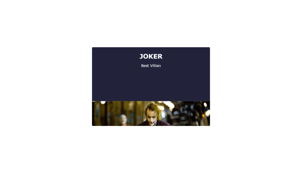
<h1>Joker</h1>
<p>Best Villian</p>
</div>
</div>
</body>
</html>This is an HTML code for creating a simple webpage that consists of an image and a caption. The code starts with the declaration of the document type and language, followed by the head of the document which includes meta information, a link to the stylesheet file and the title of the page.
The body of the document contains a div with a class of “container”. Within the “container” div, there is an image tag with a source of “img.jpg” and a div with a class of “caption”. The “caption” div contains two elements, an h1 tag with text “Joker” and a p tag with text “Best Villian”.
CSS:
Create a new CSS file named “style.css” and copy the provided code into it. Ensure that the file has a “.css” extension.
body {
    display: flex;
    justify-content: center;
    align-items: center;
    min-height: 100vh;
    font-family: Verdana, Geneva, Tahoma, sans-serif;
    overflow: hidden;
}

.container {
    position: relative;
    width: 600px;
    height: 400px;
    border-radius: 5px;
    overflow: hidden;
}

.container img {
    width: 100%;
    height: 100%;
    background-position: center;
    background-size: cover;
    transition: all 0.5s;
}

.caption {
    position: absolute;
    top: 0;
    left: 0;
    height: 100%;
    width: 100%;
    display: flex;
    flex-direction: column;
    justify-content: center;
    align-items: center;
    color: #fff;
    transition: all 0.5s;
    background: #22223b;
    transform: translateY(-100%);
}

.caption h1 {
    text-transform: uppercase;
    margin: 0;
}

.caption p {
    font-size: 18px;
    text-transform: capitalize;
}

.container:hover .caption {
    transform: translateY(0);
}

.container:hover img {
    transform: translateY(100%);
}
The CSS code provides styling for an HTML page that displays an image and its caption in a container. The body element is set to have display as flex and align and justify its content to center. Its minimum height is use to 100% of the view height and its font family is use to a specific font.
The .container class sets the container element to have a relative position, a width of 600px, a height of 400px, a border-radius of 5px, and sets its overflow property to hidden. The img element within the container has its width and height set to 100% and its background size is set to cover. It also has a transition of 0.5s for all properties.
The .caption class sets the caption element to be positioned absolutely, with its top and left properties set to 0, and its height and width set to 100%. It has display as flex, a flex direction of column, and align and justify its content to center. The text color is use to white and has a transition of 0.5s for all properties. The background color is use to #22223b and it has a translateY property of -100% to initially hide it. The h1 and p elements within the caption have specific styles applied to their text.
When the container is hovered over, the .container:hover .caption sets the transform property of the caption to translateY(0), causing it to become visible. The .container:hover img sets the transform property of the image to translateY(100%), causing it to move downwards and reveal the caption.
Summary:
This code is an HTML document with a CSS stylesheet for an image overlay slide from top. The body of the HTML document is center and has a font family set to Verdana. The .container class sets the position and size of the image and sets the overflow to hidden. The .container img class sets the size and background of the image. The .caption class sets the position, color, and font of the overlay text. The .container:hover .caption class sets the overlay text to slide from top on hover. The .container:hover img class sets the image to slide from top on hover.