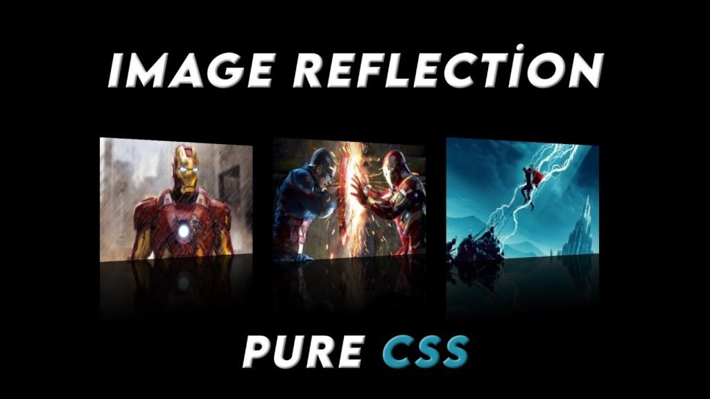
Hello Readers!, In this code, we are creating a reflection effect for images using pure CSS. This effect can be seen when hovering over the images and can add a dynamic and interactive touch to any website or project.
The first step is to set up the basic structure of the HTML document, which includes setting the character set, viewport, and linking the stylesheet. We have three images in the container that will be the focus of our reflection effect.
Next, in the CSS, we have set up a few basic styles for the body and container. The body has been use to display as flex, with justify-content and align-items set to center. This allows for the images to be center in the middle of the page. The container has been use to have a width of 1100px and a display of flex with a justify-content of space-between. This sets up the space between the images.
For the images themselves, we have used the -webkit-box-reflect property to create the reflection effect. The transform-origin has been use to center and the images have been use to rotate on the Y axis. A transition time of 0.5 seconds has been use so that the effect is not too abrupt.
Finally, when the container is hover over, the opacity of the images is use to 0.1. When the images are hover over, the transformation is use back to 0 degrees and the opacity is return to 1. This creates a smooth transition between the reflection and the image itself.
In conclusion, this code creates a visually appealing and dynamic effect for images. By using pure CSS, it is simple to implement and can enhance any project.
Video Tutorial of Image Reflection
To see a live demonstration of the Image Reflection, Click Here. For a complete video guide on how the generator works, check out the accompanying YouTube video.
Image Reflection Effects
HTML:
Create a new file with the name “index.html” and add the provided code to it. Ensure the file has a “.html” extension.
<!DOCTYPE html>
<html lang="en">

<head>
    <meta charset="UTF-8">
    <meta http-equiv="X-UA-Compatible" content="IE=edge">
    <meta name="viewport" content="width=device-width, initial-scale=1.0">
    <link rel="stylesheet" href="style.css">
    <title>Image Reflection Pure CSS</title>
</head>

<body>
    <div class="container">
        <img src="img1.jpg" alt="ironman">
        <img src="img2.jpg" alt="thor">
        <img src="img3.jpg" alt="captain">
    </div>
</body>

</html>
The body section of this code is where the heart of the image reflection effect lies. It is a simple and straightforward HTML structure that includes a container div and three images. The container div serves as the parent element for the images and is where the images are place.
The images are display using a source file and an alt attribute, providing a text description of the image if it cannot be display. The alt attribute is also an important aspect of accessibility and SEO, as it helps search engines understand the content of the image.
The simplicity of this code is what makes it so effective. The images are the main focus, and the body section makes sure that they are the center of attention. By keeping the HTML structure simple, it is easy to understand and implement, and the CSS stylesheet can do the rest of the work.
In conclusion, the body section of this code sets up the main structure for the image reflection effect, making it simple and straightforward for developers and designers to use.
CSS:
Create a new CSS file name “style.css” and copy the provide code into it. Ensure that the file has a “.css” extension.
* {
    margin: 0;
    padding: 0;
    box-sizing: border-box;
}

body {
    display: flex;
    justify-content: center;
    align-items: center;
    min-height: 100vh;
    background: #000;
}

.container {
    width: 1100px;
    display: flex;
    justify-content: space-between;
}

.container img {
    -webkit-box-reflect: below 1px linear-gradient(transparent, transparent, #0004);
    transform-origin: center;
    max-width: 350px;
    min-height: 250px;
    transform: perspective(800px) rotateY(20deg);
    transition: 0.5s;
}

.container:hover img {
    opacity: 0.1;
}

.container img:hover {
    transform: perspective(800px) rotateY(0deg);
    opacity: 1;
}
This code is a CSS stylesheet for creating an image reflection effect using pure CSS. The code starts with a universal selector that sets the margin, padding, and box-sizing to zero for all elements on the page.
The body section sets the display to flex, centers the content, sets minimum height to 100vh, and sets background to black. It sets up the basic layout for the images to be center and have a consistent black background.
The .container class sets up the container div as a flex container, with a width of 1100px and a justification of space-between. This creates a structure that places the images evenly apart, making sure that they have equal spacing between them.
The .container img selector sets up the styles for the images within the container. The -webkit-box-reflect property creates the reflection effect, with a linear gradient set up for the transparent, transparent, and black colors. The transform-origin, max-width, min-height, transform, and transition properties are also set up, creating a visually appealing rotation and transition effect.
The .container:hover img selector sets the opacity to 0.1 when hovering over the container, creating a fade effect for the images. The .container img:hover selector sets the transform and opacity properties when hovering over the images, creating a smooth transition back to their original position.
In conclusion, this code sets up the styles for creating a visually appealing image reflection effect, using pure CSS. The code is simple to understand and implement, making it a great option for developers and designers looking to add an attractive touch to their images.
Summary:
This code creates a reflection effect for images using pure CSS. The HTML document includes three images in a container with basic styles for the body and container set up in the CSS. The images have the -webkit-box-reflect property set up to create the reflection effect, with rotation and transition properties also set. The effect can be seen when hovering over the container and images, creating a visually appealing and dynamic effect.