
In this code snippet, we have a simple HTML structure creating a container to hold our loading animation. Inside this container, there’s a div element with the class “loader”, which will contain the animated lines representing the loading spinner. These lines are style and animated purely using CSS.
Now, diving into the CSS, the * selector resets the default margin, padding, and box-sizing for all elements to ensure consistent layout handling.
The .container class sets up the positioning for the loader. It’s set to occupy the entire viewport (position: fixed; top: 0; bottom: 0; left: 0; right: 0;), and the loader itself will be centered both horizontally and vertically (display: flex; justify-content: center; align-items: center;).
The .loader class defines the dimensions and positioning of the loader itself. It’s set to be a square with a size of 3.12rem, absolutely positione in the center of its container.
Each line of the loader animation is represented by a div with the class “line”. These lines are style to have a border, and they’re absolutely positione within the loader container. They are initially set to have a width of 0 and are positione at the bottom center of the loader.
The animation is achieved using keyframes (@keyframes) named lineAnimate. It alternates between two colors (#caf0f8 and #0096c7) to create the pulsating effect. Each line has a different delay (animation-delay) to create the rotating effect when the animation runs. The transform property is used to rotate and translate each line to its correct position within the loader.
Overall, this code creates a visually appealing loading spinner using only HTML and CSS, without the need for any JavaScript.
Video Tutorial of Loader Animation Using HTML & Pure CSS:
To witness a live showcase of Loader Animation, please click here. To access a comprehensive video tutorial detailing the functionality of the generator, feel free to view the accompanying YouTube video.
You may like this:
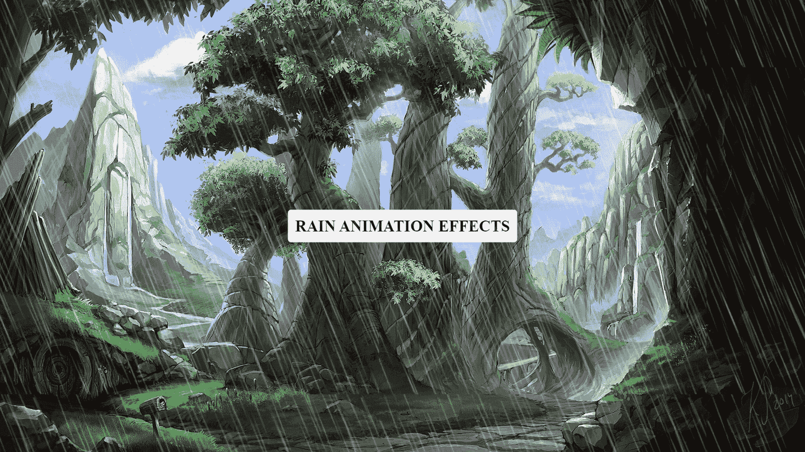
- Colorful Rain Animation Effects
- Random Color Palette Generator
- Word Counter
- Working Google Search Engine
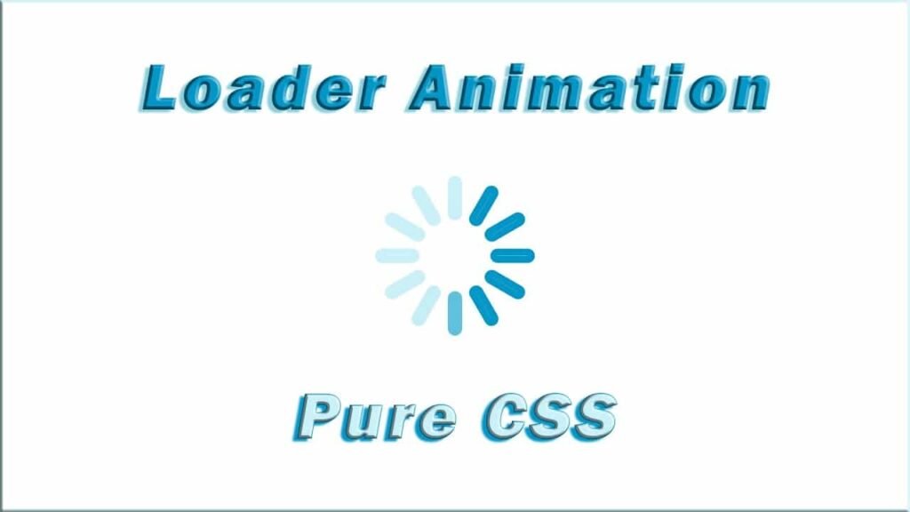
Loader Animation Using HTML & Pure CSS
HTML:
Create a new file with the name “index.html” and add the provided code to it. Ensure the file has a “.html” extension.
<!DOCTYPE html>
<html lang="en">
<head>
    <meta charset="UTF-8">
    <meta http-equiv="X-UA-Compatible" content="IE=edge">
    <meta name="viewport" content="width=device-width, initial-scale=1.0">
    <title>Pure CSS Loader</title>
    <link rel="stylesheet" href="style.css">
</head>
<body>
    <div class="container">
        <div class="loader">
          <div class="line"></div>
          <div class="line"></div>
          <div class="line"></div>
          <div class="line"></div>
          <div class="line"></div>
          <div class="line"></div>
          <div class="line"></div>
          <div class="line"></div>
          <div class="line"></div>
          <div class="line"></div>
          <div class="line"></div>
          <div class="line"></div>
        </div>
      </div>
</body>
</html>
This HTML code represents the structure of a loading spinner animation. Let’s break it down:
<div class="container">: Thisdivserves as a container for the entire loading animation. It helps with positioning the loader in the center of the viewport.<div class="loader">: Inside the container, there’s anotherdivwith the class “loader”. Thisdivis where the actual loading animation takes place.<div class="line"></div>(repeated 12 times): These are the individual lines that constitute the loading spinner. Eachdivwith the class “line” represents one line of the spinner. These lines will be style and animated to create the spinning effect.
So essentially, this HTML structure sets up a container for the loading animation and then creates the loading animation itself using multiple lines (represented by div elements with the class “line”) nested within the loader container.
CSS:
* {
    margin: 0;
    padding: 0;
    box-sizing: border-box;
}
.container {
    position: fixed;
    top: 0;
    bottom: 0;
    left: 0;
    right: 0;
    margin: auto;
    display: flex;
    justify-content: center;
    align-items: center;
}
.loader {
    height: 3.12rem;
    width: 3.12rem;
    position: absolute;
    top: 0;
    bottom: 0;
    left: 0;
    right: 0;
    margin: auto;
}
.loader .line {
    height: 50%;
    width: 0;
    border: 0.25rem solid #caf0f8;
    position: absolute;
    left: 0;
    right: 0;
    margin: auto;
    transform-origin: bottom;
    border-radius: 0.62rem;
    animation: lineAnimate 2s ease-in-out infinite alternate;
}
.loader .line:nth-child(1) {
    transform: rotate(30deg) translatey(-20px);
    animation-delay: 0.16s;
}
.loader .line:nth-child(2) {
    transform: rotate(60deg) translatey(-20px);
    animation-delay: 0.33s;
}
.loader .line:nth-child(3) {
    transform: rotate(90deg) translatey(-20px);
    animation-delay: 0.5s;
}
.loader .line:nth-child(4) {
    transform: rotate(120deg) translatey(-20px);
    animation-delay: 0.66s;
}
.loader .line:nth-child(5) {
    transform: rotate(150deg) translatey(-20px);
    animation-delay: 0.83s;
}
.loader .line:nth-child(6) {
    transform: rotate(180deg) translatey(-20px);
    animation-delay: 1s;
}
.loader .line:nth-child(7) {
    transform: rotate(210deg) translatey(-20px);
    animation-delay: 1.16s;
}
.loader .line:nth-child(8) {
    transform: rotate(240deg) translatey(-20px);
    animation-delay: 1.33s;
}
.loader .line:nth-child(9) {
    transform: rotate(270deg) translatey(-20px);
    animation-delay: 1.5s;
}
.loader .line:nth-child(10) {
    transform: rotate(300deg) translatey(-20px);
    animation-delay: 1.66s;
}
.loader .line:nth-child(11) {
    transform: rotate(330deg) translatey(-20px);
    animation-delay: 1.83s;
}
.loader .line:nth-child(12) {
    transform: rotate(360deg) translatey(-20px);
    animation-delay: 2s;
}
@keyframes lineAnimate {
    0%, 40% {
        border-color: #caf0f8;
   }
    60%, 100% {
        border-color: #0096c7;
   }
}
This CSS code defines the styling and animation for the loading spinner created in the HTML code. Let’s go through it step by step:
*: This is a universal selector that targets all elements on the page.margin: 0;,padding: 0;: This removes any default margin and padding from all elements, ensuring consistent spacing.box-sizing: border-box;: This ensures that padding and border are include in the element’s total width and height, preventing layout issues.
.container: This class styles the container that holds the loading spinner.position: fixed;: It fixes the container position relative to the viewport.top: 0; bottom: 0; left: 0; right: 0;: This sets all edges of the container to 0, effectively centering it.margin: auto;: This centers the container horizontally.display: flex; justify-content: center; align-items: center;: This centers the content (the loading spinner) inside the container both vertically and horizontally using flexbox.
.loader: This class styles the loading spinner itself.height: 3.12rem; width: 3.12rem;: Sets the dimensions of the spinner to be a square with a side length of 3.12rem.position: absolute;: It positions the spinner absolutely within its container.top: 0; bottom: 0; left: 0; right: 0; margin: auto;: Centers the spinner within its container using absolute positioning.
.loader .line: This class styles each individual line of the spinner.height: 50%;: Each line takes up half of the spinner’s height.width: 0;: Initially, each line has no width.border: 0.25rem solid #caf0f8;: Sets the border style for each line.position: absolute;: Positions each line absolutely within its parent.loader.transform-origin: bottom;: Sets the transformation origin to the bottom of each line.border-radius: 0.62rem;: Gives the lines rounded ends.animation: lineAnimate 2s ease-in-out infinite alternate;: Applies the animation namedlineAnimateto each line, making them pulse back and forth indefinitely.
@keyframes lineAnimate: This defines the keyframes for the animation applied to each line.0%, 40% { border-color: #caf0f8; }: At the start and during the first 40% of the animation, the border color is set to #caf0f8.60%, 100% { border-color: #0096c7; }: From 60% to the end of the animation, the border color changes to #0096c7, creating the pulsating effect.
The nth-child selectors with different rotation angles and animation delays create the spinning effect by positioning each line at specific angles and staggering their animation start times.
Summary:
This HTML and CSS code snippet creates a pure CSS loader animation. The loader consists of twelve lines, each representing a segment of the loader. These lines rotate and change color in an alternating manner, giving the impression of movement. The loader is center on the page using flexbox and positioned absolutely within a container. Each line has a specific rotation and animation delay to achieve the desired spinning effect.
