
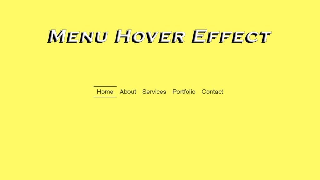
In this article, we will be discussing a simple yet elegant hover effect for a menu. This effect can be add to any menu to make it visually appealing and interactive. The code used in this tutorial is written in HTML and CSS. The code can be easily understood and customized to meet specific needs.
The HTML code for this hover effect is very simple. It is just a basic unorder list that contains links for different pages on the website. The links are wrappe in list items and each list item is containe within an unordered list tag.
The CSS code is what makes this hover effect possible. The first few lines of code set up the background color, font, and position of the menu. The unordered list tag has its display property set to “flex” so that the list items will align vertically in a row.
Next, the list items are given the property of “list-style: none” so that there will not be any bullets in front of the links. The links themselves have the text-decoration property use to “none” so that they are not underline.
The next section of code sets up the hover effect. The ::before and ::after pseudo-elements are use to create two lines that run along the top and bottom of the link. When the mouse hovers over the link, the lines are transform from a scale of 0 to 1, creating a visual effect.
In conclusion, this hover effect is a great way to add some interactivity and visual interest to a menu. The code is easy to understand and can be customize to meet specific needs. Whether you are a beginner or an experienced developer, this hover effect is a great project to add to your portfolio.
Video Tutorial of Menu Hover Effect
To see a live demonstration of the Menu Hover Effect, Click Here. For a complete video guide on how the generator works, check out the accompanying YouTube video.
Menu Hover Effect
HTML:
Create a new file with the name “index.html” and add the provided code to it. Ensure the file has a “.html” extension.
<!DOCTYPE html>
<html lang="en">

<head>
    <meta charset="UTF-8">
    <meta http-equiv="X-UA-Compatible" content="IE=edge">
    <meta name="viewport" content="width=device-width, initial-scale=1.0">
    <link rel="stylesheet" href="style.css">
    <title>Menu Hover Effect</title>
</head>

<body>
    <ul>
        <li><a href="#">Home</a></li>
        <li><a href="#">About</a></li>
        <li><a href="#">Services</a></li>
        <li><a href="#">Portfolio</a></li>
        <li><a href="#">Contact</a></li>
    </ul>
</body>

</html>
This is an HTML code for a basic website that consists of a navigation menu.
The <body> tag contains the content of the document, which in this case is a navigation menu consisting of an unordered list <ul> containing five list items <li>. Each list item contains a link <a> with a corresponding href attribute that specifies the URL of the page to be linked to.
The <a> tag defines a hyperlink to another web page or to a specific location within the same page. The text between the opening and closing <a> tags is displayed as a clickable link.
CSS:
Create a new CSS file name “style.css” and copy the provide code into it. Ensure that the file has a “.css” extension.
body{
    display: flex;
    justify-content: center;
    align-items: center;
    min-height: 100vh;
    background: #fffa65;
    font-family: sans-serif;
    overflow: hidden;
}

ul{
    padding: 0;
    margin: 0;
    display: flex;
    flex-wrap: wrap;
}
ul li{
    list-style: none;
}
ul li a{
    text-decoration: none;
    color: #3d3d3d;
    font-size: 30px;
    padding: 10px 15px;
    position: relative;
}
ul li a::before{
    content: '';
    position: absolute;
    top: 0;
    left: 0;
    width: 100%;
    height: 2px;
    background: #3d3d3d;
    transform: scaleX(0);
    transition: all 0.5s;
    transform-origin: left;
}
ul li a::after{
    content: '';
    position: absolute;
    bottom: 0;
    left: 0;
    width: 100%;
    height: 2px;
    background: #3d3d3d;
    transform: scaleX(0);
    transition: all 0.5s;
    transform-origin: right;
}
ul li a:hover::before, ul li a:hover::after{
    transform: scaleX(1);
}
This code sets up the CSS for a navigation menu on a webpage. The code uses CSS Flexbox to style and position the menu.
The first line sets up the body of the webpage, using the display property to set it as a flex container. The justify-content and align-items properties center the contents of the body vertically and horizontally. The min-height property sets the minimum height of the body to 100% of the viewport height, ensuring that the menu is always visible on the screen. The background color is use to #fffa65, and the font family is use to sans-serif. The overflow property is use to hidden, which prevents any overflow content from being visible.
The next section sets up the unordered list (ul) that contains the menu items. The padding and margin properties are use to 0 to remove any default space around the list. The display property is use to flex, and the flex-wrap property is use to wrap, which allows the menu items to wrap onto a new line if necessary.
The li elements are then style, with list-style set to none to remove the default bullet points. The links within each li are style using the a selector. The text-decoration property is use to none, which removes the underline from the links. The color is use to #3d3d3d and the font size is use to 30px. The padding is use to 10px 15px to provide some space around the links.
::before and ::after pseudo-elements:
The ::before and ::after pseudo-elements are use to add the underline effect to the links. The content property is use to an empty string, and the position property is use to absolute, which positions the pseudo-elements relative to the li element. The top and left properties are use to 0, which places the pseudo-elements at the top left corner of the li element. The width and height properties are use to 100% and 2px respectively, which creates a bar that spans the entire width of the li element. The background color is use to #3d3d3d.
The transform property is use to scale the bars, with the scaleX function setting the initial scale to 0. The transition property sets the animation to last 0.5 seconds, and the transform-origin property sets the origin for the transformation to either the left or right.
Finally, the hover effect is use up using the :hover pseudo-class. When the mouse hovers over the link, both the ::before and ::after pseudo-elements are scale to 1, which makes the bars visible.
Conclusion:
The code is for a simple website menu with a hover effect. The menu is center on the page and has a yellow background. The menu items are list in an unordered list and are style with a sans-serif font. When a menu item is hover over, two lines appear above and below the text, creating a highlighted effect. The hover effect is achieve through CSS transformations and transitions.


