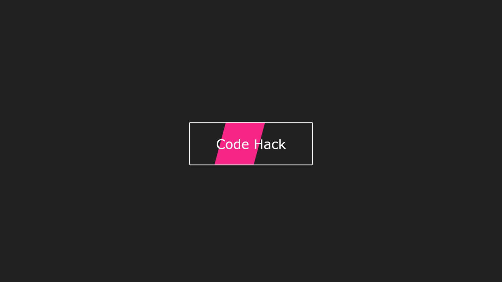
In this blog, You’ll learn how to create Rotation Button Interaction With HTML, CSS & JavaScript. In this project you’ll see The variable is currently assigned a value of “undefined” because no value has been assigned to it yet. You can assign a value to the variable later using the assignment operator (=). and In CSS, the transform-origin property sets the origin for an element’s transformations. It is used to specify the point of origin for transformations such as rotate, scale, or skew. The default value is “50% 50%”, which means that the origin is the center of the element. You can also set specific values for the horizontal and vertical origins, such as “left top” or “20px 40px”.
Where value can be any of the following:
- keywords (e.g. “top”, “bottom”, “left”, “right”, “center”)
- length values (e.g. “20px”, “2em”)
- percentage values (e.g. “50%”, “20%”)
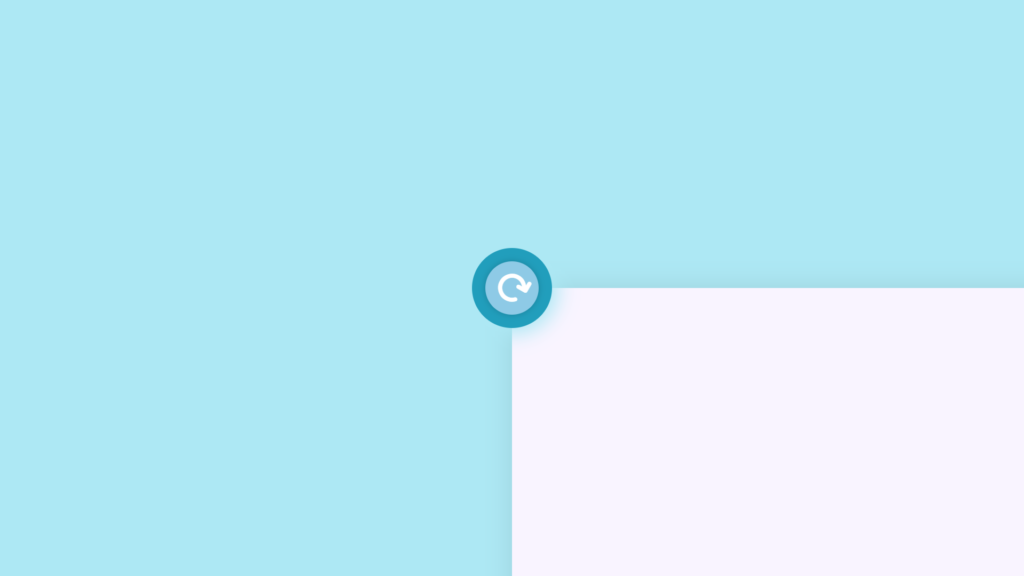
Video Tutorial of Rotation Button Interaction
To see a live demonstration of the Floating Text Animation, Click Here. For a complete video guide on how the generator works, check out the accompanying YouTube video.
Floating Text Animation
HTML:
Create a new file with the name “index.html” and add the provide code to it. Ensure the file has a “.html” extension.
<!DOCTYPE html>
<html lang="en">
<head>
    <meta charset="UTF-8">
    <meta http-equiv="X-UA-Compatible" content="IE=edge">
    <meta name="viewport" content="width=device-width, initial-scale=1.0">
    <title>Rotation Button Interaction</title>
    <link rel="stylesheet" href="./style.css">
    <link rel="stylesheet" href="https://cdnjs.cloudflare.com/ajax/libs/font-awesome/6.2.1/css/all.min.css" integrity="sha512-MV7K8+y+gLIBoVD59lQIYicR65iaqukzvf/nwasF0nqhPay5w/9lJmVM2hMDcnK1OnMGCdVK+iQrJ7lzPJQd1w==" crossorigin="anonymous" referrerpolicy="no-referrer" />
</head>
<body>
    <div class="btn">
        <span class="icon">
            <i class="fa-solid fa-arrow-rotate-right"></i>
        </span>
    </div>
    <div class="box"></div>
</body>
</html>
The body of this HTML document contains two main elements: a div with the class “btn” and a div with the class “box”.
The “btn” div serves as the button that the user interacts with. It contains a nested span element with the class “icon” which in turn contains an i element with classes “fa-solid” and “fa-arrow-rotate-right”. These classes are from Font Awesome library, which provides scalable vector icons that can be customized (size, color, shadow, etc.) using CSS. The icon used is an arrow that indicates it’s a button to rotate something.
The “box” div is an empty element that will be used to create a visual effect when the button is clicked. It doesn’t have any content but will be styled and transformed using CSS and JavaScript, respectively.
The two elements are positioned relative to each other in the HTML code and will work together to create the final interactive experience. The “btn” element, when clicked, will rotate and the “box” element will rotate as well, creating an illusion of a box rotating around the button. The CSS and JavaScript code work together to achieve this effect.
In summary, the body of this HTML document contains the basic structure for an interactive button that rotates an element on the page when clicked. The button is create using the Font Awesome library for the icon and the “box” element is use to create the visual effect of rotation. The final interactive experience is achiev through the combination of CSS and JavaScript code.
CSS:
Create a new CSS file name “style.css” and copy the provide code into it. Ensure that the file has a “.css” extension.
*{
    margin: 0;
    padding: 0;
    box-sizing: border-box;
}
body{
    display: flex;
    justify-content: center;
    align-items: center;
    min-height: 100vh;
    background: #ade8f4;
    overflow: hidden;
}
.btn{
    position: relative;
    width: 120px;
    height: 120px;
    background: #219ebc;
    border-radius: 50%;
    display: flex;
    justify-content: center;
    align-items: center;
    box-shadow: 0 0 30px 10px #ade8f4;
    cursor: pointer;
    transition: .5s cubic-bezier(0.175, 0.885, 0.32, 1.275);
}
.btn .icon{
    position: relative;
    width: 80px;
    height: 80px;
    background: #8ecae6;
    border-radius: 50%;
    display: flex;
    justify-content: center;
    align-items: center;
    box-shadow: 0 0 10px rgba(0, 0, 0, .2);
}
.btn .icon i{
    font-size: 3em;
    color: #fff;
    transform: rotate(30deg);
}
.box{
    position: absolute;
    bottom: -60%;
    left: 50%;
    width: 100vw;
    height: 110vh;
    background: #f9f4ff;
    z-index: -1;
    box-shadow: 0 0 40px rgba(0, 0, 0, .1);
    transition: .5s cubic-bezier(0.175, 0.885, 0.32, 1.275);
    transform-origin: top left;
}
This code applies CSS styles to elements in the HTML document. The first line sets properties for all elements, second line styles the body element, centering its content and setting background color and hiding overflow.
The next CSS block applies styles to the element with the class “btn”, including setting its size, background color, border-radius, and shadow. It also centers the content within the button and adds a cursor pointer and transition effect when hovered over.
The CSS styles the inner elements of the button, giving it a background color, border-radius, shadow, and centers its content. It also rotates the icon inside the button by 30 degrees.
This code is applying CSS styles to elements in the HTML document. The first line sets properties for all elements, and the second line styles the body element, centering its content and setting background color. The last CSS block styles the “box” element, positioning it behind other elements and hiding it by default, applies background color, shadow and transition effect, positioning it in the bottom left corner of the page.
JavaScript:
In between the <body></body> tags, you can include JavaScript code by enclosing it within <script> tags.
        const btn = document.querySelector('.btn');
        const box = document.querySelector('.box');
        let rotateValue = btn.style.transform;
        let rotateSumValue;
        btn.onclick = function(){
            rotateSumValue = rotateValue + "rotate(90deg)";
            btn.style.transform = rotateSumValue;
            box.style.transform = rotateSumValue;
            rotateValue =rotateSumValue;
        };
This code selects the elements with the class of “btn” and “box” from the HTML document using the querySelector method. It then creates a variable “rotateValue” that stores the current value of the “transform” property of the “btn” element. The onclick event is then assigned to the “btn” element, which triggers a function when the button is clicked. The function calculates the new value of the “transform” property by concatenating the current value stored in “rotateValue” with “rotate(90deg)”. This new value is then assign to both the “btn” and “box” elements’ “transform” property. Finally, the variable “rotateValue” is updat to store the new value.
Summary:
This code creates a web page with an interactive button that rotates an element when clicked using HTML, CSS, and JavaScript. The HTML defines the structure of the page with a button element and an empty element for visual effects. JavaScript adds interactivity by rotating the button and element by 90 degrees on click. CSS styles the button and element with position, size, color, and effects.