
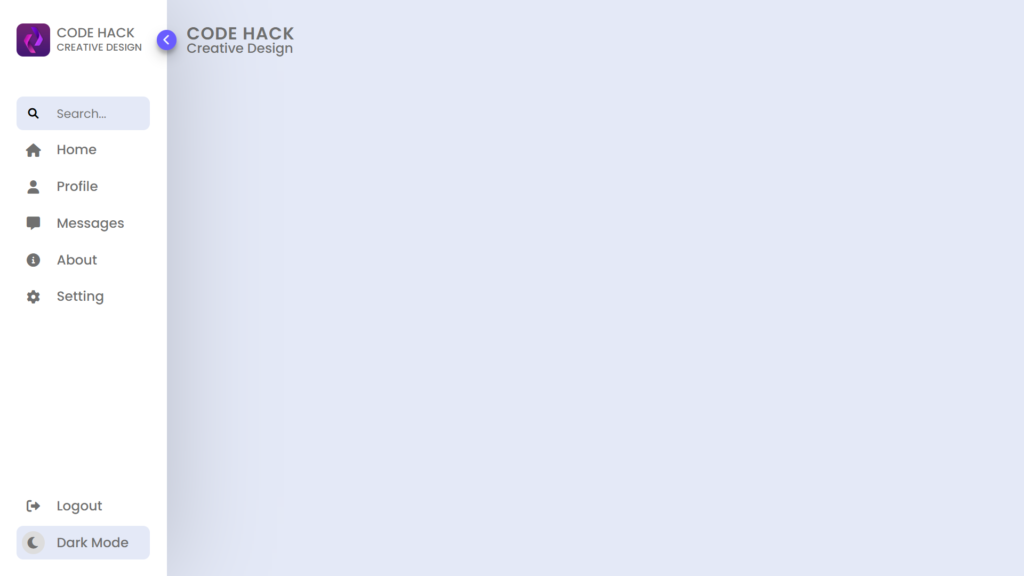
Hello Readers!, This code is an example of a sidebar menu using HTML, CSS, and JavaScript. The menu is designed with a logo, search bar, and various options such as “home,” “profile,” and “settings.” The menu also includes a toggle button to open and close the sidebar, as well as a dark mode feature that can be activated by clicking a switch.
The code sets up the HTML document and includes links to CSS stylesheets, including Font Awesome for icons.
The menu is structure using various HTML elements, including a nav, header, menu, and ul elements. Each menu option is represent by an li element and includes an icon, a link, and a span for the option text. The logo and search bar are also include in the menu.
The JavaScript code adds toggle and dark mode functionality to the HTML sidebar menu by selecting elements and adding event listeners to them. The toggle button opens/closes the sidebar by adding/removing the “active” class to the nav element, and the switch toggle changes the background and text color of the menu by adding/removing the “dark” class to the body element.
Overall, this code is a functional and visually pleasing example of a sidebar menu that can be use on a website. The use of CSS and JavaScript allows for a dynamic and interactive experience for the user.
Video Tutorial of Responsive Sidebar Menu Dark & Light Mode
To see a live demonstration of the Sidebar Menu Dark & Light Mode, Click Here. For a complete video guide on how the generator works, check out the accompanying YouTube video.
Sidebar Menu Dark & Light Mode
HTML:
Create a new file with the name “index.html” and add the provide code to it. Ensure the file has a “.html” extension.
<!DOCTYPE html>
<html lang="en">

<head>
    <meta charset="UTF-8">
    <meta http-equiv="X-UA-Compatible" content="IE=edge">
    <meta name="viewport" content="width=device-width, initial-scale=1.0">
    <title>Sidebar Menu</title>
    <link rel="stylesheet" href="./style.css">
    <link rel="stylesheet" href="https://cdnjs.cloudflare.com/ajax/libs/font-awesome/6.1.2/css/all.min.css" />
</head>

<body>
    <section>
        <nav>
            <header>
                <div class="imgBx">
                    <img src="./logo.jpg" alt="logo">
                    <h3>code hack<br><span>creative design</span></h3>
                </div>
                <div class="toggle">
                    <i class="fa-solid fa-chevron-right"></i>
                    <i class="fa-solid fa-chevron-left"></i>
                </div>
            </header>
            <menu>
                <ul>
                    <li>
                        <i class="fa-solid fa-magnifying-glass"></i>
                        <input type="text" placeholder="Search...">
                    </li>
                    <li>
                        <a href="#">
                            <i class="fa-solid fa-house"></i>
                            <span>home</span>
                        </a>
                    </li>
                    <li>
                        <a href="#">
                            <i class="fa-solid fa-user"></i>
                            <span>profile</span>
                        </a>
                    </li>
                    <li>
                        <a href="#">
                            <i class="fa-solid fa-message"></i>
                            <span>messages</span>
                        </a>
                    </li>
                    <li>
                        <a href="#">
                            <i class="fa-solid fa-circle-info"></i>
                            <span>about</span>
                        </a>
                    </li>
                    <li>
                        <a href="#">
                            <i class="fa-solid fa-gear"></i>
                            <span>setting</span>
                        </a>
                    </li>
                </ul>
                <div class="mode">
                    <div class="icon">
                        <a href="#">
                            <i class="fa-solid fa-right-from-bracket"></i>
                            <span>logout</span>
                        </a>
                    </div>
                    <div class="dayNight">
                        <div class="switch">
                            <div class="iconBx">
                                <i class="fa-solid fa-moon"></i>
                                <i class="fa-solid fa-sun"></i>
                            </div>
                        </div>
                        <span class="switchText">dark mode</span>
                    </div>
                </div>
            </menu>
        </nav>
        <main>
            <h2>code hack<br><span>creative design</span></h2>
        </main>
    </section>
</body>

</html>
The body of this code is where the structure and layout of the sidebar menu is define. The code uses various HTML elements such as a section, nav, header, menu, and ul elements to create the structure of the menu.
The nav element includes a header with a logo, toggle button, and menu with a search bar and options such as “home,” “profile,” and “settings.” The options are in li elements, each with an icon, link, and span for text. The menu also has a dark mode switch and text that can be active by clicking it.
The main element is also include in the body of the code, which contains a heading displaying the name of the menu.
Overall, the body of this code is responsible for creating the layout and structure of the sidebar menu, and it uses various HTML elements and CSS styles to create a visually pleasing and interactive user experience.
CSS:
Create a new CSS file name “style.css” and copy the provide code into it. Ensure that the file has a “.css” extension.
:root {
    --body-color: #E4E9F7;
    --sidebar-color: #FFF;
    --primary-color: #695CFE;
    --primary-color-light: #F6F5FF;
    --toggle-color: #DDD;
    --text-color: #707070;
    --transition: all .3s ease;
    --transition1: all .5s ease;
}

* {
    margin: 0;
    padding: 0;
    box-sizing: border-box;
    font-family: Poppins;
}
body {
    min-height: 100vh;
    background: var(--body-color);
    transition: var(--transition1);
}
body.dark {
    --body-color: #18191a;
    --sidebar-color: #242526;
    --primary-color: #3a3b3c;
    --primary-color-light: #3a3b3c;
    --toggle-color: #fff;
    --text-color: #ccc;
}
section {
    position: relative;
    width: 100%;
    height: 100vh;
    display: flex;
}
section nav {
    position: relative;
    width: 250px;
    height: 100%;
    background: var(--sidebar-color);
    padding: 25px;
    transition: var(--transition1);
    box-shadow: 0 2px 150px rgba(0, 0, 0, .2);
}
section nav header {
    position: relative;
    width: 100%;
    height: 70px;
    display: flex;
    justify-content: center;
    align-items: center;
}
section nav header .imgBx {
    position: relative;
    width: 100%;
    display: flex;
    align-items: center;
    overflow: hidden;
}

section nav header .imgBx img {
    position: relative;
    width: 50px;
    height: 50px;
    object-fit: cover;
    cursor: pointer;
    margin-right: 10px;
    border-radius: 10px;
}
section nav header h3 {
    color: var(--text-color);
    font-size: 20px;
    font-weight: 500;
    text-transform: uppercase;
    line-height: 20px;
    transition: var(--transition1);
}
section nav header h3 span {
    white-space: nowrap;
    font-size: 15px;
}
section nav.active header h3 {
    opacity: 0;
}

section nav header .toggle {
    position: absolute;
    right: -40px;
    width: 30px;
    height: 30px;
    background: var(--primary-color);
    border-radius: 50%;
    cursor: pointer;
    display: flex;
    justify-content: center;
    align-items: center;
    box-shadow: rgba(0, 0, 0, 0.19) 0px 10px 20px, rgba(0, 0, 0, 0.23) 0px 6px 6px;
}

section nav.active {
    width: 100px;
}

section nav header .toggle i {
    color: var(--primary-color-light);
    animation: animToggle .5s ease;
    filter: drop-shadow(0px 1px 3px 1px rgba(60, 64, 67, 0.15));
}
body.dark nav header .toggle i{
    color: var(--text-color);
}
section nav header .toggle i:nth-child(1) {
    display: none;
}

section nav.active header .toggle i:nth-child(2) {
    display: none;
}

section nav.active header .toggle i:nth-child(1) {
    display: block;
}

@keyframes animToggle {
    0% {
        opacity: 0;
    }

    100% {
        opacity: 1;
    }
}

section nav menu {
    position: relative;
    width: 100%;
    height: calc(100% - 70px);
    overflow: hidden;
    display: flex;
    justify-content: space-between;
    flex-direction: column;
}

section nav menu ul {
    position: relative;
    width: 100%;
    margin-top: 50px;
}

section nav menu ul li {
    position: relative;
    width: 100%;
    height: 50px;
    margin-bottom: 5px;
    display: flex;
    align-items: center;
    border-radius: 10px;
    overflow: hidden;
}

section nav menu ul li:first-child {
    background: var(--body-color);
}

section nav menu ul li:first-child .fa-magnifying-glass {
    position: relative;
    width: 50px;
    min-width: 50px;
    height: 50px;
    display: flex;
    justify-content: center;
    align-items: center;
    margin-right: 10px;
    cursor: pointer;
}
body.dark menu ul li:first-child .fa-magnifying-glass{
    color: var(--text-color);
}
section nav menu ul li:first-child input {
    position: relative;
    width: calc(100% - 50px);
    padding-right: 15px;
    background: transparent;
    outline: none;
    border: none;
    font-size: 18px;
    transition: var(--transition);
    color: var(--text-color);
}

section nav.active menu ul li:first-child input {
    opacity: 0;
}

section nav menu ul li a {
    position: relative;
    width: 100%;
    height: 100%;
    text-decoration: none;
    display: flex;
    align-items: center;
    transition: var(--transition1);
    overflow: hidden;
}

section nav menu ul li a:hover {
    background: var(--primary-color);
    color: var(--primary-color-light);
}

section nav menu ul li a i.fa-solid {
    position: relative;
    width: 50px;
    min-width: 50px;
    height: 50px;
    margin-right: 10px;
    font-size: 20px;
    color: var(--text-color);
    display: flex;
    justify-content: center;
    align-items: center;
    transition: var(--transition);
}

section nav menu ul li a span {
    font-size: 20px;
    text-transform: capitalize;
    font-weight: 500;
    color: var(--text-color);
    transition: var(--transition);
}
section nav menu ul li a:hover i.fa-solid,
section nav menu ul li a:hover span {
    color: var(--primary-color-light);
}
body.dark menu ul li a:hover i.fa-solid,
body.dark menu ul li a:hover span{
    color: var(--text-color);
}
section nav.active menu ul li a span {
    opacity: 0;
}
section nav menu .mode {
    position: relative;
    width: 100%;
}
section nav menu .mode .icon {
    position: relative;
    width: 100%;
    height: 50px;
    margin-bottom: 5px;
    border-radius: 10px;
    transition: var(--transition);
    overflow: hidden;
}

section nav menu .mode .icon:hover {
    background: var(--primary-color);
}
section nav menu .mode .icon a {
    position: relative;
    width: 100%;
    height: 100%;
    display: flex;
    align-items: center;
    text-decoration: none;
}
section nav menu .mode .icon a i.fa-solid {
    position: relative;
    width: 50px;
    min-width: 50px;
    height: 50px;
    display: flex;
    justify-content: center;
    align-items: center;
    margin-right: 10px;
    font-size: 20px;
    color: var(--text-color);
    transition: var(--transition);
}
section nav menu .mode .icon a span {
    font-size: 20px;
    text-transform: capitalize;
    font-weight: 500;
    color: var(--text-color);
    transition: var(--transition);
}

section nav menu .mode .icon:hover a i.fa-solid,
section nav menu .mode .icon:hover a span {
    color: var(--primary-color-light);
}
body.dark menu .mode .icon:hover a i.fa-solid,
body.dark menu .mode .icon:hover a span{
    color: var(--text-color);
}
section nav.active menu .mode .icon a span {
    opacity: 0;
}
section nav menu .mode .dayNight {
    position: relative;
    width: 100%;
    height: 50px;
    background: var(--body-color);
    border-radius: 10px;
    display: flex;
    align-items: center;
}

section nav menu .mode .dayNight .switch {
    position: relative;
    width: 50px;
    min-width: 50px;
    height: 50px;
    margin-right: 10px;
    display: flex;
    justify-content: center;
    align-items: center;
}

section nav menu .mode .dayNight .switch .iconBx {
    position: relative;
    width: 35px;
    height: 35px;
    background: var(--toggle-color);
    display: flex;
    justify-content: center;
    align-items: center;
    border-radius: 50%;
    cursor: pointer;
    overflow: hidden;
}
section nav menu .mode .dayNight .switch .iconBx i.fa-solid{
    position: absolute;
    font-size: 20px;
    color: var(--text-color);
    animation: animToggle 1s ease;
    transition: var(--transition);
}
section nav menu .mode .dayNight span {
    font-size: 20px;
    text-transform: capitalize;
    font-weight: 500;
    color: var(--text-color);
    white-space: nowrap;
    transition: var(--transition1);
}

 section nav.active menu .mode .dayNight span {
    opacity: 0;
}

section nav menu .mode .dayNight .switch .iconBx i.fa-solid:last-child{
    transform: translateX(30px);
    color: var(--primary-color-light);
}
body.dark .mode .dayNight .switch .iconBx i.fa-solid:first-child{
    transform: translateX(-30px);
}
body.dark .mode .dayNight .switch .iconBx i.fa-solid:last-child{
    transform: translateX(0);
}
section main{
    padding: 40px 30px;
}
section main h2{
    color: var(--text-color);
    font-size: 26px;
    font-weight: 600;
    line-height: 20px;
    text-transform: uppercase;
    letter-spacing: 1px;
}
section main h2 span{
    color: var(--text-color);
    font-size: 20px;
    font-weight: 500;
    text-transform: capitalize;
    letter-spacing: 0;
}
This code is an example of a CSS stylesheet for a sidebar menu. It uses CSS variables, also known as “CSS custom properties,” to define various design elements such as colors, typography, and transitions.
The code defines CSS variables at the root level for various colors and transition effects used in the stylesheet. These include the background color of the body, the color of the sidebar, the primary color of the menu, and others.
The code styles the menu using CSS selectors and properties. The “body” selector sets the page background color. The “section nav” selector sets the sidebar’s width, height, background color, and other properties.
The code uses JavaScript for interactive sidebar, CSS for animations, and CSS variables for dynamic effects such as toggle button and dark mode.
This CSS code defines the visual appearance of the sidebar menu, including layout, colors, typography, and interactive elements. CSS variables make the code organized and maintainable for future design changes.
JavaScript:
In between the <body></body> tags, you can include JavaScript code by enclosing it within <script> tags.
        const activeToggle = document.querySelector('.toggle');
        const body = document.querySelector('body');
        const nav = document.querySelector('nav');
        const faMagnifyingGlass = document.querySelector('.fa-magnifying-glass');
        const switchBx = document.querySelector('.switch');
        const switchText = document.querySelector('.switchText');

        activeToggle.addEventListener('click', () => {
            nav.classList.toggle('active');
        });
        faMagnifyingGlass.addEventListener('click', () => {
            nav.classList.remove('active');
        });
        switchBx.addEventListener("click", () => {
            body.classList.toggle("dark");

            if (body.classList.contains("dark")) {
                switchText.innerText = "light mode";
                switchText.style.transition = '.5s ease';
            } else {
                switchText.innerText = "dark mode";
                switchText.style.transition = '.5s ease'
            }
        });
This code is an example of JavaScript that is use to add interactive functionality to the sidebar menu. The code uses JavaScript’s Document Object Model (DOM) API to access and manipulate HTML elements on the page.
The code starts by declaring a set of variables that store references to specific HTML elements on the page. These elements include the toggle button, the body, the sidebar menu, the search icon, the switch, and the switch text.
The code then uses the addEventListener() method to attach event handlers to the HTML elements. The first event handler is attached to the toggle button, and it uses the click event to toggle the ‘active’ class on the sidebar menu, which is used to open and close the menu.
The second event handler is attached to the search icon, and it uses the click event to remove the ‘active’ class from the sidebar menu when the search icon is clicked.
The third event handler is attached to the switch, and it uses the click event to toggle the “dark” class on the body of the page, which is used to enable dark mode. If “dark” class is present, switchText will change to “light mode,” else it will change to “dark mode.”
Summary:
This code creates a responsive sidebar menu using HTML, CSS, and JavaScript. The menu includes a logo, search bar, and various options such as “home,” “profile,” and “settings.” The menu has a toggle button for the sidebar and a dark mode switch. The code uses CSS for styling and JavaScript for the toggle and dark mode functionality. Overall, this code creates a functional and visually pleasing sidebar menu that can be use on a website.

