
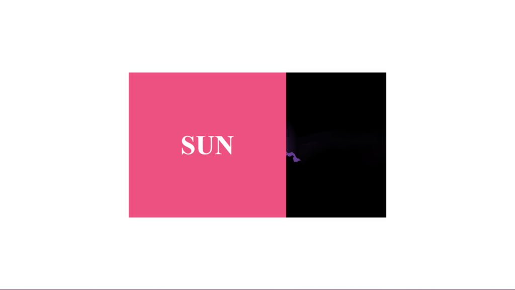
Hello Readers!, This code creates a simple hover effect where a text “sun” slides in from the left when the cursor hovers over an image of the sun. The HTML structure consists of a container div that holds the image and a nested div for the slide effect. The CSS uses absolute positioning to place the slide div at the bottom of the container and sets its width to 0 by default.
When the cursor hovers over the container, the width of the slide div is set to 100% using the :hover pseudo-class, creating the sliding effect. The text within the slide div is also positioned and styled to be centered within the slide. This effect can be easily modified to slide in from a different direction or to trigger on a different event.
Video Tutorial of Slide from the Left Hover Effect
To see a live demonstration of the Slide from the Left, Click Here. For a complete video guide on how the generator works, check out the accompanying YouTube video.
Slide from the Left
HTML:
Create a new file with the name “index.html” and add the provide code to it. Ensure the file has a “.html” extension.
<!DOCTYPE html>
<html lang="en">

<head>
    <meta charset="UTF-8">
    <meta http-equiv="X-UA-Compatible" content="IE=edge">
    <meta name="viewport" content="width=device-width, initial-scale=1.0">
    <title>Slide from the left hover effect</title>
    <link rel="stylesheet" href="style.css">
</head>

<body>
    <div class="container">
        <img src="img.jpg" alt="sun">
        <div class="slide">
            <div class="text">sun</div>
        </div>
    </div>
</body>

</html>
The body section of this code is where the main content of the webpage is place. In this particular example, the body contains a header element with a div containing a heading text.
In this example, the body section has a header element with a div inside it containing a heading text. The header element can be use to define a container for introductory content or a set of navigation links. The div element is a container that can be use to group elements together and apply styles to them. The heading text is contain within an h3 tag, which is use to define a level-three heading in HTML.
In this example, the body section is the main content area of the webpage, it would contain various elements like images, text, and links. It is one of the most important sections of an HTML document.
CSS:
Create a new CSS file name “style.css” and copy the provide code into it. Ensure that the file has a “.css” extension.
* {
    margin: 0;
    padding: 0;
    box-sizing: border-box;
}

body {
    display: flex;
    justify-content: center;
    align-items: center;
    min-height: 100vh;
}

.container {
    position: relative;
    width: 50%;
}

.container img {
    display: block;
    width: 100%;
    height: auto;
}

.container .slide {
    position: absolute;
    bottom: 0;
    right: 0;
    left: 0;
    background: #ED5181;
    overflow: hidden;
    width: 0;
    height: 100%;
    transition: 0.5s ease-in-out;
}

.container:hover .slide {
    width: 100%;
}

.container .slide .text {
    color: #fff;
    font-size: 5em;
    font-weight: 700;
    text-transform: uppercase;
    position: absolute;
    top: 50%;
    left: 50%;
    transform: translate(-50%, -50%);
    white-space: nowrap;
}
This code is a CSS stylesheet that is use to style an HTML webpage. The first line of code, “* { margin: 0; padding: 0; box-sizing: border-box; }” is a global CSS rule that sets the margin, padding, and box-sizing properties for all elements on the webpage to 0 and border-box respectively. This rule is typically use to reset the default styles of the browser and ensure consistency across different browsers.
The next CSS rule, “body { display: flex; justify-content: center; align-items: center; min-height: 100vh; }” sets the display property of the body element to flex, which allows for the use of flexbox layout. The justify-content and align-items properties are use to center the elements within the body vertically and horizontally respectively. The min-height property is use to 100vh, which stands for 100% of the viewport height.
The CSS rules starting with “.container { position: relative; width: 50%; }” and ending with “.container .slide .text { color: #fff; font-size: 5em; font-weight: 700; text-transform: uppercase; position: absolute; top: 50%; left: 50%; transform: translate(-50%, -50%); white-space: nowrap; }” styles the element with the class “container” and its child elements.
The container element has 50% width and relative positioning. Its child img has block display, auto width/height, and class “slide” has absolute positioning, 100% width/height, and a background color of #ED5181. On hover, the class “slide” width becomes 100%. The text inside “slide” has white color, 5em font-size, 700 font-weight, uppercase text-transform, absolute position, centered top/left via translate, and no wrap white-space.
Summary:
This code is an HTML and CSS that creates a slide-from-left hover effect. It has a container div with an image and a slide div, and CSS that sets default properties, positions the slide element, creates hover effect, and styles text. It creates an image with an overlay and text appearing on hover.

