
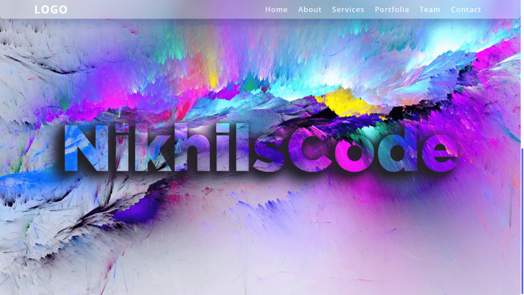
Hello Reader!, In this blog we are create a Sticky Navbar with Parallax Effect using HTML, CSS & JavaScript.
The body of the HTML code includes the header element, which contains a logo and a navigation menu. The navigation menu is made up of unordered lists and links to different sections of the webpage. A toggle button is also included in the header, which allows the navigation menu to be hidden or shown on smaller screens.
Two div elements with the class imgBx and imgBx1 are also included in the body of the HTML code. These elements create the parallax effect on the webpage. The imgBx div is set to be fixed, so it remains in place as the user scrolls. The imgBx1 div is set to be absolute, so it moves up as the user scrolls, giving the impression of a parallax effect.
The JavaScript code adds “sticky” class to header on scroll. This changes navigation bar style. The toggle function adds/removes “active” class to header when toggle button is click.
CSS code styles HTML elements like the header, logo, navigation menu, and toggle button. It sets their position, size, and style, as well as the background color, font size, and weight.
The CSS code also includes a media query for screens smaller than 992 pixels, which changes the style of the toggle button and the position of the navigation menu.
Video Tutorial of Sticky Navbar With Parallax Effect
To see a live demonstration of the Sticky Navbar With Parallax Effect, Click Here. For a complete video guide on how the generator works, check out the accompanying YouTube video.
You may like this:
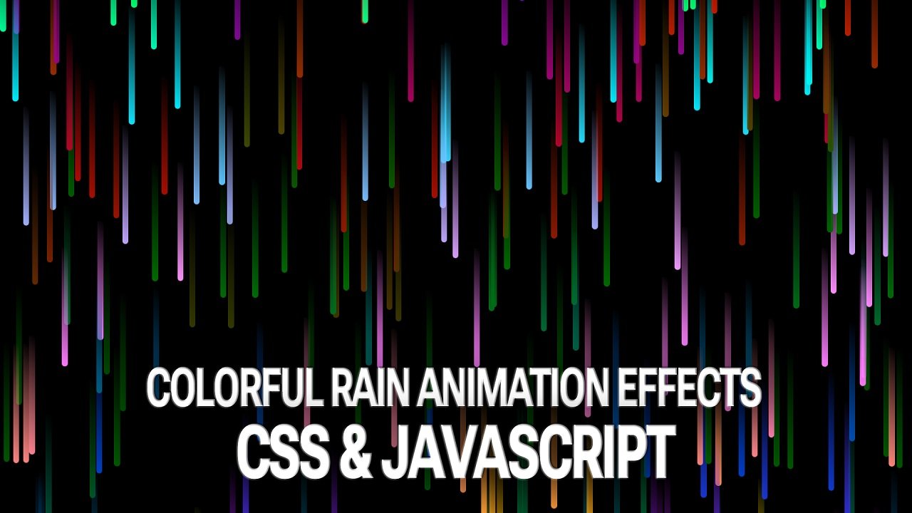
- Colorful Rain Animation Effects
- Random Color Palette Generator
- Word Counter
- Working Google Search Engine
Sticky Navbar With Parallax Effect
HTML:
Create a new file with the name “index.html” and add the provided code to it. Ensure the file has a “.html” extension.
<!DOCTYPE html>
<html lang="en">

<head>
    <meta charset="UTF-8">
    <meta http-equiv="X-UA-Compatible" content="IE=edge">
    <meta name="viewport" content="width=device-width, initial-scale=1.0">
    <title>Sticky Navbar With Parallax Effect</title>
    <link rel="stylesheet" href="./style.css">
</head>

<body>
    <header id="header">
        <a href="#" class="logo">logo</a>
        <ul>
            <li>
                <a href="#">home</a>
            </li>
            <li>
                <a href="#">about</a>
            </li>
            <li>
                <a href="#">services</a>
            </li>
            <li>
                <a href="#">portfolia</a>
            </li>
            <li>
                <a href="#">team</a>
            </li>
            <li>
                <a href="#">contact</a>
            </li>
        </ul>
        <div class="toggle active" onclick="toggle()"></div>
    </header>
    <div class="imgBx"></div>
    <div class="imgBx1"></div>
</body>

</html>
This is a basic HTML markup for a web page that includes a header with a logo and a navigation menu, as well as two div elements for displaying images. It also includes a link to an external CSS file called “style.css” for styling the page.
The meta tags in the head section define the character set, compatibility with Internet Explorer, and the viewport for the page. The title tag sets the title of the page that appears in the browser tab.
The header contains a ul element with six li elements, each with an a element that represents a link to different pages of the website. The div element with class toggle is used to toggle the navigation menu on smaller screens using JavaScript.
The two div elements with classes imgBx and imgBx1 are empty and will need to be filled with images using CSS.
Overall, this is a basic structure of a webpage, and additional content will need to be add in order to create a full webpage.
CSS:
Create a new CSS file name “style.css” and copy the provide code into it. Ensure that the file has a “.css” extension.
*{
    margin: 0;
    padding: 0;
    box-sizing: border-box;
    font-family: 'Noto Sans';
}
html{
    scroll-behavior: smooth;
}
.imgBx{
    position: fixed;
    top: 0;
    left: 0;
    width: 100%;
    height: 100vh;
    background: url(./img.png);
    background-size: cover;
    background-position: center;
}
.imgBx1{
    position: absolute;
    top: 100%;
    width: 100%;
    height: 100vh;
    background: url(./img.png);
    background-size: cover;
    background-position: center;
}
::-webkit-scrollbar{
    width: 10px;
}
::-webkit-scrollbar-track{
    background: #fff;
}
::-webkit-scrollbar-thumb{
    background: #0718c4;
    border: 3px solid #fff;
    border-radius: 8px;
    transition: .3s ease;
}
::-webkit-scrollbar-thumb:hover{
    background: #0718c4aa;
}
header{
    position: fixed;
    top: 0;
    left: 0;
    width: 100%;
    display: flex;
    justify-content: space-between;
    align-items: center;
    padding: 40px 100px;
    transition: .6s;
    z-index: 10000;
}
header.sticky{
    padding: 5px 100px;
    border-bottom: 1px solid rgba(0, 0, 0, .1);
    background: rgba(255, 255, 255, 0.25);
    box-shadow: 0 8px 32px 0 rgba(31, 38, 135, 0.37);
    backdrop-filter: blur(20px);
    border-bottom-left-radius: 10px;
    border-bottom-right-radius: 10px;
}
header .logo{
    position: relative;
    font-weight: 700;
    color: #fff;
    text-decoration: none;
    font-size: 2em;
    text-transform: uppercase;
    letter-spacing: 2px;
    transition: .6s;
}
header ul{
    position: relative;
    display: flex;
    justify-content: center;
    align-items: center;
}
header ul li{
    position: relative;
    list-style: none;
}
header ul li a{
    position: relative;
    margin: 0 15px;
    text-decoration: none;
    color: #fff;
    letter-spacing: 2px;
    font-weight: 500;
    font-size: 1.3em;
    transition: .6s;
    text-transform: capitalize;
}
.toggle{
    display: none;
}

/* Responsive */
@media (max-width: 992px){
    .toggle{
        display: block;
        position: relative;
        width: 30px;
        height: 30px;
        cursor: pointer;
    }
    .toggle::before{
        content: '';
        position: absolute;
        top: 4px;
        width: 100%;
        height: 2px;
        background: #fff;
        z-index: 1;
        box-shadow: 0 10px 0 #fff;
        transition: .5s;
    }
    .toggle::after{
        content: '';
        position: absolute;
        bottom: 4px;
        width: 100%;
        height: 2px;
        background: #fff;
        z-index: 1;
        transition: .5s;
    }
    header.active .toggle::before{
        top: 14px;
        transform: rotate(45deg);
        box-shadow: 0 0 0 #fff;
    }
    header.active .toggle::after{
        bottom: 14px;
        transform: rotate(-45deg);
    }
    header ul{
        position: absolute;
        top: 59px;
        left: 110px;
        width: 100%;
        height: calc(100vh);
        padding: 50px 100px;
        visibility: hidden;
        opacity: 0;
        transition: .5s ease;
        display: flex;
        justify-content: center;
        align-items: center;
        flex-direction: column;
        gap: 20px;
    }
    header.active ul{
        left: 0%;
        background: #fff;
        visibility: visible;
        opacity: 1;
        transition: .5s ease;
    }
    header.active ul li a{
        margin: 5px 0;
        font-size: 24px;
    }
    header,
    header.sticky{
        padding: 5px 50px;
        border-bottom: 1px solid rgba(0, 0, 0, .1);
        background: rgba(255, 255, 255, 0.25);
        box-shadow: 0 8px 32px 0 rgba(31, 38, 135, 0.37);
        backdrop-filter: blur(20px);
        border-bottom-left-radius: 10px;
        border-bottom-right-radius: 10px;
    }
    header.active ul li a{
        color: #000;
    }
}
This is a CSS code for styling a website header. Here is an overview of what this code does:
- The first block of code sets some basic styles for all elements in the page, such as setting margins and padding to zero and using the ‘Noto Sans’ font family.
- The ‘html’ block of code sets the scrolling behavior to smooth.
- The ‘imgBx’ and ‘imgBx1’ blocks of code define two different styles for image containers.
- The ‘::webkit-scrollbar’ block of code sets the style of the scroll bar that appears on webkit-based browsers (e.g. Chrome, Safari).
- The ‘header’ block of code sets the style for the header of the website, including its position, width, height, padding, and background color.
- The ‘header.sticky’ block of code defines the style for the header when it becomes sticky, including reducing the padding and adding a border, background, box shadow, and border radius.
- The ‘.logo’ block of code sets the style for the logo in the header.
- The ‘ul’ and ‘li’ blocks of code define the style for unordered lists and their list items, respectively.
- The ‘toggle’ block of code sets the style for a button that will appear on small screens to toggle the navigation menu.
- Finally, the ‘@media’ block of code defines the styles that will be applie when the screen width is less than 992 pixels, which includes setting the ‘toggle’ button to display and setting styles for the navigation menu when it appears.
JavaScript:
In between the <body></body> tags, you can include JavaScript code by enclosing it within <script> tags.
        window.addEventListener('scroll', function () {
            var header = document.querySelector('header');
            header.classList.toggle('sticky', window.scrollY > 0);
        });

        function toggle() {
            var header = document.getElementById('header');
            header.classList.toggle('active');
        };
This is JavaScript code that adds functionality to the HTML and CSS code for a website’s header.
The first part of the code adds an event listener to the window object that listens for when the user scrolls on the website. When the user scrolls, the code checks whether the user has scrolled past the top of the page (i.e., window.scrollY > 0). If the user has scrolled past the top of the page, the code adds the class sticky to the header element, which changes the styling of the header to make it sticky.
The second part of the code defines a function called toggle(). When this function is called (presumably by a button or other interactive element on the website), it toggles the class active on the header element. This changes the styling of the header to show a navigation menu for smaller screens. The class active changes the position of the navigation menu from hidden to visible and adjusts the font size and color of the links in the navigation menu.
Conclusion:
Creating a “Sticky Navbar with Parallax Effect” using HTML and CSS is a popular technique among designers today. The HTML code includes a header element with a logo and navigation menu, as well as two div elements that create the parallax effect. The JavaScript code adds or removes a class from the header element, changing the style of the navigation bar. The CSS code styles the HTML elements, including the header, logo, navigation menu, and toggle button. The media query in the CSS code changes the style of the toggle button and the position of the navigation menu for smaller screens.
