
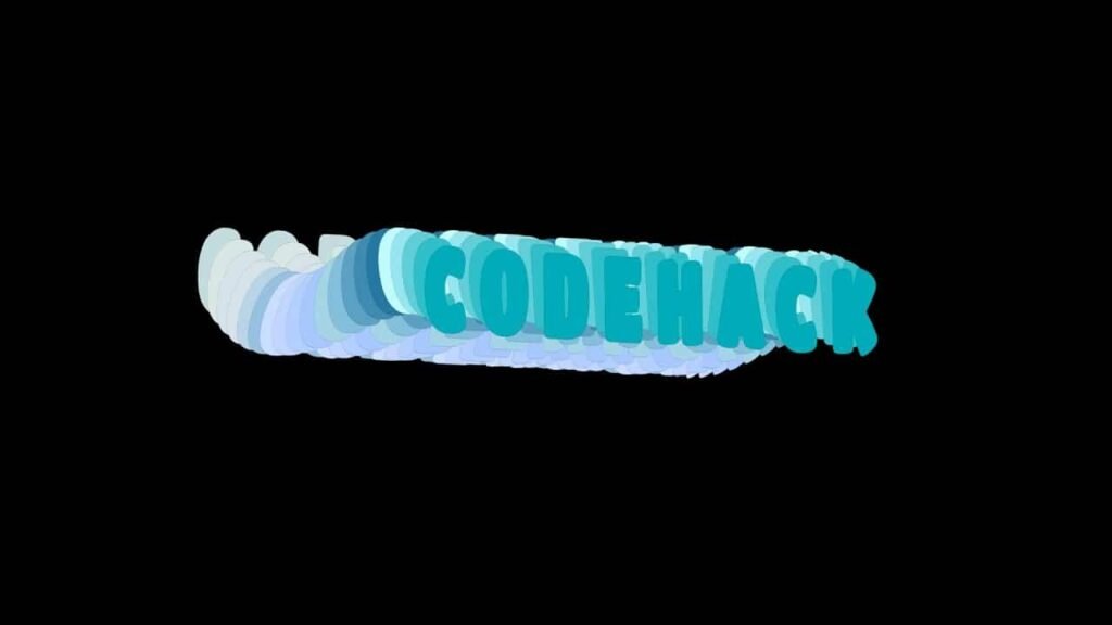
In this code snippet, we delve into the mesmerizing world of text wave animation using HTML and CSS. Through this exploration, we uncover several key techniques that enable the creation of dynamic, visually appealing effects on web elements.
One prominent feature of this code is the use of CSS animations to achieve the wave-like motion of text elements. By defining keyframes and applying them to individual text elements with varying delays, we create a synchronized wave effect that traverses through the text in a fluid motion. This technique enhances the visual interest of the webpage, drawing the viewer’s attention to the dynamic nature of the content.
Furthermore, the implementation of Google Fonts enriches the visual presentation by providing a distinct typeface – ‘Titan One’ – adding a touch of personality to the text elements. This showcases how font selection can play a crucial role in defining the overall aesthetic of a webpage.
The code also demonstrates the utilization of CSS transforms to manipulate the position and rotation of text elements in three-dimensional space. By applying transformations such as translation and rotation along different axes, we achieve depth and perspective, enhancing the immersive quality of the animation.
Additionally, the code utilizes CSS selectors to target specific text elements, allowing for individualized styling and animation properties. This level of granularity enables fine-tuning of the visual effects, ensuring coherence and harmony within the overall design.
Moreover, the concept of animation timing is illustrated through the use of animation delays, ensuring that each text element undergoes its transformation at the appropriate moment, contributing to the overall rhythm and flow of the animation.
Video Tutorial of Text Wave Animation Using HTML & Pure CSS:
To witness a live showcase of Text Wave Animation, please click here. To access a comprehensive video tutorial detailing the functionality of the generator, feel free to view the accompanying YouTube video.
You may like this:
- Colorful Rain Animation Effects
- Random Color Palette Generator
- Word Counter
- Working Google Search Engine
Text Wave Animation Using HTML & Pure CSS
HTML:
Create a new file with the name “index.html” and add the provided code to it. Ensure the file has a “.html” extension.
<!DOCTYPE html>
<html lang="en">

<head>
    <meta charset="UTF-8">
    <meta http-equiv="X-UA-Compatible" content="IE=edge">
    <meta name="viewport" content="width=device-width, initial-scale=1.0">
    <title>Text Wave Animation</title>
    <link rel="stylesheet" href="style.css">
    <script src="../custom-scripts.js" defer=""></script>
</head>

<body>
    <div class="container">
        <div class="wave">CODEHACK</div>
        <div class="wave">CODEHACK</div>
        <div class="wave">CODEHACK</div>
        <div class="wave">CODEHACK</div>
        <div class="wave">CODEHACK</div>
        <div class="wave">CODEHACK</div>
        <div class="wave">CODEHACK</div>
        <div class="wave">CODEHACK</div>
        <div class="wave">CODEHACK</div>
        <div class="wave">CODEHACK</div>
        <div class="wave">CODEHACK</div>
        <div class="wave">CODEHACK</div>
        <div class="wave">CODEHACK</div>
        <div class="wave">CODEHACK</div>
        <div class="wave">CODEHACK</div>
        <div class="wave">CODEHACK</div>
        <div class="wave">CODEHACK</div>
        <div class="wave">CODEHACK</div>
        <div class="wave">CODEHACK</div>
        <div class="wave">CODEHACK</div>
    </div>
</body>

</html>
This HTML code snippet demonstrates the use of a single main div with the class “container”, containing multiple nested divs with the class “wave”, each displaying the text “CODEHACK”.
The main div with the class “container” serves as a parent container, encapsulating all the individual wave elements within it. This structure allows for easy organization and manipulation of the content as a cohesive unit.
Within the container, the nested divs with the class “wave” represent individual wave elements, each displaying the text “CODEHACK”. These divs likely serve as placeholders for the actual content or elements intended to be displayed on the webpage.
By utilizing this hierarchical structure, developers can apply consistent styling or functionality to all the wave elements collectively by targeting the parent container, or they can apply specific styles or actions to each wave element individually by targeting their respective classes.
Overall, this code pattern provides a flexible and scalable approach to organizing and presenting content on a webpage, allowing for efficient management and customization of elements within the layout.
CSS:
@import url('https://fonts.googleapis.com/css?family=Titan+One&display=swap');

body {
	background-color: #000;
	font-family: 'Titan One', cursive;
}

.container {
	position: fixed;
	top: 0;
	bottom: 0;
	left: 0;
	right: 0;
	margin: auto;
	display: flex;
	justify-content: center;
	align-items: center;
	transform-style: preserve-3d;
	transform: rotatex(-5deg) rotateY(-45deg);
	animation: movewave 30s ease-in-out infinite;
}

.wave {
	position: absolute;
	font-size: 10rem;
	transform-style: preserve-3d;
	letter-spacing: 2rem;
	font-weight: 900;
}

.wave:nth-child(1) {
	transform: translatez(-20px) translateY(-40px) rotateX(15deg);
	animation: move-1 ease-in-out 2s infinite;
	animation-delay: 0.1s;
	color: #07beb8;
	text-shadow: 0px 0px #330b00;
}

.wave:nth-child(2) {
	transform: translatez(-40px) translateY(-40px) rotateX(15deg);
	animation: move-2 ease-in-out 2s infinite;
	animation-delay: 0.2s;
	color: #3dccc7;
	text-shadow: 0px 0px #331700;
}

.wave:nth-child(3) {
	transform: translatez(-60px) translateY(-40px) rotateX(15deg);
	animation: move-3 ease-in-out 2s infinite;
	animation-delay: 0.3s;
	color: #68d8d6;
	text-shadow: 0px 0px #320;
}

.wave:nth-child(4) {
	transform: translatez(-80px) translateY(-40px) rotateX(15deg);
	animation: move-4 ease-in-out 2s infinite;
	animation-delay: 0.4s;
	color: #9ceaef;
	text-shadow: 0px 0px #332e00;
}

.wave:nth-child(5) {
	transform: translatez(-100px) translateY(-40px) rotateX(15deg);
	animation: move-5 ease-in-out 2s infinite;
	animation-delay: 0.5s;
	color: #c4fff9;
	text-shadow: 0px 0px #2d3300;
}

.wave:nth-child(6) {
	transform: translatez(-120px) translateY(-40px) rotateX(15deg);
	animation: move-6 ease-in-out 2s infinite;
	animation-delay: 0.6s;
	color: #2c7da0;
	text-shadow: 0px 0px #213300;
}

.wave:nth-child(7) {
	transform: translatez(-140px) translateY(-40px) rotateX(15deg);
	animation: move-7 ease-in-out 2s infinite;
	animation-delay: 0.7s;
	color: #468faf;
	text-shadow: 0px 0px #163300;
}

.wave:nth-child(8) {
	transform: translatez(-160px) translateY(-40px) rotateX(15deg);
	animation: move-8 ease-in-out 2s infinite;
	animation-delay: 0.8s;
	color: #61a5c2;
	text-shadow: 0px 0px #0a3300;
}

.wave:nth-child(9) {
	transform: translatez(-180px) translateY(-40px) rotateX(15deg);
	animation: move-9 ease-in-out 2s infinite;
	animation-delay: 0.9s;
	color: #89c2d9;
	text-shadow: 0px 0px #003301;
}

.wave:nth-child(10) {
	transform: translatez(-200px) translateY(-40px) rotateX(15deg);
	animation: move-10 ease-in-out 2s infinite;
	animation-delay: 1s;
	color: #a9d6e5;
	text-shadow: 0px 0px #00330d;
}

.wave:nth-child(11) {
	transform: translatez(-220px) translateY(-40px) rotateX(15deg);
	animation: move-11 ease-in-out 2s infinite;
	animation-delay: 1.1s;
	color: #abc4ff;
	text-shadow: 0px 0px #003318;
}

.wave:nth-child(12) {
	transform: translatez(-240px) translateY(-40px) rotateX(15deg);
	animation: move-12 ease-in-out 2s infinite;
	animation-delay: 1.2s;
	color: #b6ccfe;
	text-shadow: 0px 0px #003324;
}

.wave:nth-child(13) {
	transform: translatez(-260px) translateY(-40px) rotateX(15deg);
	animation: move-13 ease-in-out 2s infinite;
	animation-delay: 1.3s;
	color: #c1d3fe;
	text-shadow: 0px 0px #00332f;
}

.wave:nth-child(14) {
	transform: translatez(-280px) translateY(-40px) rotateX(15deg);
	animation: move-14 ease-in-out 2s infinite;
	animation-delay: 1.4s;
	color: #ccdbfd;
	text-shadow: 0px 0px #002b33;
}

.wave:nth-child(15) {
	transform: translatez(-300px) translateY(-40px) rotateX(15deg);
	animation: move-15 ease-in-out 2s infinite;
	animation-delay: 1.5s;
	color: #99c1de;
	text-shadow: 0px 0px #002033;
}

.wave:nth-child(16) {
	transform: translatez(-320px) translateY(-40px) rotateX(15deg);
	animation: move-16 ease-in-out 2s infinite;
	animation-delay: 1.6s;
	color: #bcd4e6;
	text-shadow: 0px 0px #001433;
}

.wave:nth-child(17) {
	transform: translatez(-340px) translateY(-40px) rotateX(15deg);
	animation: move-17 ease-in-out 2s infinite;
	animation-delay: 1.7s;
	color: #d6e2e9;
	text-shadow: 0px 0px #000933;
}

.wave:nth-child(18) {
	transform: translatez(-360px) translateY(-40px) rotateX(15deg);
	animation: move-18 ease-in-out 2s infinite;
	animation-delay: 1.8s;
	color: #d6e2e9;
	text-shadow: 0px 0px #030033;
}

.wave:nth-child(19) {
	transform: translatez(-380px) translateY(-40px) rotateX(15deg);
	animation: move-19 ease-in-out 2s infinite;
	animation-delay: 1.9s;
	color: #dbe7e4;
	text-shadow: 0px 0px #0e0033;
}

.wave:nth-child(20) {
	transform: translatez(-400px) translateY(-40px) rotateX(15deg);
	animation: move-20 ease-in-out 2s infinite;
	animation-delay: 2s;
	color: #c5dedd;
	text-shadow: 0px 0px #1a0033;
}

@keyframes move-1 {

	0%,
	100% {
		transform: translatez(-20px) translateY(-40px) rotateX(15deg);
	}

	50% {
		transform: translatez(-20px) translateY(40px) rotateX(-15deg);
	}
}

@keyframes move-2 {

	0%,
	100% {
		transform: translatez(-40px) translateY(-40px) rotateX(15deg);
	}

	50% {
		transform: translatez(-40px) translateY(40px) rotateX(-15deg);
	}
}

@keyframes move-3 {

	0%,
	100% {
		transform: translatez(-60px) translateY(-40px) rotateX(15deg);
	}

	50% {
		transform: translatez(-60px) translateY(40px) rotateX(-15deg);
	}
}

@keyframes move-4 {

	0%,
	100% {
		transform: translatez(-80px) translateY(-40px) rotateX(15deg);
	}

	50% {
		transform: translatez(-80px) translateY(40px) rotateX(-15deg);
	}
}

@keyframes move-5 {

	0%,
	100% {
		transform: translatez(-100px) translateY(-40px) rotateX(15deg);
	}

	50% {
		transform: translatez(-100px) translateY(40px) rotateX(-15deg);
	}
}

@keyframes move-6 {

	0%,
	100% {
		transform: translatez(-120px) translateY(-40px) rotateX(15deg);
	}

	50% {
		transform: translatez(-120px) translateY(40px) rotateX(-15deg);
	}
}

@keyframes move-7 {

	0%,
	100% {
		transform: translatez(-140px) translateY(-40px) rotateX(15deg);
	}

	50% {
		transform: translatez(-140px) translateY(40px) rotateX(-15deg);
	}
}

@keyframes move-8 {

	0%,
	100% {
		transform: translatez(-160px) translateY(-40px) rotateX(15deg);
	}

	50% {
		transform: translatez(-160px) translateY(40px) rotateX(-15deg);
	}
}

@keyframes move-9 {

	0%,
	100% {
		transform: translatez(-180px) translateY(-40px) rotateX(15deg);
	}

	50% {
		transform: translatez(-180px) translateY(40px) rotateX(-15deg);
	}
}

@keyframes move-10 {

	0%,
	100% {
		transform: translatez(-200px) translateY(-40px) rotateX(15deg);
	}

	50% {
		transform: translatez(-200px) translateY(40px) rotateX(-15deg);
	}
}

@keyframes move-11 {

	0%,
	100% {
		transform: translatez(-220px) translateY(-40px) rotateX(15deg);
	}

	50% {
		transform: translatez(-220px) translateY(40px) rotateX(-15deg);
	}
}

@keyframes move-12 {

	0%,
	100% {
		transform: translatez(-240px) translateY(-40px) rotateX(15deg);
	}

	50% {
		transform: translatez(-240px) translateY(40px) rotateX(-15deg);
	}
}

@keyframes move-13 {

	0%,
	100% {
		transform: translatez(-260px) translateY(-40px) rotateX(15deg);
	}

	50% {
		transform: translatez(-260px) translateY(40px) rotateX(-15deg);
	}
}

@keyframes move-14 {

	0%,
	100% {
		transform: translatez(-280px) translateY(-40px) rotateX(15deg);
	}

	50% {
		transform: translatez(-280px) translateY(40px) rotateX(-15deg);
	}
}

@keyframes move-15 {

	0%,
	100% {
		transform: translatez(-300px) translateY(-40px) rotateX(15deg);
	}

	50% {
		transform: translatez(-300px) translateY(40px) rotateX(-15deg);
	}
}

@keyframes move-16 {

	0%,
	100% {
		transform: translatez(-320px) translateY(-40px) rotateX(15deg);
	}

	50% {
		transform: translatez(-320px) translateY(40px) rotateX(-15deg);
	}
}

@keyframes move-17 {

	0%,
	100% {
		transform: translatez(-340px) translateY(-40px) rotateX(15deg);
	}

	50% {
		transform: translatez(-340px) translateY(40px) rotateX(-15deg);
	}
}

@keyframes move-18 {

	0%,
	100% {
		transform: translatez(-360px) translateY(-40px) rotateX(15deg);
	}

	50% {
		transform: translatez(-360px) translateY(40px) rotateX(-15deg);
	}
}

@keyframes move-19 {

	0%,
	100% {
		transform: translatez(-380px) translateY(-40px) rotateX(15deg);
	}

	50% {
		transform: translatez(-380px) translateY(40px) rotateX(-15deg);
	}
}

@keyframes move-20 {

	0%,
	100% {
		transform: translatez(-400px) translateY(-40px) rotateX(15deg);
	}

	50% {
		transform: translatez(-400px) translateY(40px) rotateX(-15deg);
	}
}

@keyframes movewave {

	0%,
	100% {
		left: 25%;
		transform: rotatex(5deg) rotateY(0deg) rotate(0deg);
	}

	50% {
		left: -20%;
		transform: rotatex(-10deg) rotateY(55deg) rotateY(-360deg) rotate(10deg);
	}
}
This CSS code snippet is a demonstration of an animated wave effect achieve through HTML and CSS. Let’s break down the key components and functionalities of this code:
- Font Import:
- The code begins with an
@importrule importing the “Titan One” font from Google Fonts.
- Body Styling:
- The
bodyelement is styled to have a black background color and to use the “Titan One” font, providing a consistent visual theme for the entire webpage.
- Container Styling:
- The
.containerclass is defined with styling properties such as position, display, and alignment to position its content in the center of the viewport. - It utilizes the
transformproperty with 3D transformations (rotatexandrotateY) to create a visually engaging perspective effect.
- Wave Styling:
- The
.waveclass represents individual wave elements within the container. - Each wave element is position absolutely within the container and styled with a large font size, bold text, and letter spacing for emphasis.
- The color and text shadow properties are define for each wave element to create a visually striking appearance.
- Keyframe Animations:
- Multiple
@keyframesrules are defined to create the animation effects for the wave elements. - Each keyframe animation defines the movement and transformation of a specific wave element.
- The animations include translation along the z-axis (
translatez), translation along the y-axis (translateY), and rotation along the x-axis (rotateX). - Animation durations and delays are specified to control the timing and sequence of the wave movements.
- Main Animation:
- The
movewavekeyframe animation is applied to the container to create an overall wave motion effect. - This animation animates the
leftproperty to move the container horizontally across the viewport, simulating a wave-like motion. - It also incorporates complex 3D transformations to rotate and tilt the container dynamically.
In summary, this code showcases an advanced use of CSS animations and transformations to create a visually captivating wave effect, adding dynamism and depth to web content.
Summary:
In this blog, we explored a fascinating demonstration of HTML and CSS code that creates a captivating wave animation effect. The code snippet provided showcases the implementation of animated waves using div elements styled with CSS properties and keyframe animations. Here’s a summary of what we’ve covered:
- Animated Wave Effect: The main highlight of the blog is the animate wave effect achieve through CSS animations and transformations.
- HTML Structure: The code utilizes a simple HTML structure with a container div and multiple child divs representing the waves.
- CSS Styling: Each wave div is style using CSS properties like position, font size, color, and text shadow to create a visually appealing appearance.
- Keyframe Animations: Keyframe animations are employ to define the movement and transformation of each wave element, simulating the motion of waves.
- Container Animation: A main animation, named
movewave, is applied to the container to create an overall wave motion effect across the viewport. This animation incorporates complex 3D transformations to achieve a dynamic visual effect. - Engagement and Impact: The combination of CSS animations, transformations, and carefully chosen styling properties results in an engaging and visually striking animation that can enhance the aesthetic appeal of web pages.
Overall, this blog provides valuable insights into creating dynamic and visually appealing animations using HTML and CSS, offering inspiration and guidance for developers looking to add creative effects to their web projects.


